Hoarder’s Heir is made up of the dynamic prop duo Kenneth Hyatt and Justin Schram. They bring a rich, collected and unique aesthetic to their work. It was so inspiring to bring their approach to life in the new brand we created for them. With a wide range of illustrations, the execution of the brand is endless.
Posts Tagged ‘Branding and Logo Design’
Blankets from Emma
April 7, 2015
Blankets from Emma is a new company that began with a sweet story of an owner and her adopted dog Emma. Emma waswas brought home in snuggly fleece blanket and went on to love that same blanket for her 15 year long life. Inspired by Emma, these soft, snuggly blankets are now being sewn in the USA for more dogs (and cats) to enjoy. Blankets from Emma are made from the highest quality fleece and are constructed to with stand countless washings and snuggles. It was a pleasure to illustrate Emma and her blanket for this logo development.
Client: Juliana Falk
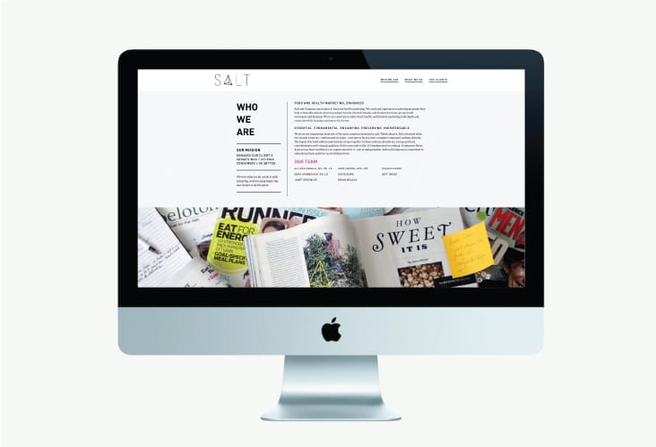
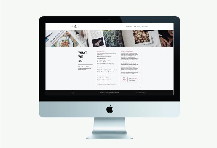
Salt and Company
January 7, 2015
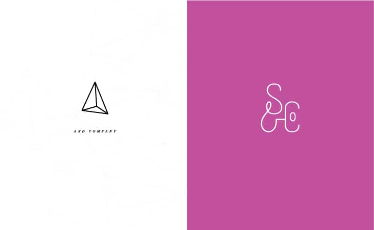
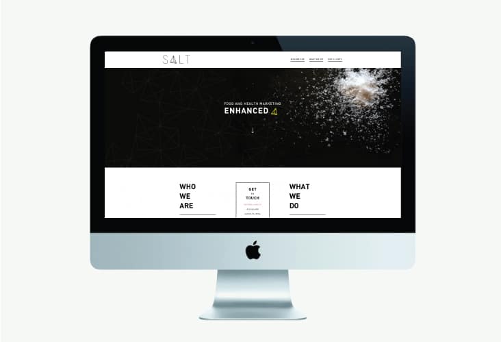
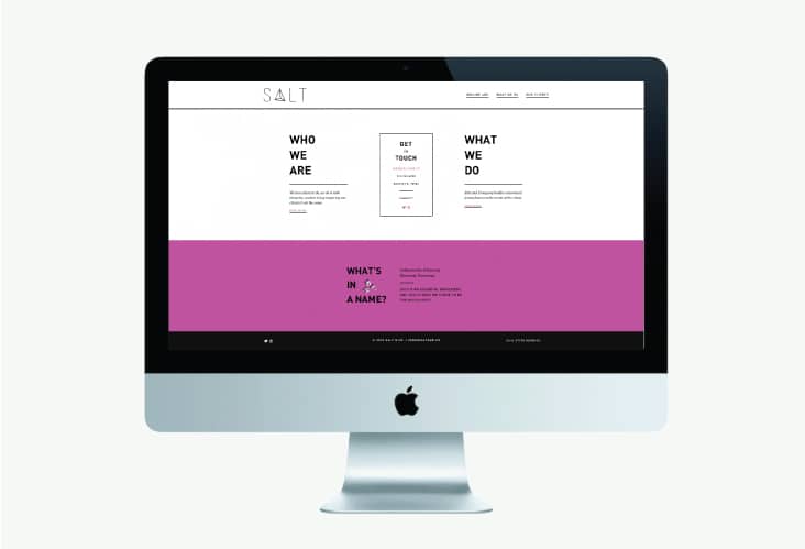
Salt and Company specializes in food and health marketing. They craft and implement marketing programs that help commodity boards, farm to package brands, lifestyle brands, and food professional groups build awareness and demand. They are on a mission to infuse food, health, and lifestyle marketing with depth and creativity while helping consumers live better. It was a pleasure working with Allison and Brian on the redesign of their logo, identity package and website. We’re thrilled with the outcome and can’t wait to share more upcoming work for Salt and Co. soon.
Client: Allison and Brian Beadle
Poppies and Posies
September 9, 2014
Poppies & Posies is a boutique floral design firm based in New York City & New England. We recently had the pleasure of helping Creative Director and Owner, Sierra Steifman rebrand her successful floral business. Sierra approaches each project with an enthusiastic attention to detail. Her seasonal flowers are arranged in a loose, garden-inspired style, complete with unexpected elements such as berries, fruits and vegetables. We took her same approach to the design of her new logo and graphic elements, hand illustrating each small detail that makes up her new mark and graphic details.
Client: Sierra Steifman
Callie’s Hot Little Biscuit
July 17, 2014
We’re excited to be a part of Carrie Morey of Callie’s Charleston Biscuits newest venture, Callie’s Hot Little Biscuit, a counter-service restaurant, located at 476 ½ King Street in downtown Charleston. Callie’s Hot Little Biscuit will serve a variety of freshly baked Callie’s Biscuits and a range of other delicious breakfast, lunch and late night treats perfect for anyone on the go. The 629 square foot shop of biscuit goodness is set to open this week!
Client: Callie's Charleston Biscuits
Craft Hair
July 3, 2013
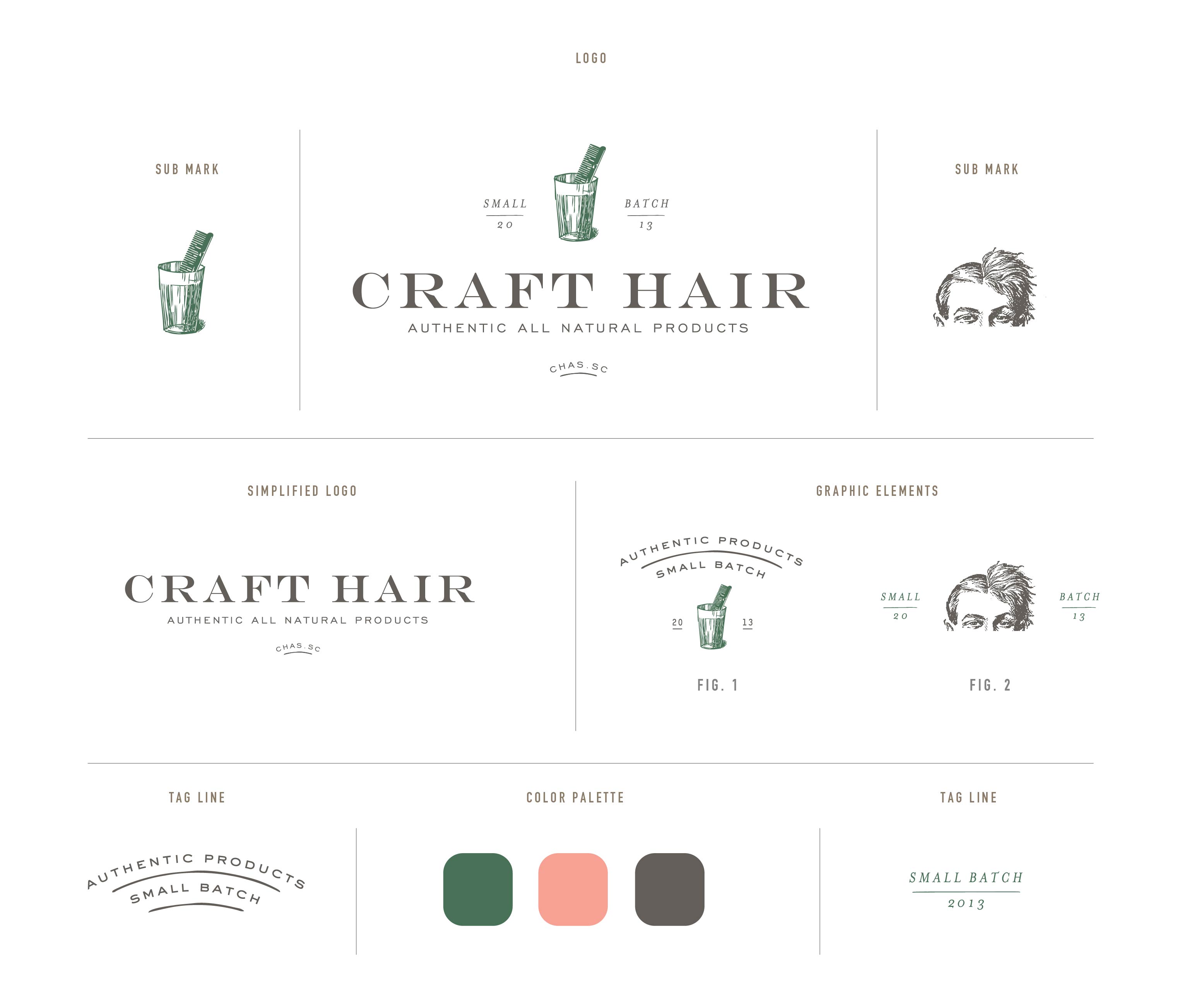
Craft Hair is a brand new hair and body products company with a deep appreciation for authentic, small batch products and classic cocktails. The two behind these exciting new products have histories in both hair styling and the food and beverage industry. They combined their expertise and passion for the two and formed Craft Hair. Read the rest of this entry »
Client: Craft Hair
Corpus Callosum
May 30, 2013
DEFINITION: The Corpus Callosum is a wide, flat bundle of neural fibers beneath the cortex in the eutherian brain at the longitudinal fissure. It connects the left and right cerebral hemispheres and facilitates interhemispheric communication.
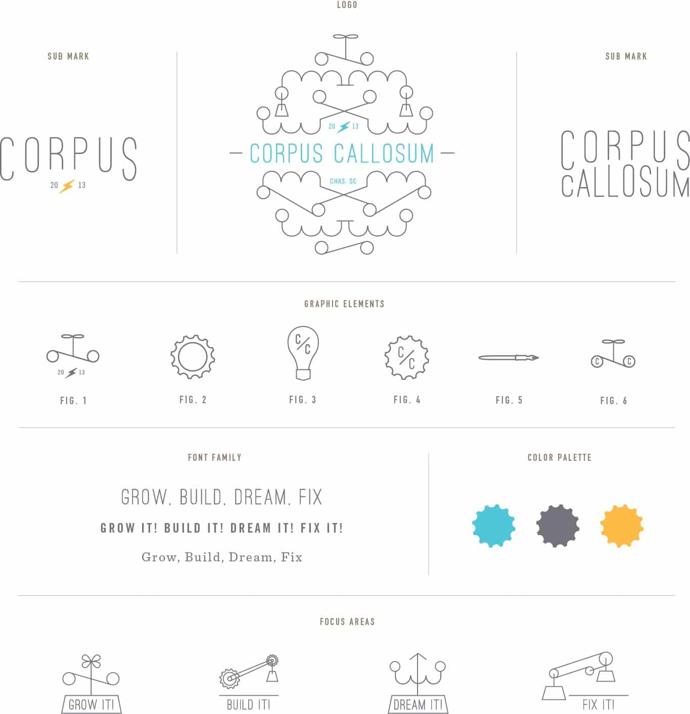
We just finished the branding for Corpus Callosum, which will eventually be a new community center in Charleston that supports learning in innovative ways. We are really excited to be part of this project. Read the rest of this entry »
Client: Corpus Callosum
Home Team Kitchen
May 7, 2013
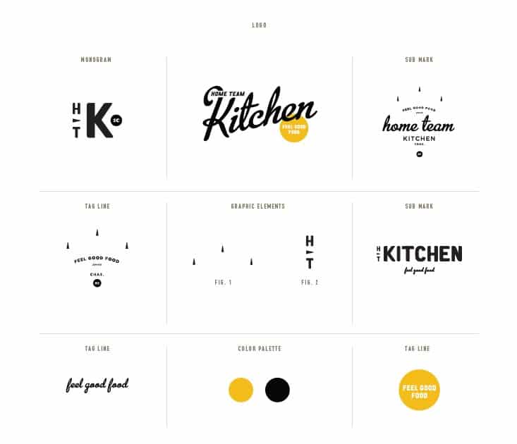
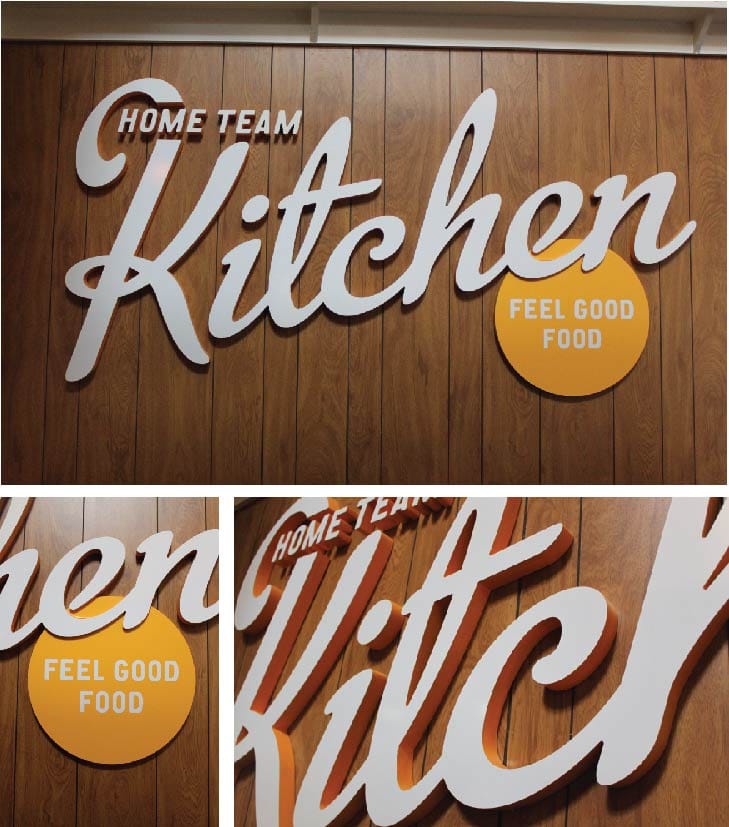
We were excited to help out our friends from Home Team BBQ on their latest venture, Home Team Kitchen. Home Team Kitchen is a welcoming spot inside of Charleston’s new downtown bowling spot, The Alley. We took a cue from the restaurants location and pulled out small bowling details and infused them into the brand in a subtle way. The menu is full of “feel good food” and is one of our office’s favorite lunch spots! Read the rest of this entry »
Client: Home Team Kitchen
Coastal Crust
February 13, 2013
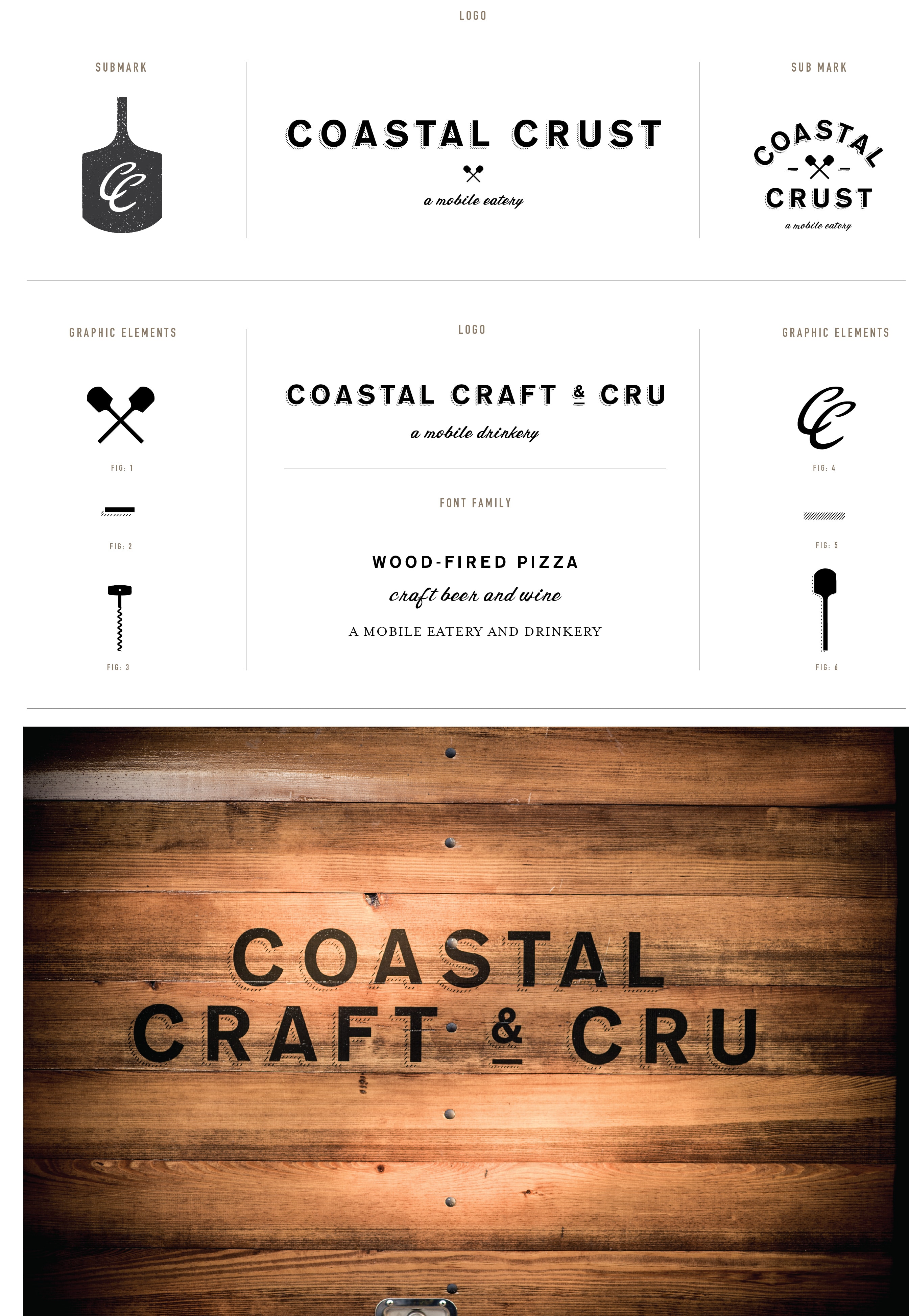
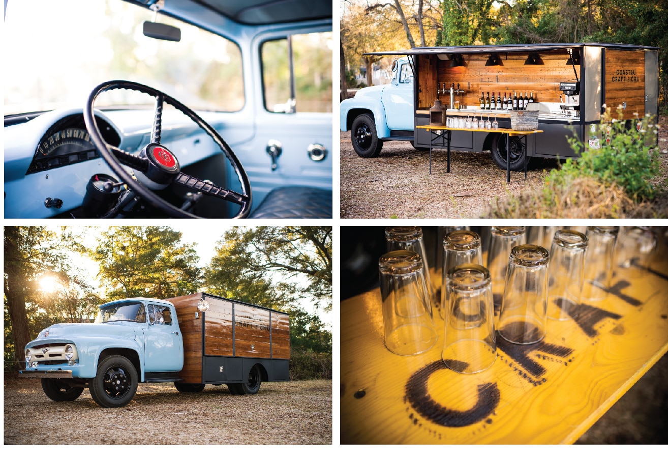
We are excited to share new branding work for Coastal Crust (and Coastal Craft & Cru), a unique new catering service. These restored custom trucks are outfitted to perfection and are ready to serve up delicious wood fired pizzas and craft beer & wine. We designed the logo(s) to be classic and clean knowing they would be paired with these beautiful vehicles. In addition, we designed and illustrated bold graphic elements that pair nicely with the type used in the logo(s). Special thanks to the talented photographer Brennan Wesley for the use of these beautiful photographs of the Coastal Craft and Cru truck. Read the rest of this entry »
Client: Coastal Crust
Hob Nob
November 7, 2012
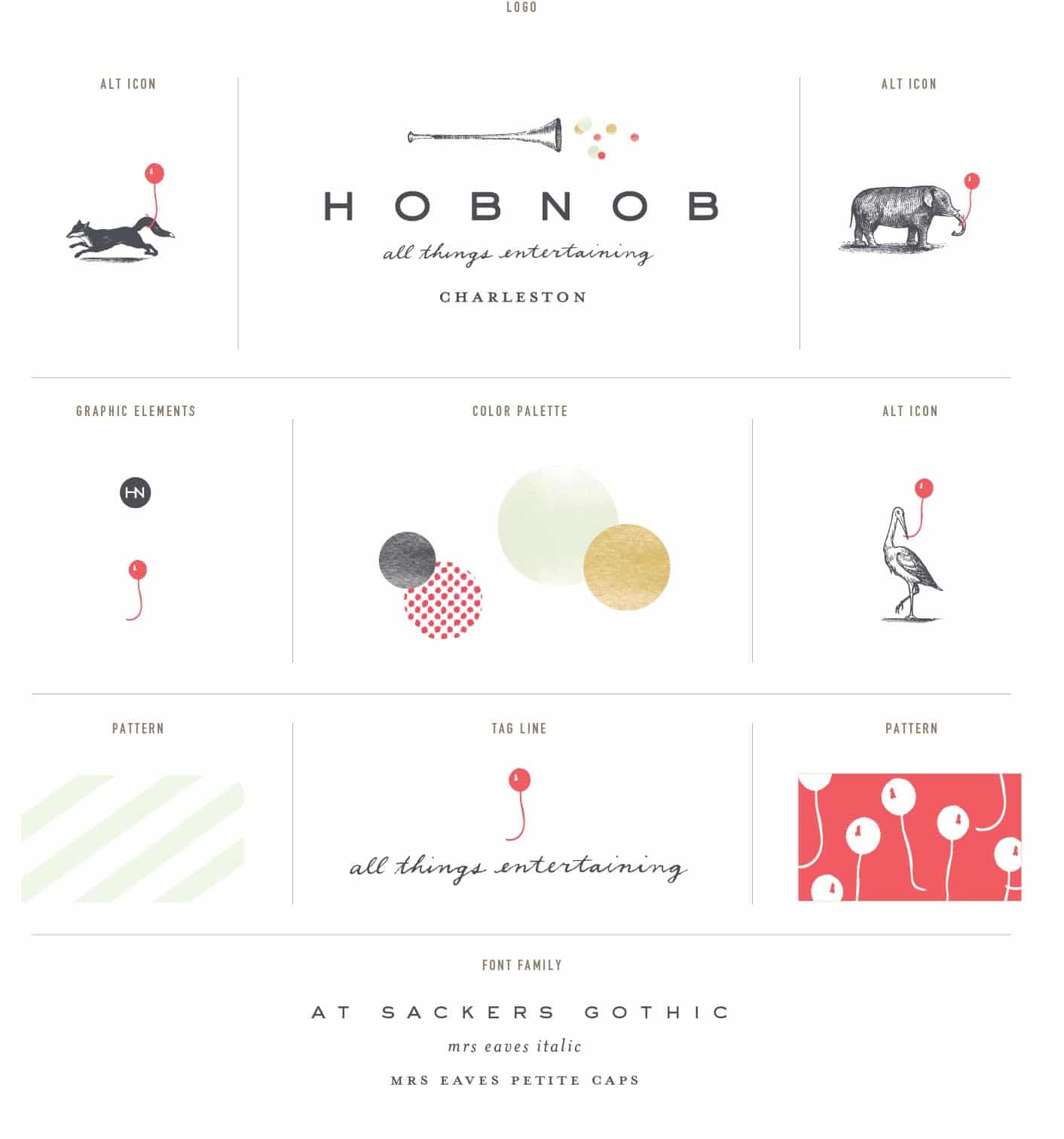
Hob Nob is all things entertaining. We designed this branding and logo family for a new company in Charleston who curates unique events. From children’s birthday parties to small adult gatherings, Hob Nob brings a unique sense of style and attention to detail. We designed this logo with a series of interchangeable icons – different animals who all hold a common balloon. The bright pop of color and whimsey of the balloon perfectly captures the client and the sensibilities of the company. Read the rest of this entry »
Client: Hob Nob
