Veronica Scott is the talented designer behind VEE, a collection of women’s clothing designed and produced in California. Her Spring 2012 line is made up of classic silhouettes paired with quirky prints in a dreamy color palette. That unique pairing was the inspiration behind the branding for VEE. For the logo, we paired a classic “V” typface with a hummingbird wing (hummingbirds are one of Veronica’s favorite things) and took a cue from her lovely prints while developing her color palette.
Archive for March, 2012
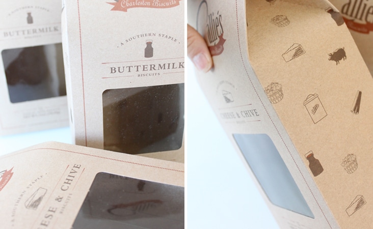
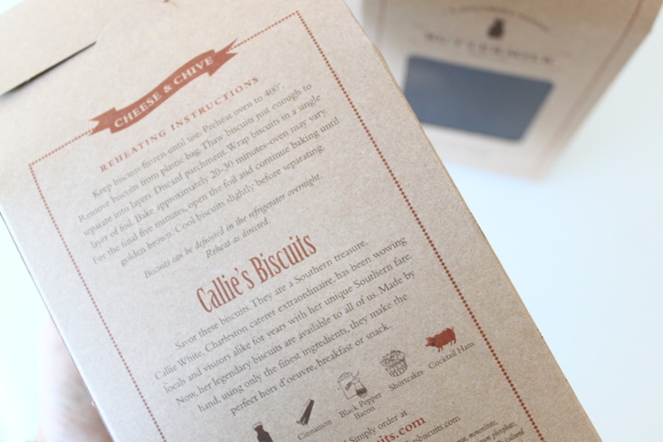
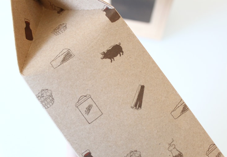
Callie’s Biscuits New Packaging
March 22, 2012
Our favorite southern biscuits just got a new look! Carrie of Callie’s Biscuits came ti us looking for a way to elevate her made-by-hand biscuits on the shelf as well as find a way to quickly identify the different biscuit varieties the company has to offer. Each custom kraft box utilizes a small illustration that acts as the biscuit variety identifier. Kraft paper, classic type, and whimsical illustrations help to convey Carrie’s commitment to her hand-made process and quality of her ingredients. Read the rest of this entry »
Client: Callie's Charleston Biscuits
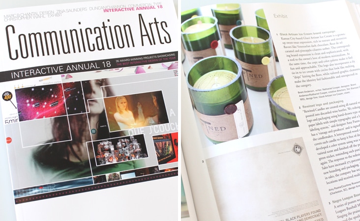
Communication Arts Interactive Annual – Exhibit
March 20, 2012
Just got the Interactive Annual from Communication Arts today and excited to see Rewined Candles featured in Exhibit. We can’t wait to pour over the amazing sites featured in this years annual.
Client: Rewined Candles
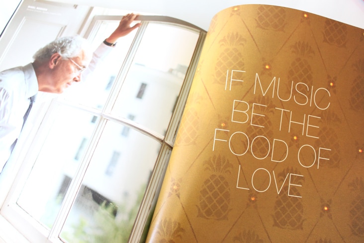
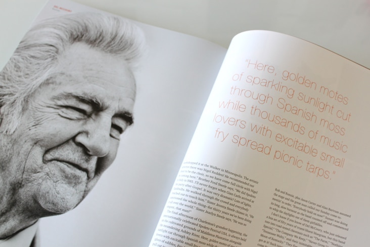
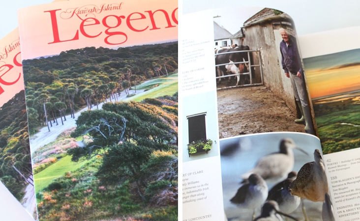
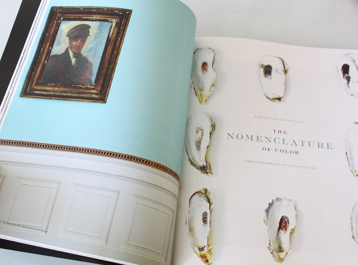
Legends Magazine – Volume 23
March 19, 2012
The 2012 issue of Legends Magazine is here! Volume 23 is, as always, full of beautiful photography and thoughtful writing. It was a pleasure to design and compile the entire magazine again this year. See last year’s issue here.
Client: Kiawah Island Developement Partners
Eberjey Brand Update
March 9, 2012
We’ve been long admirers of the company Eberjey, so when Ali and Mariela gave us a call to help them refresh their brand, we were thrilled. Ali and Mariela started Eberjey 1996 from the belief that the layer worn next to the heart should express happiness, love and confidence. We updated their logo while maintaining all of the elements that were and are truly Eberjey – the flower, simple typography and their iconic Eberjey blue. We also developed a color palette around their established blue along with graphic elements, patterns and a type family. The changes are subtle but make a big impact. Read the rest of this entry »
Client: Eberjey
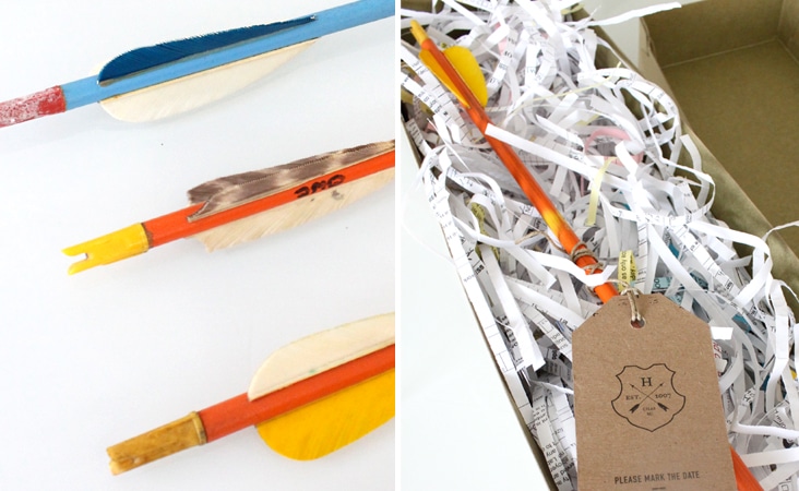
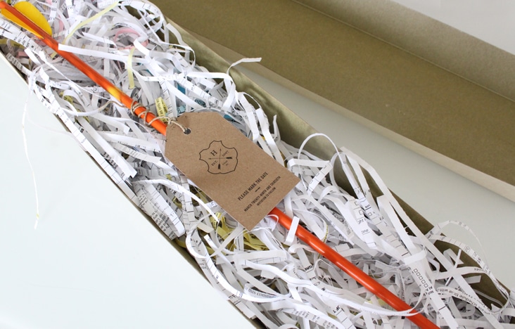
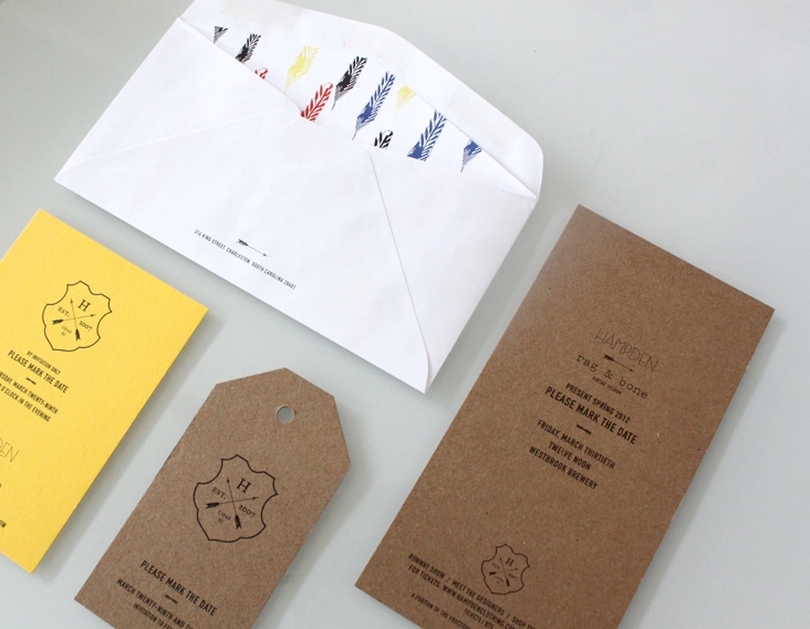
Hampden and Rag & Bone
March 5, 2012
At the end of this month Hampden Clothing will present Rag & Bone’s Spring collection. Inspired by Rag & Bone and their latest colorful collection, we designed a simple kraft tag and attached it to a vintage wooden arrow to serve as the invitation. We love the brightly worn colors of the arrows in contrast to the natural kraft paper. Read the rest of this entry »
Client: Hampden Clothing