New work for a Vietnamese kitchen opening this Spring in New Orleans. Dine-in or take-out with traditional banh mi, buns, soups, salads and more. We can’t wait to try it out in person!
Posts Tagged ‘Stitch Design Co.’
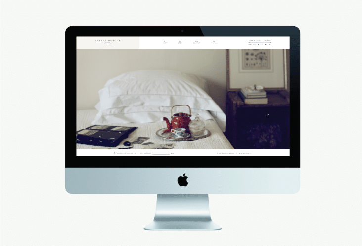
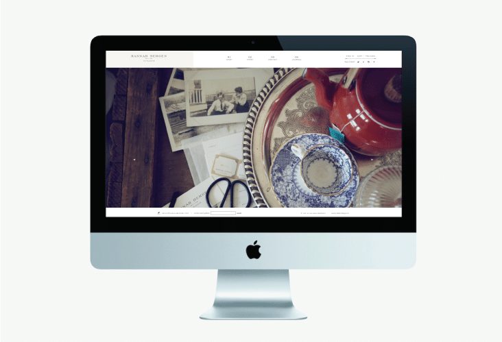
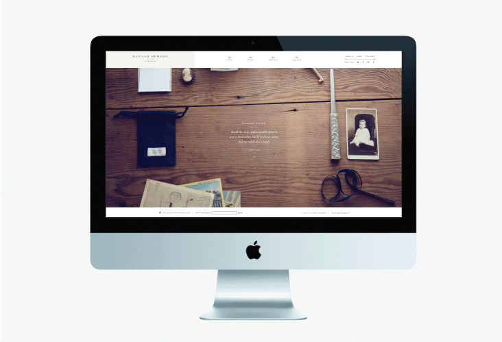
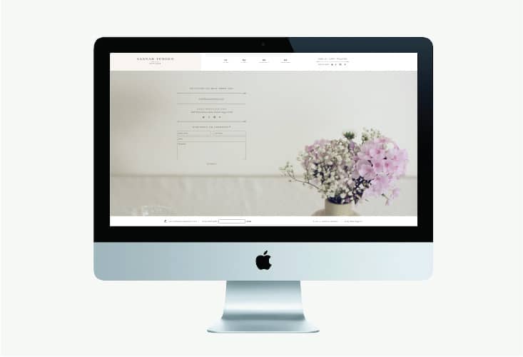
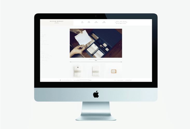
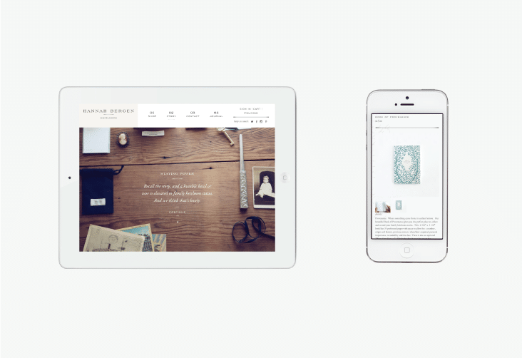
Hannah Bergen Website
December 1, 2014
Hannah Bergen is now online. Congratulations, it was another lovely collaboration!
Client: Daryl and Gilyn
Biscotti Brothers Biscottini Packaging
November 20, 2014
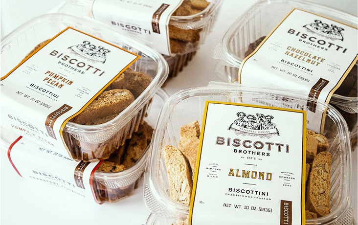
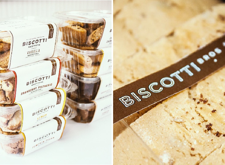
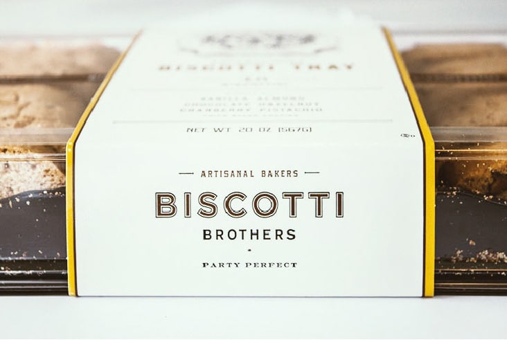
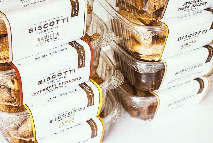
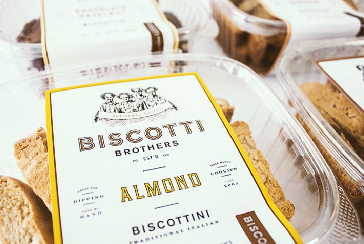
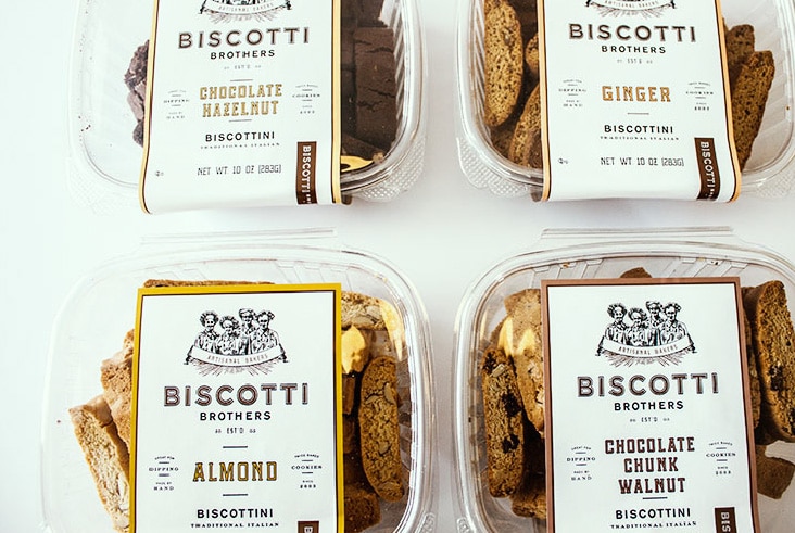
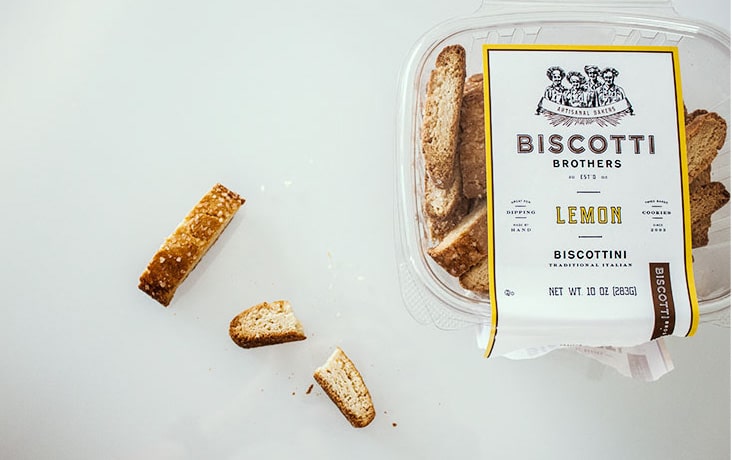
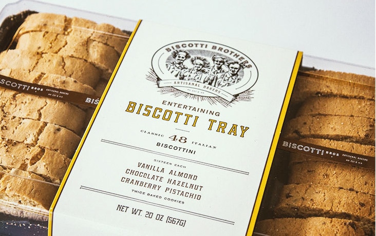
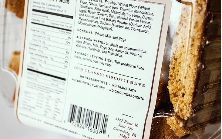
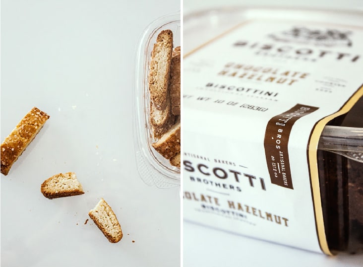
After a brand update for Biscotti Brothers, we got started on the re-design and update of their packaging. The first product to receive the new look is their delicious biscottini products. We applied the new branding to a color coded system of uncoated labels printed with metallic ink and spot varnish. We applied the spot varnish to specific areas of the design to add depth and dimension. We’re working on more of their product offerings now and are looking forward to sharing more soon!
Client: Gerry Bennett
The Campbell Foundation
November 5, 2014
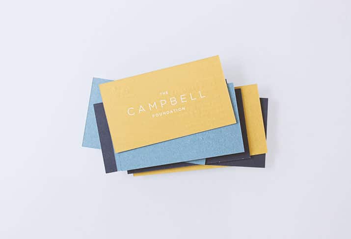
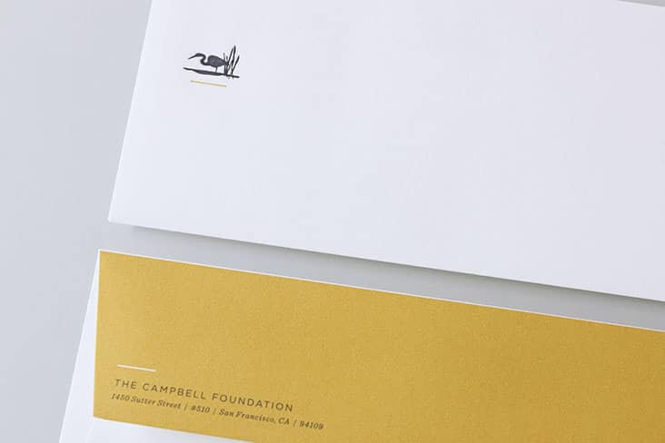
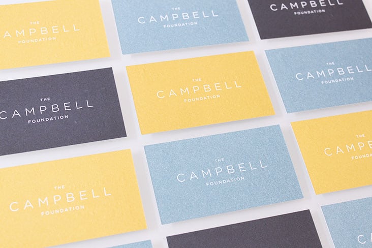
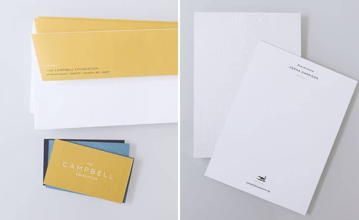
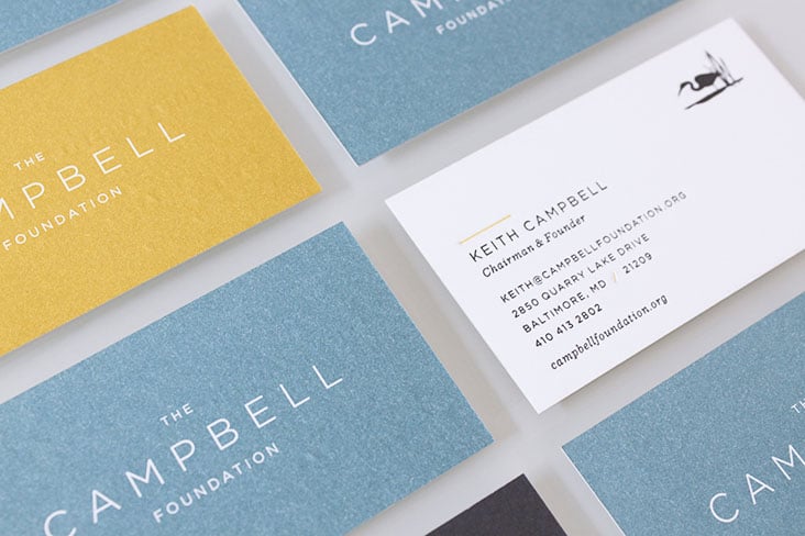
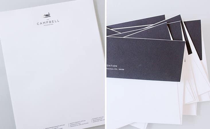
A bold yet sophisticated stationery package for The Campbell Foundation. The Campbell Foundation was established in 1998 to improve the conditions of America’s largest and most ecologically diverse and productive estuary systems: the Chesapeake and Atlantic Coastal Bays. In 2003, the geographic focus was expanded to to include Northern California and the San Francisco Bay watershed.
The stationery packaged was produced using both offset and letterpress printing techniques. The suite included business cards, letterhead, personalized notecards and matching envelopes.
Client: Samantha Campbell
The Spectator Hotel Branding
October 28, 2014
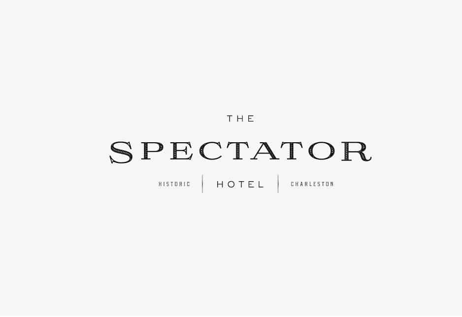
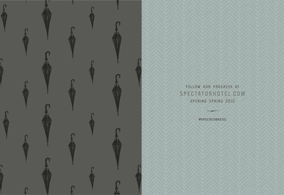
Set to open in the Spring of 2015, The Spectator Hotel will be a new kind of boutique hotel in the heart of historic Charleston. Evoking the opulence and sophistication of the roaring twenties, the hotel will offer Charleston’s best address for luxury accommodations. Beginning with naming, logo and brand development we’re thrilled with the way this brand is taking shape. There will be more Spectator to share soon! See the ground breaking invitation here.
Client: The Spectator Hotel
Jack Rudy Signature
October 23, 2014
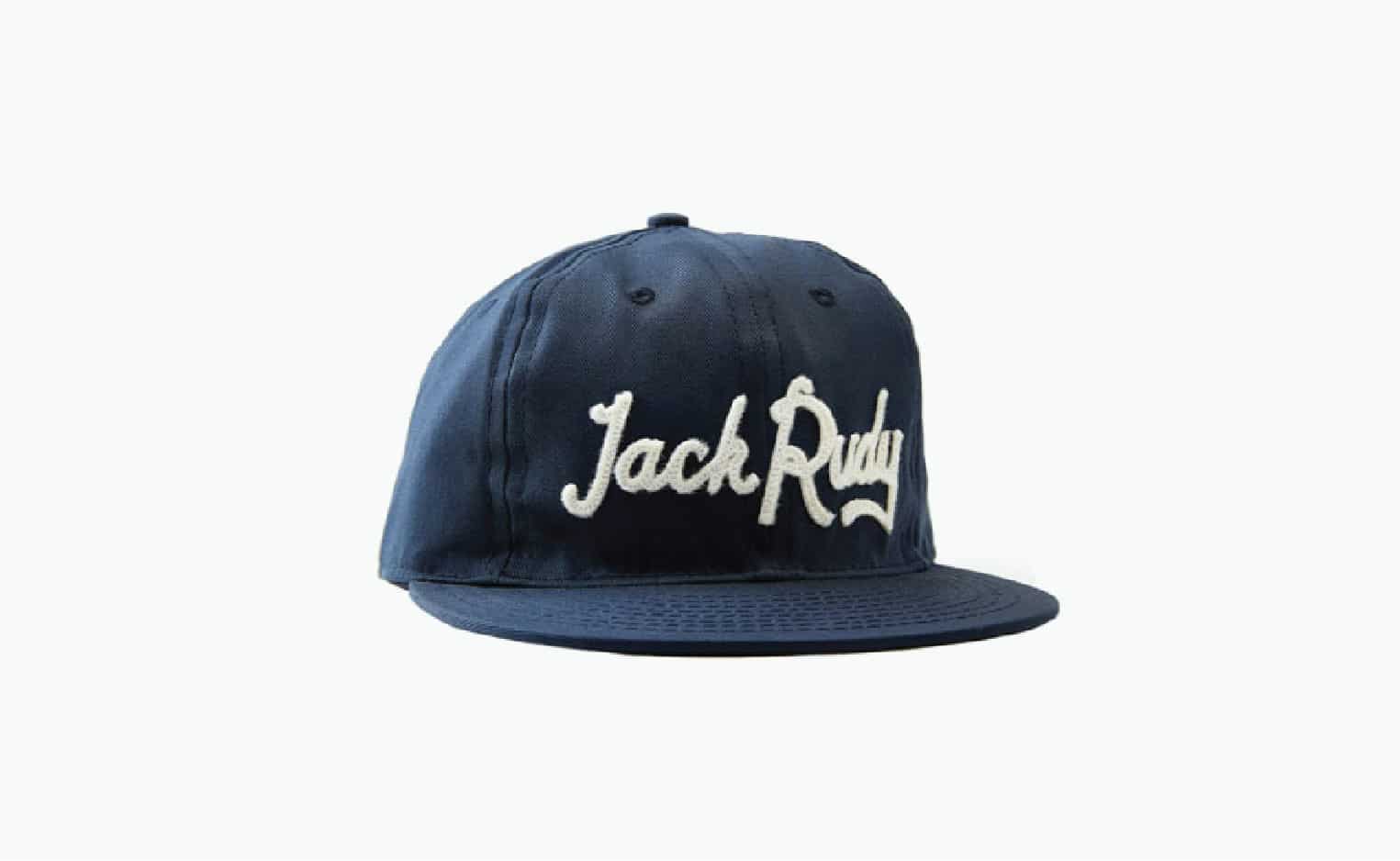
Inspired by Jack Rudy’s own signature, we developed this custom script for our favorite cocktail co, Jack Rudy. You can now wear his “signature” on this, made in the USA premium cotton twill, cap made in collaboration with Ebbets Field Flannels.
Client: Brooks Reitz
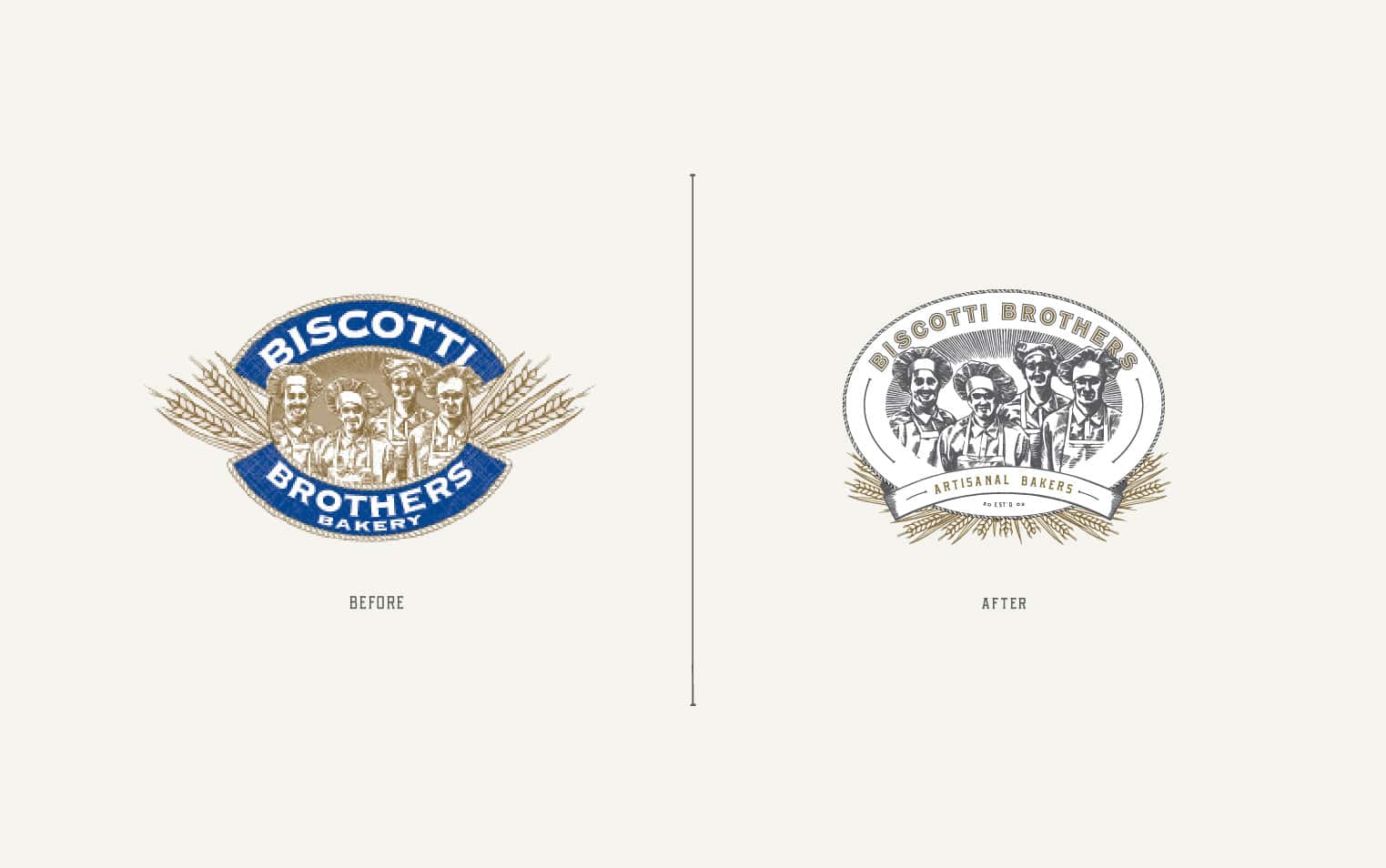
Biscotti Brothers New Logo and Brand Identity
October 2, 2014
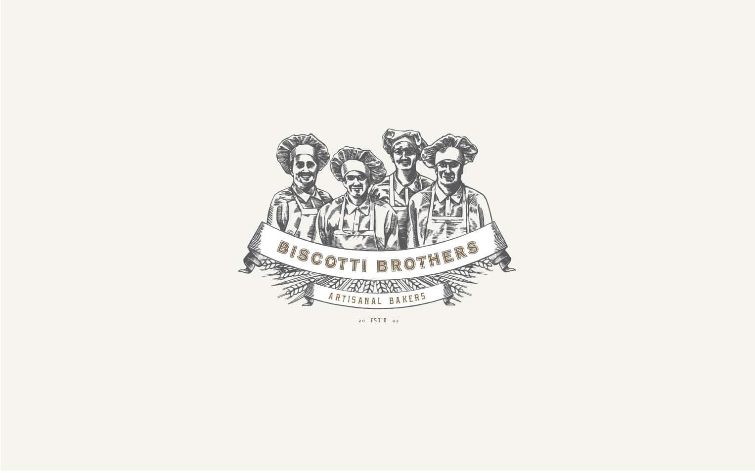
We’ve been working with the team at Biscotti Brothers over the past several months on updating their brand. Biscotti Brothers specializes in baking traditional italian cookies. They maintain the artisanal quality of their biscotti by using the freshest natural ingredients, keeping their batches small and insuring that each cookie is actually touched by the hands of a baker. There were many elements and aspects of their existing brand which we thought were successful. We wanted to make sure to enhance those elements and bring a fresh perspective to the brand. We introduced new graphic elements and type as well new and different variations of the logo and sub marks. We’re in the process of redesigning their packaging now and are enjoying our collaboration more and more with each project.
Client: Gerry Bennett
Poppies and Posies Website
September 25, 2014
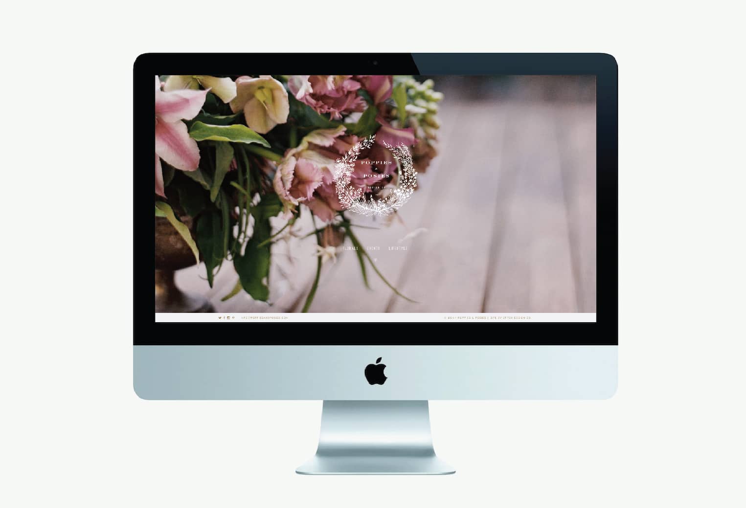
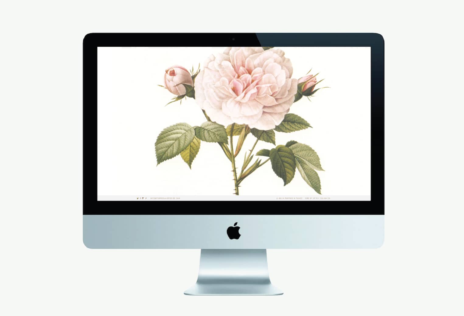
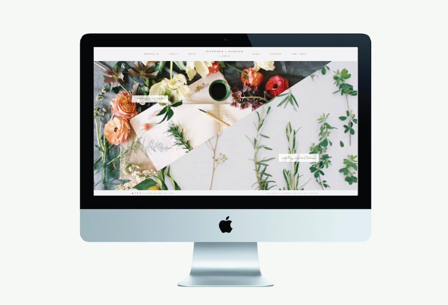
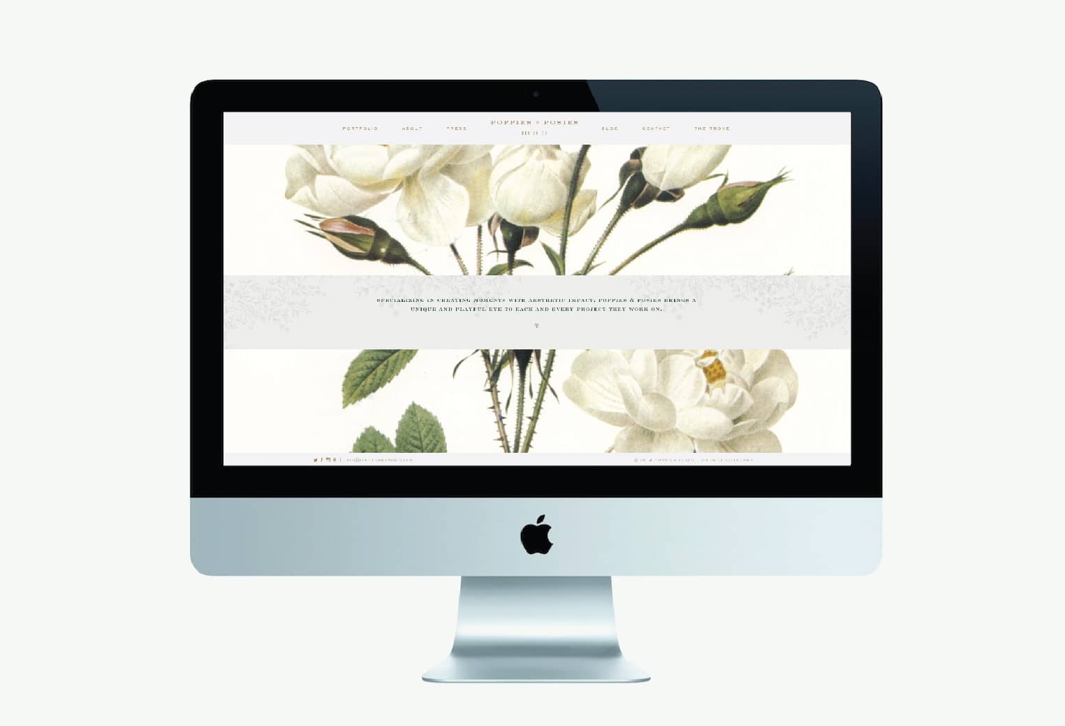
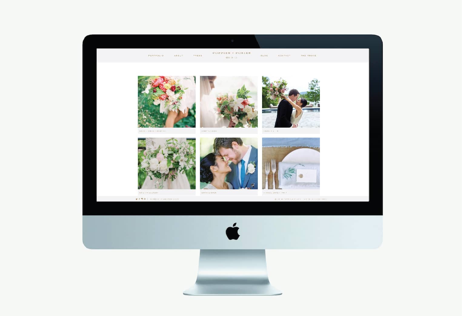
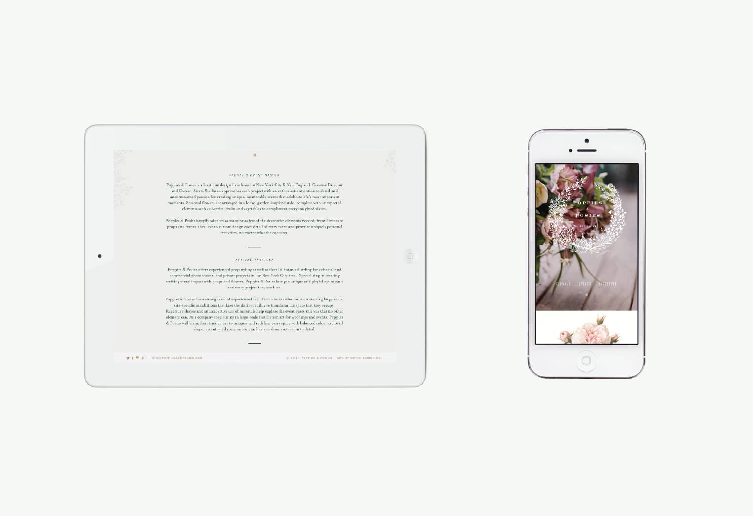
Poppies and Posies is a boutique floral design firm based in New York City & New England. The design of their new site utilizes photography and graphics in a large and impactful way. We wanted to be sure to use the site as a platform to showcase the beauty of their work. In addition to the photography, we layered in antique botanicals and handwritten type as design elements to enhance the classic and romantic nature of their work.
Client: Sierra Steifman
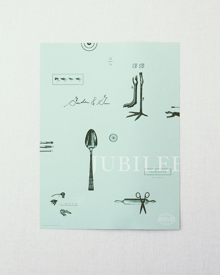
Garden & Gun Jubilee
September 23, 2014
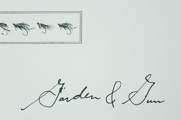
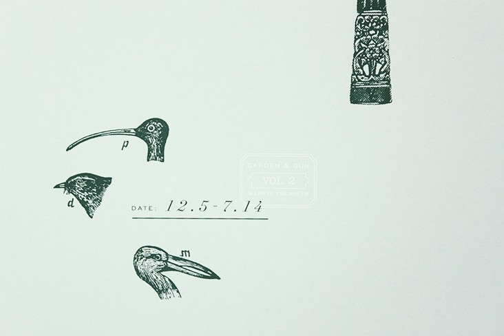
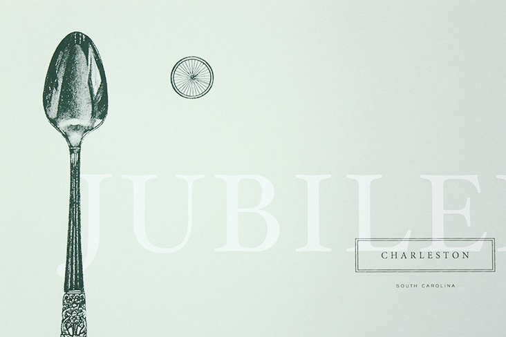
The 2014 Jubilee poster has arrived and is another successful collaboration with Garden & Gun. We are thrilled with the outcome. Special thanks to our friends at The Half and Half who did a beautiful job silkscreening this piece for us.
The tickets are on sale and now through the end of September everyone using promo code POSTER will receive one of these for each ticket purchased.
Client: Garden & Gun
