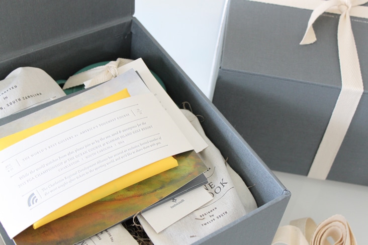
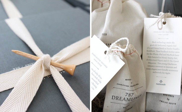
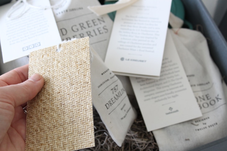
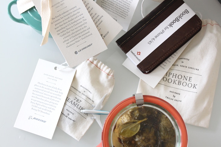
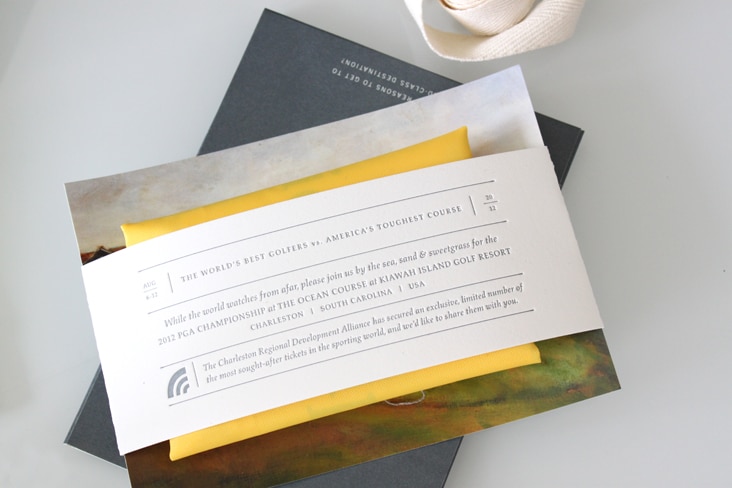
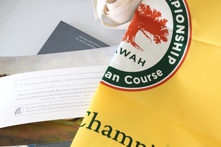
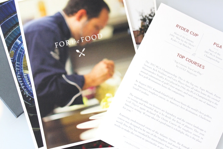
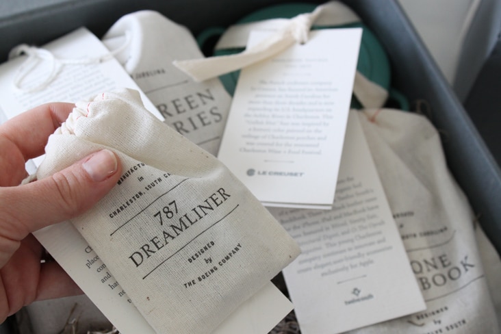
In August, Kiawah Island Golf Resort will host the world’s best golfers, on American’s toughest course, in America’s best destination, Charleston, South Carolina. The Charleston Regional Development Alliance came to us to design an invitation to top executives of companies from around the world to come experience the PGA Championship and all that Charleston has to offer. We curated a collection of unique items produced in the Charleston region. The sampling of products serve as a representation of the region’s benefits in business and in lifestyle. Read the rest of this entry »
HOW Your Best Work Awards: Small-firm Category Winner
April 11, 2012
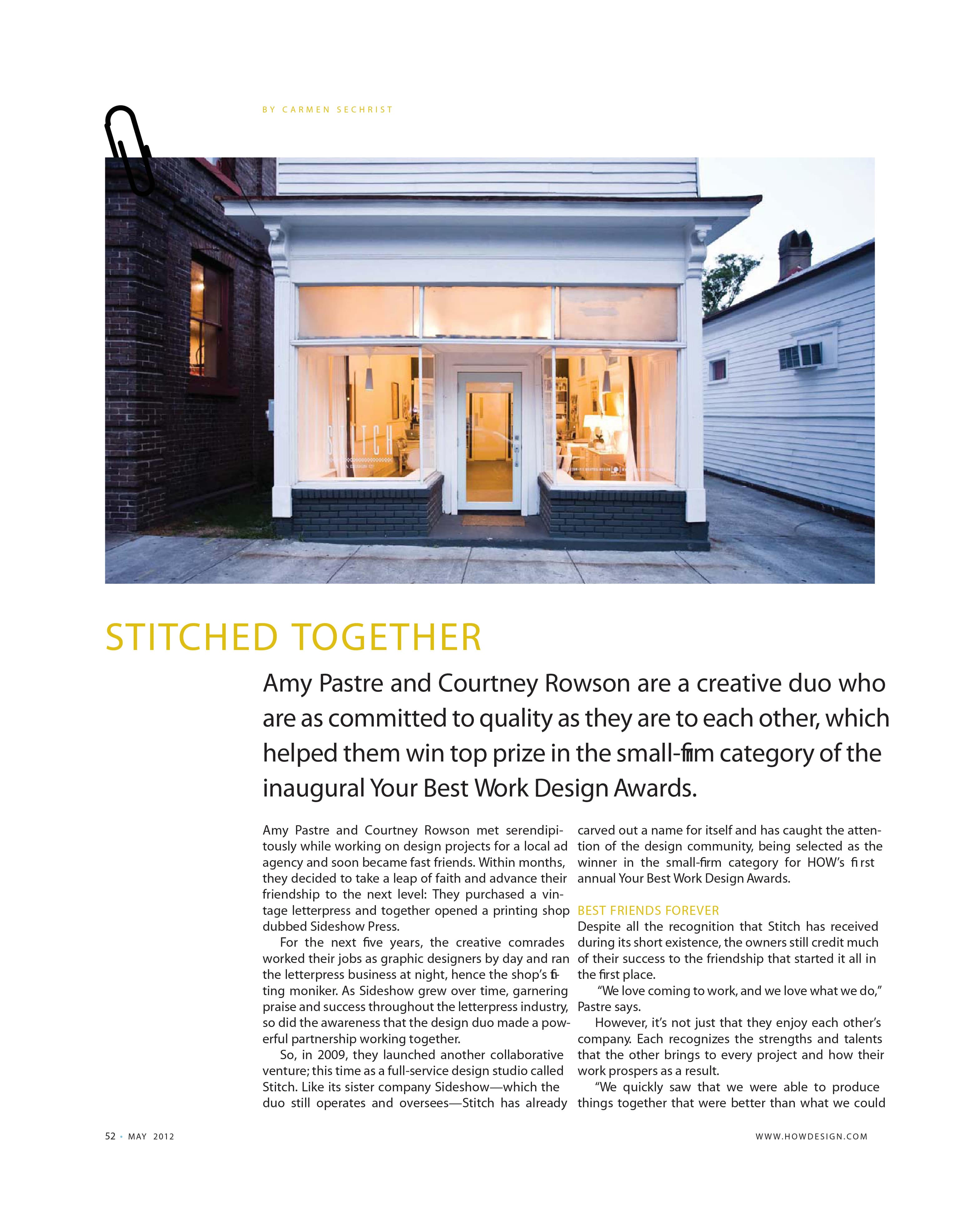
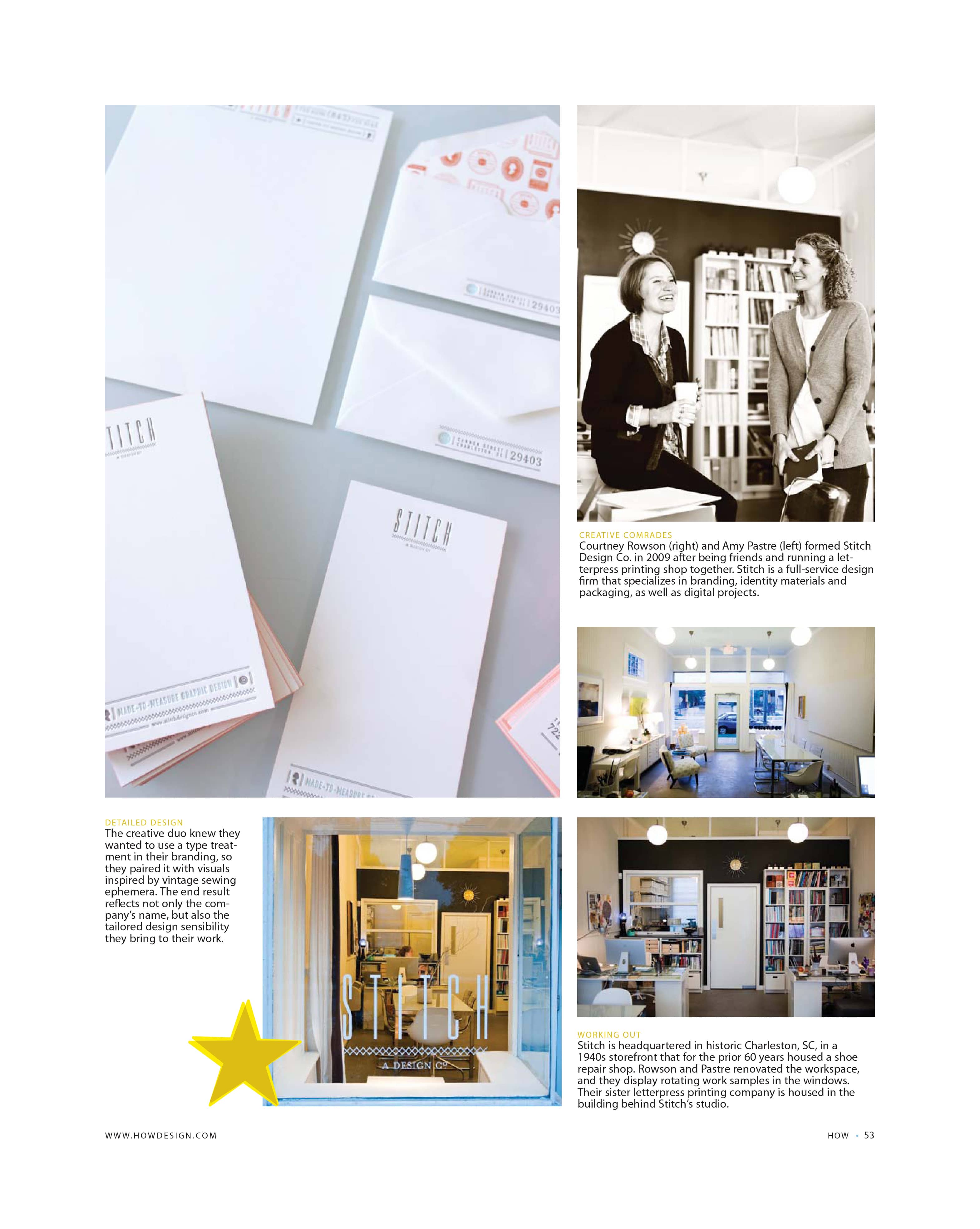
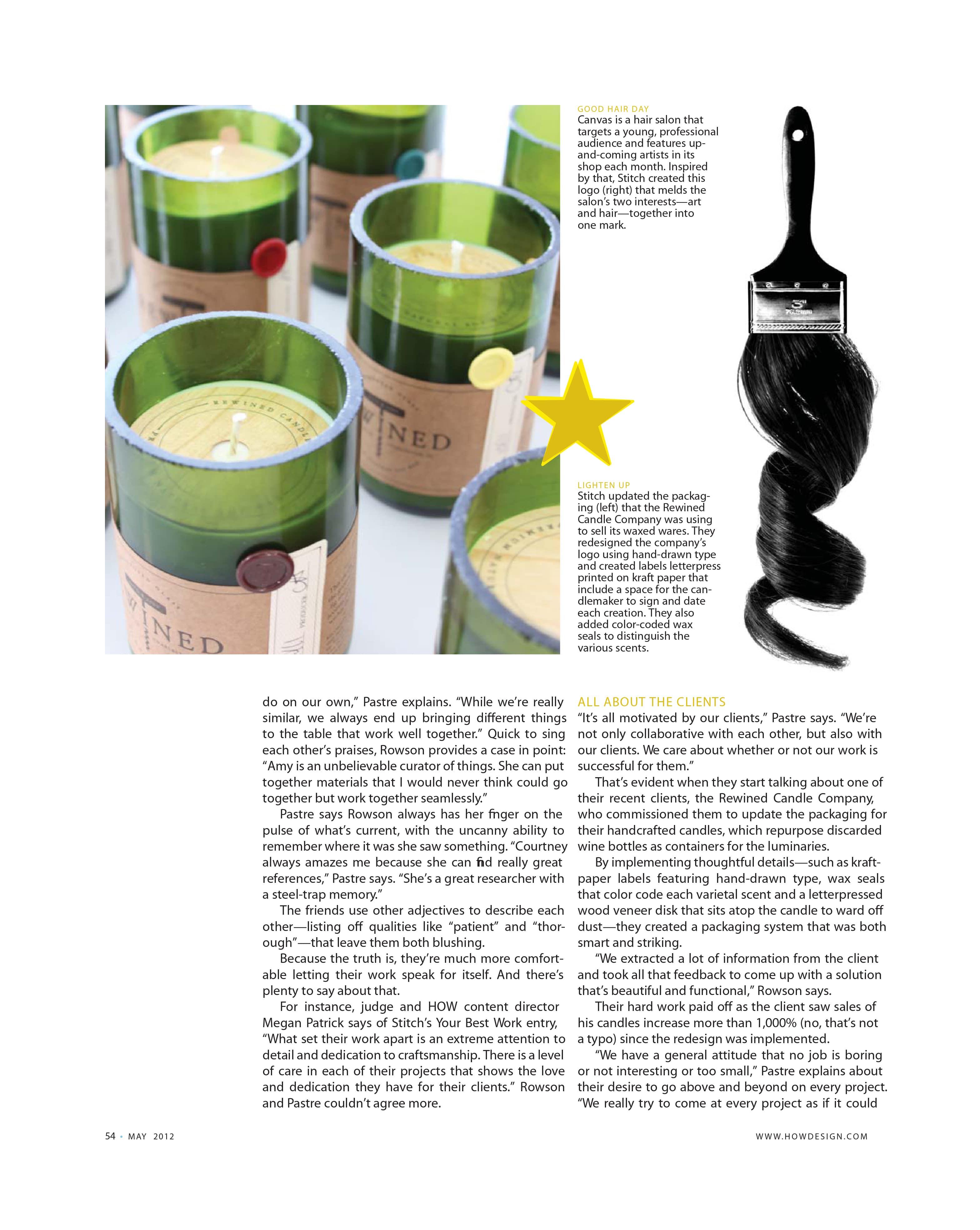
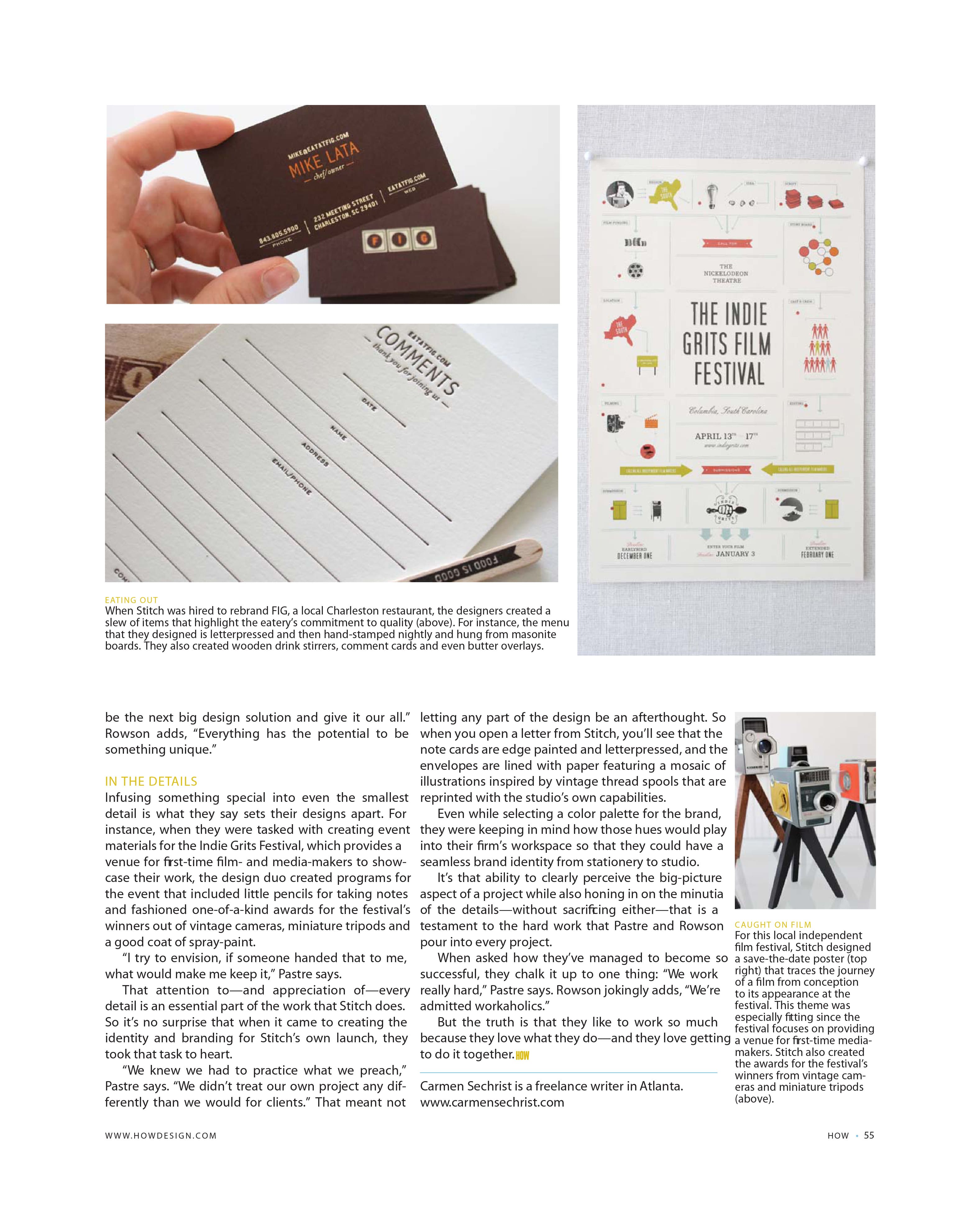
HOW Magazine put out a call for entries to design firms across the country asking to see their best work from the last two years. They chose one small design firm and one large firm to feature. Stitch was awarded the winning spot in the small design firm category! Thank you to HOW Magazine and Carmen Sechrist for a wonderful article – we’re beyond flattered and thrilled. And special thanks to Peter Frank Edwards for the amazing photos of our space and Gately Williams for the image of Courtney and Amy.
Client: Stitch Design Co.
Kathryn Whyte
April 9, 2012
We’re so pleased to officially announce Kathryn Whyte as the newest member of the Stitch team. Kathryn immediately caught our attention when she applied for the designer position posted on our blog at the first of this year (see more of her work here). Her work is sophisticated, whimsical and polished, and we thought she would be a wonderful compliment to Stitch. Read the rest of this entry »
Client: Stitch Design Co.
Vee
March 26, 2012
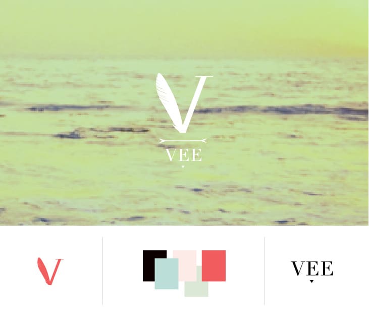
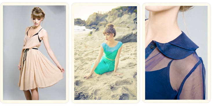
Veronica Scott is the talented designer behind VEE, a collection of women’s clothing designed and produced in California. Her Spring 2012 line is made up of classic silhouettes paired with quirky prints in a dreamy color palette. That unique pairing was the inspiration behind the branding for VEE. For the logo, we paired a classic “V” typface with a hummingbird wing (hummingbirds are one of Veronica’s favorite things) and took a cue from her lovely prints while developing her color palette.
Client: Vee
Callie’s Biscuits New Packaging
March 22, 2012
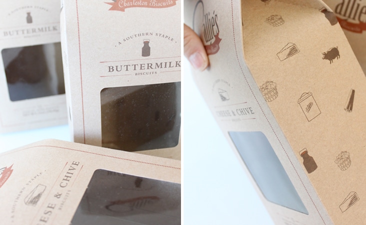
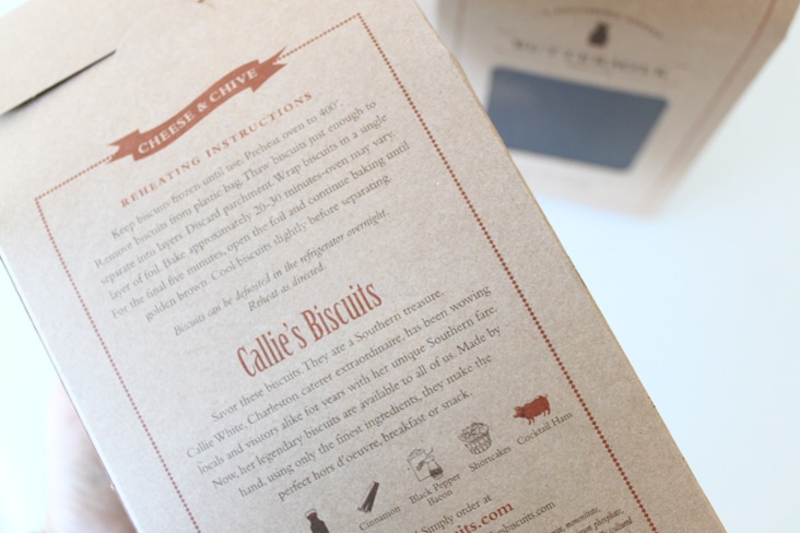
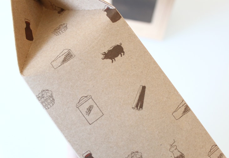
Our favorite southern biscuits just got a new look! Carrie of Callie’s Biscuits came ti us looking for a way to elevate her made-by-hand biscuits on the shelf as well as find a way to quickly identify the different biscuit varieties the company has to offer. Each custom kraft box utilizes a small illustration that acts as the biscuit variety identifier. Kraft paper, classic type, and whimsical illustrations help to convey Carrie’s commitment to her hand-made process and quality of her ingredients. Read the rest of this entry »
Client: Callie's Charleston Biscuits
Communication Arts Interactive Annual – Exhibit
March 20, 2012
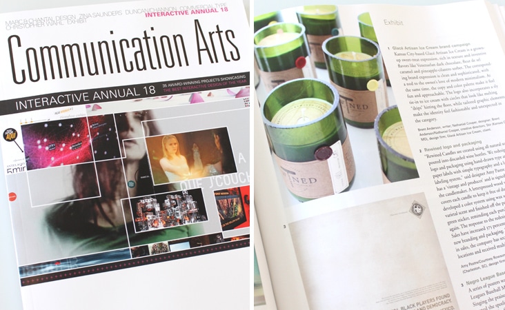
Just got the Interactive Annual from Communication Arts today and excited to see Rewined Candles featured in Exhibit. We can’t wait to pour over the amazing sites featured in this years annual.
Client: Rewined Candles
Legends Magazine – Volume 23
March 19, 2012
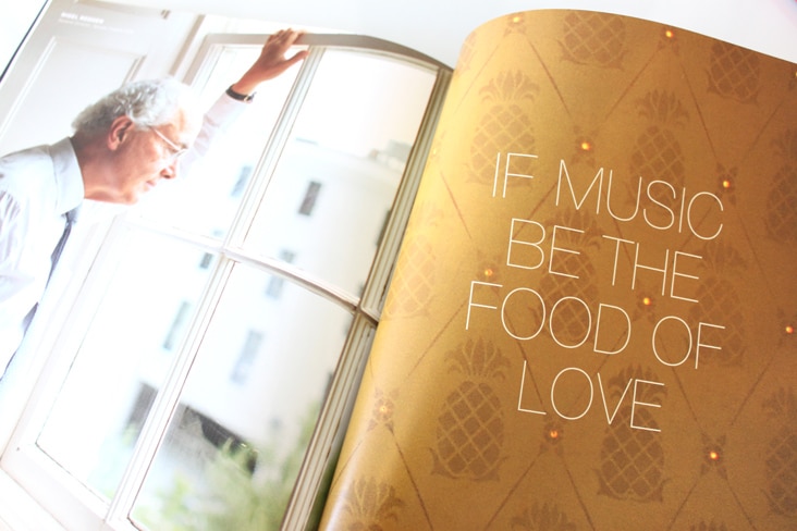
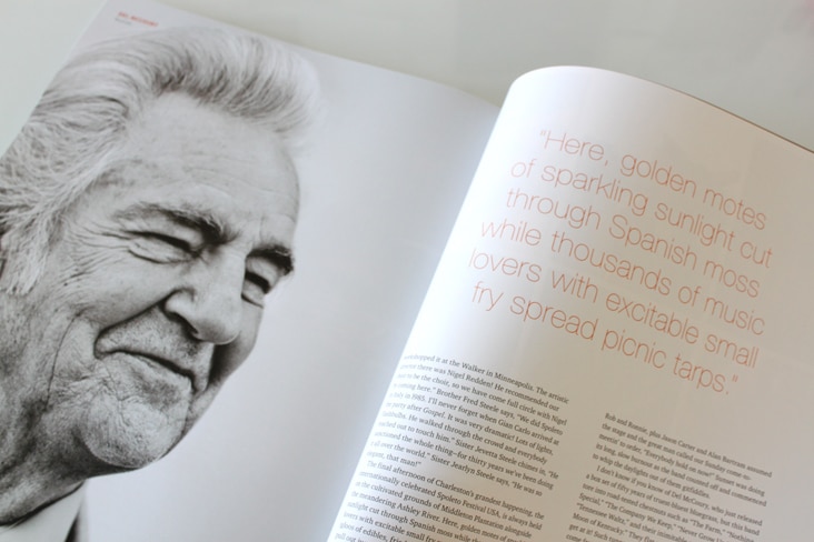
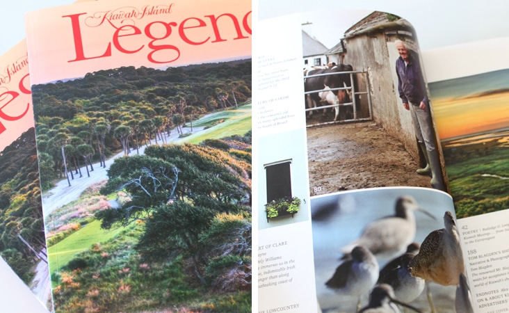
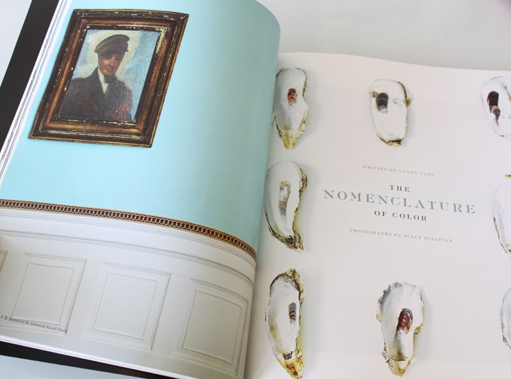
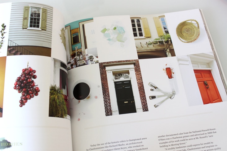
The 2012 issue of Legends Magazine is here! Volume 23 is, as always, full of beautiful photography and thoughtful writing. It was a pleasure to design and compile the entire magazine again this year. See last year’s issue here.
Client: Kiawah Island Developement Partners
Eberjey Brand Update
March 9, 2012
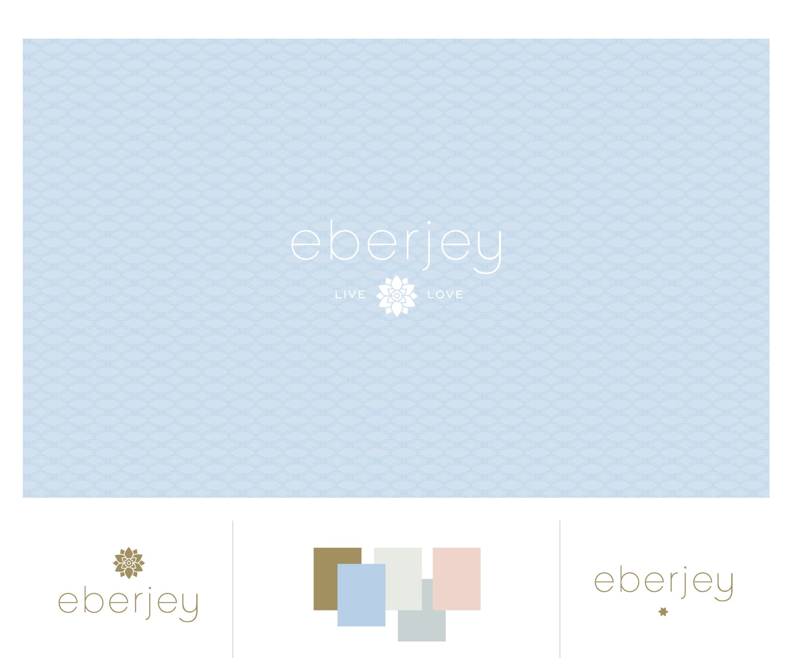
We’ve been long admirers of the company Eberjey, so when Ali and Mariela gave us a call to help them refresh their brand, we were thrilled. Ali and Mariela started Eberjey 1996 from the belief that the layer worn next to the heart should express happiness, love and confidence. We updated their logo while maintaining all of the elements that were and are truly Eberjey – the flower, simple typography and their iconic Eberjey blue. We also developed a color palette around their established blue along with graphic elements, patterns and a type family. The changes are subtle but make a big impact. Read the rest of this entry »
Client: Eberjey
Hampden and Rag & Bone
March 5, 2012
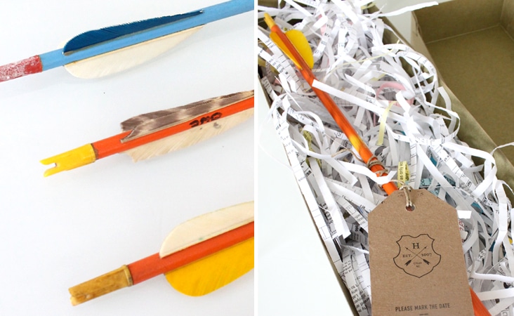
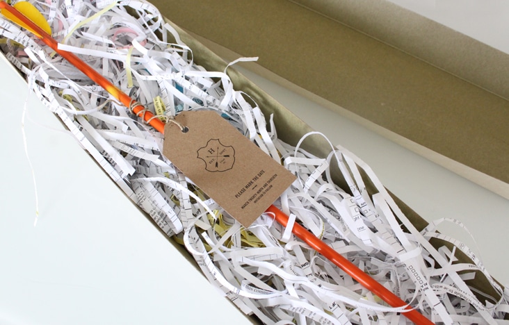
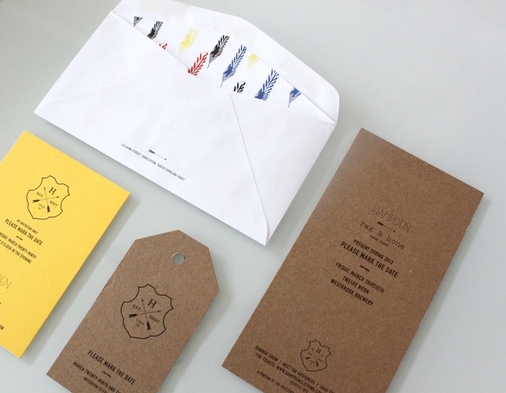
At the end of this month Hampden Clothing will present Rag & Bone’s Spring collection. Inspired by Rag & Bone and their latest colorful collection, we designed a simple kraft tag and attached it to a vintage wooden arrow to serve as the invitation. We love the brightly worn colors of the arrows in contrast to the natural kraft paper. Read the rest of this entry »
Client: Hampden Clothing
The Garden Summer
February 28, 2012
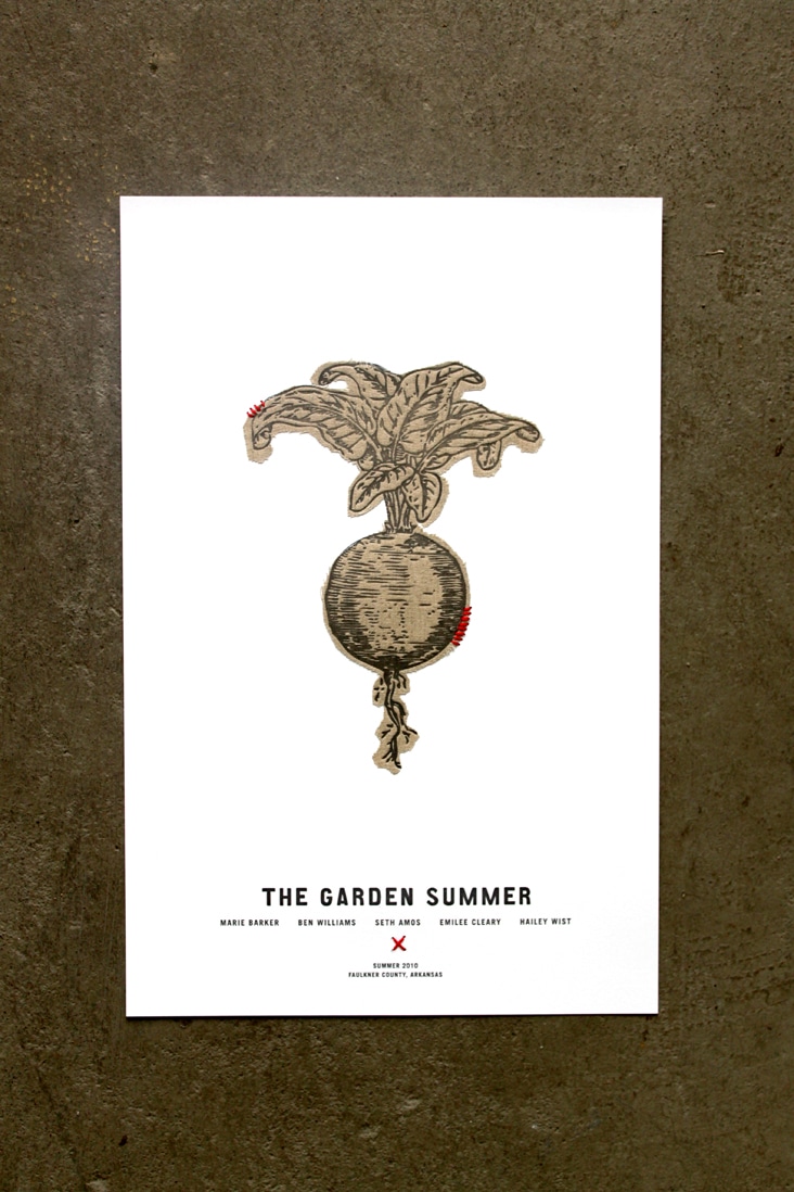
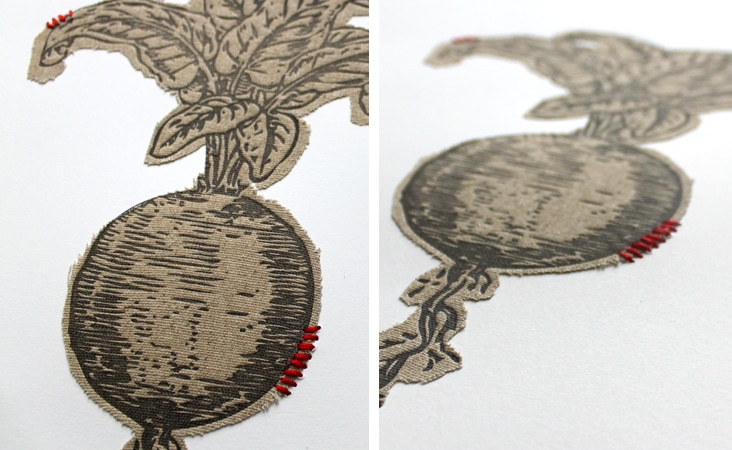
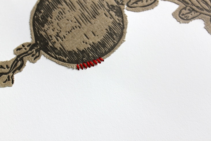
In the Summer of 2010, Hailey Wist invited four suburbanites to a ranch in rural Arkansas. They lived in a small cabin, grew a large garden, ate only from a 100-mile radius, sold at a local farmers market, and hosted a field feast. The Garden Summer project was a grassroots, community-based, social experiment. On February 9, 2012 the documentary they made of that summer premiered at The American Theater in Charleston. We designed these posters for the much anticipated event. The poster design and execution was a multi-step process. We cut fabric turnips that we then stitched to card stock and then letterpressed overtop of the fabric. It was a labor of love, but we’re so happy with the simplicity and dimension of the posters. And, we can’t forget to mention, the film was excellent! It will soon be traveling to a film festival near you and is a must see!
Client: Hailey Wist
