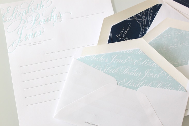
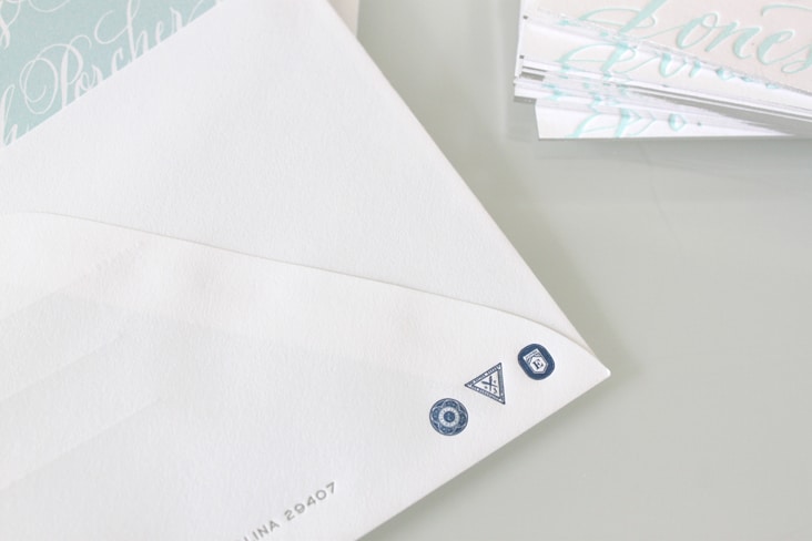
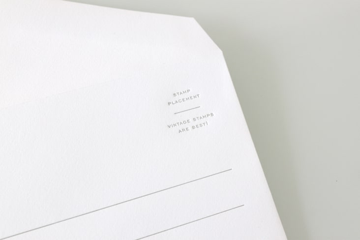
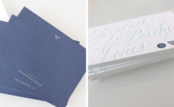
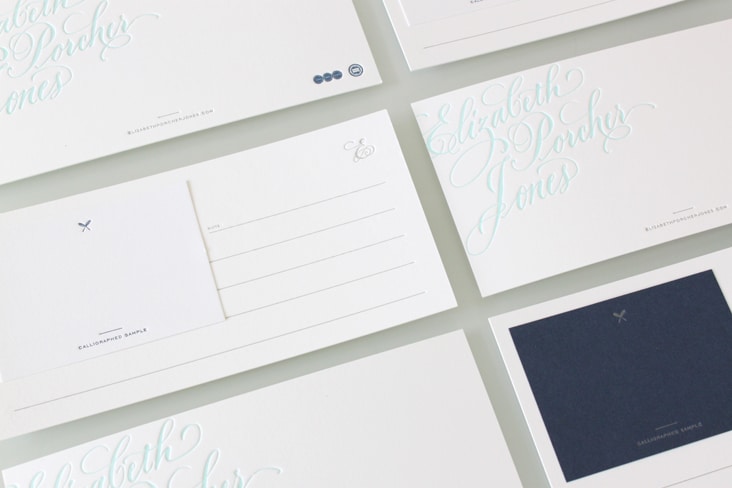
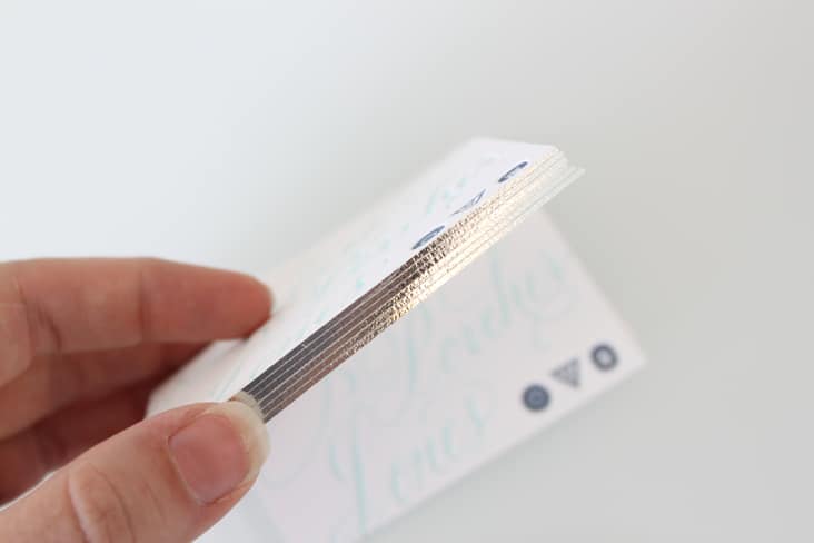
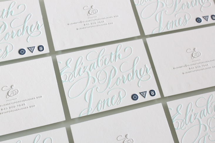
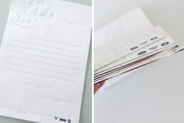
Elizabeth Porcher Jones is a talented calligrapher based out of Charleston, SC. We have collaborated with Elizabeth for many years, so needless to say, we were thrilled when she came to us to design her stationery package (and next her website). It was truly an honor to work with such beautiful assets. We designed this set to highlight her calligraphy and used support elements such as edging, fictitious guild logos, letterpress printing and letter writing etiquette to bring it all together. Read the rest of this entry »
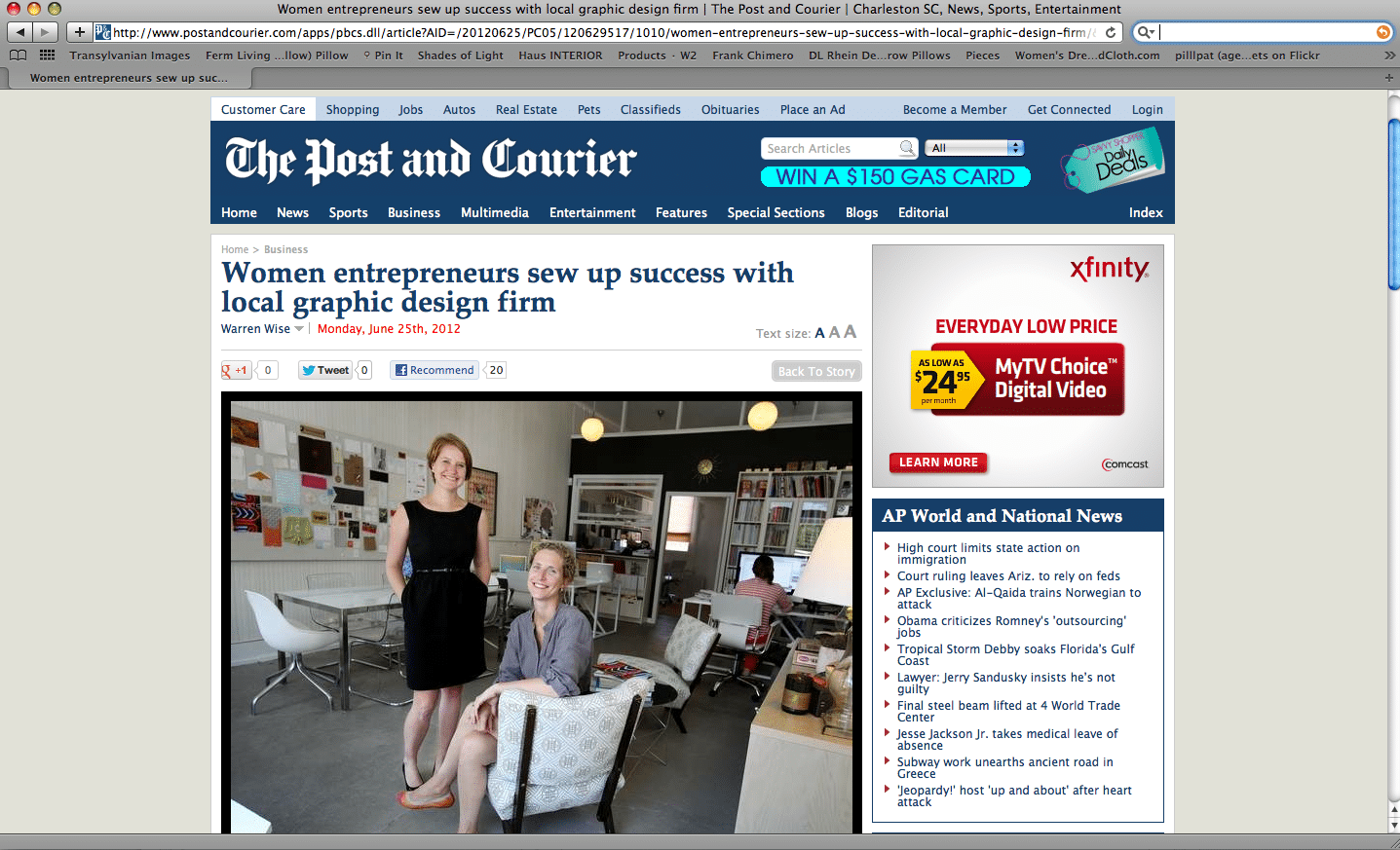
The Post and Courier
June 25, 2012
Thank you Warren Wise of The Post and Courier for the lovely article in today’s Business Section. Read the full article here.
Client: Stitch Design Co.
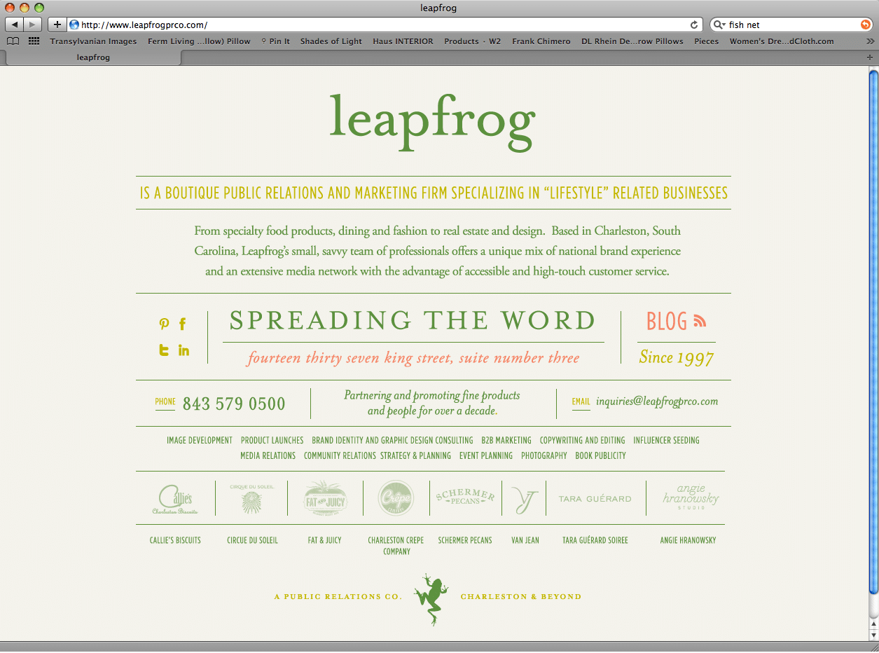
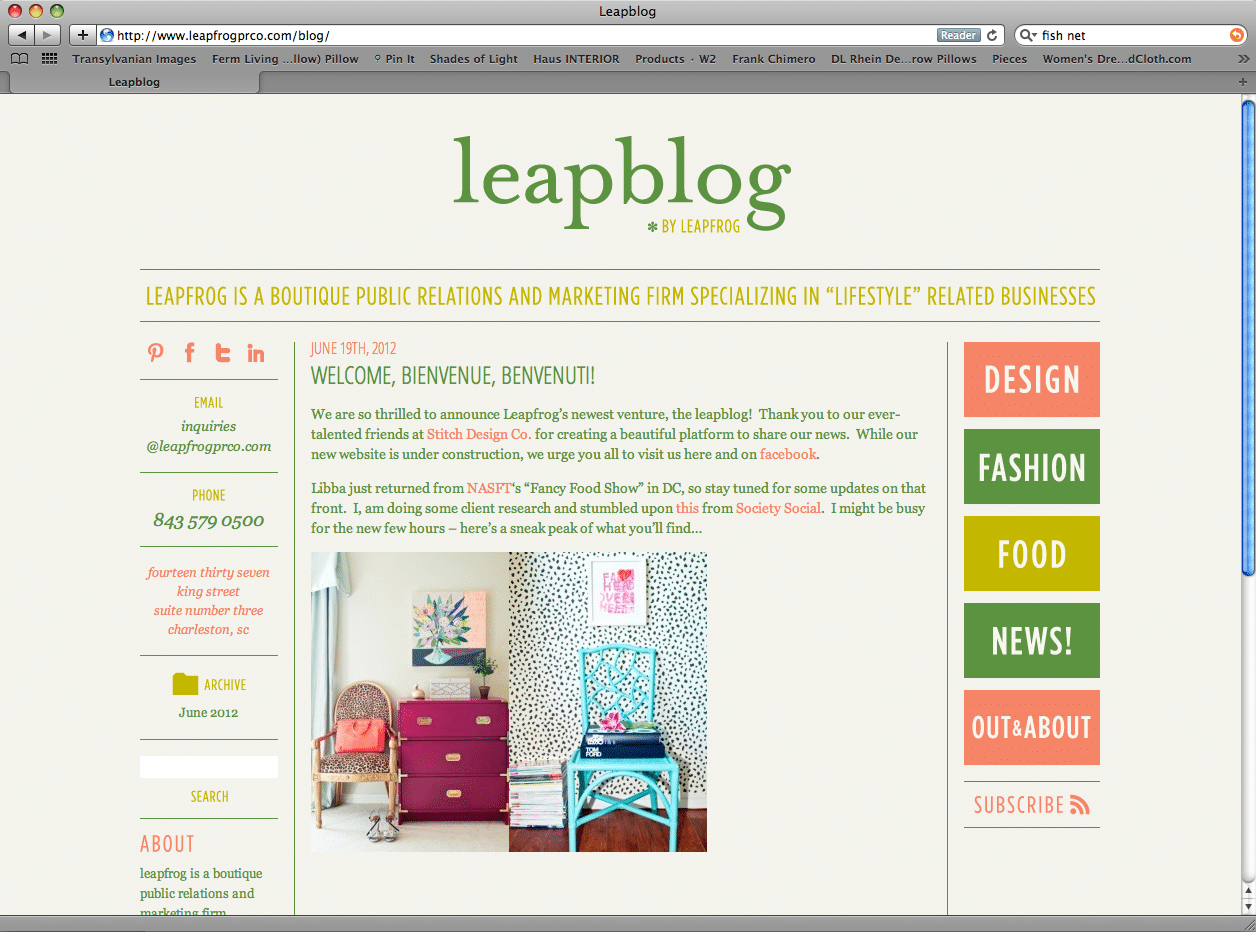
Leapfrog PR Company
June 20, 2012
A simple new site and blog for the lovely ladies at Leapfrog PR Co. We’re in the process of developing their full site now, but in the meantime you can stay up to date on their latest and greatest at the (oh so appropriately named) Leapblog! Read the rest of this entry »
Client: Leapfrog PR Company
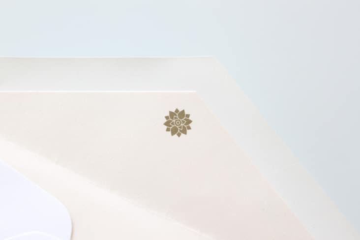
Eberjey Stationery Package
June 6, 2012
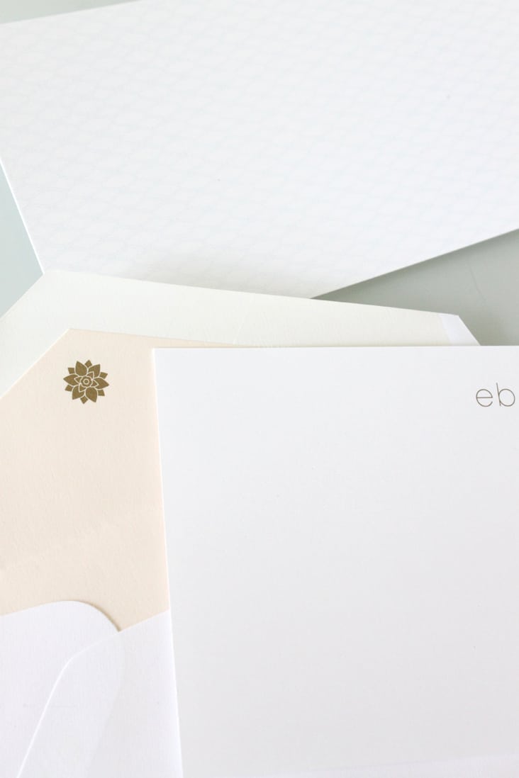
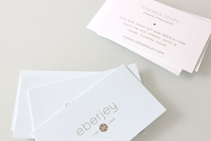
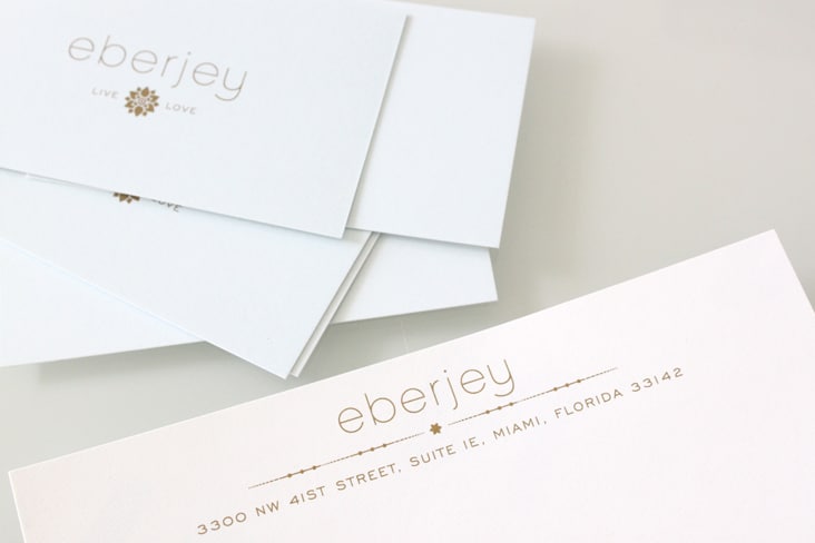
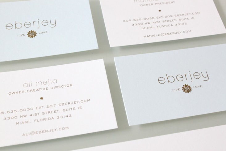
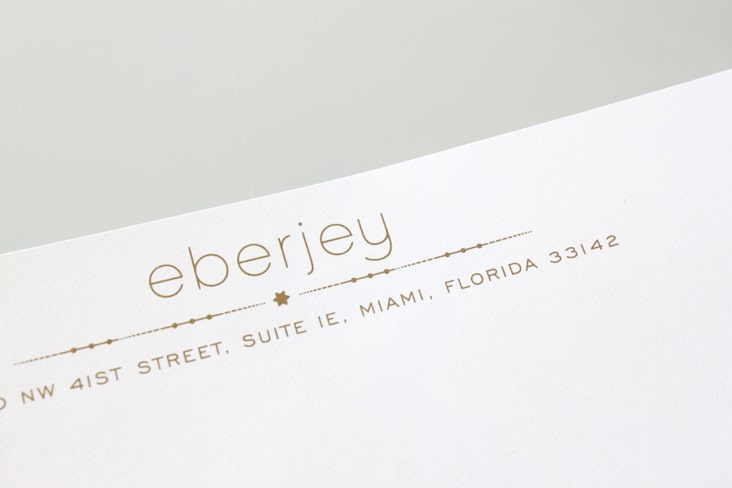
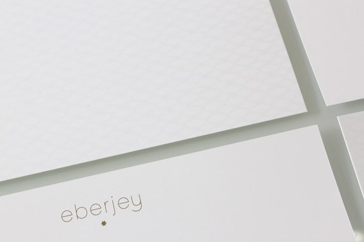
We’re excited to share the newly redesigned Eberjey stationery package. We used Metallic gold ink, pattern and their signature Eberjey blue to make this stationery set elegant, sophisticated and luxurious – just like their brand. Read the rest of this entry »
Client: Eberjey
Spoleto Festival USA 2012
May 31, 2012
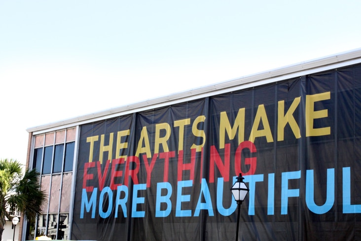
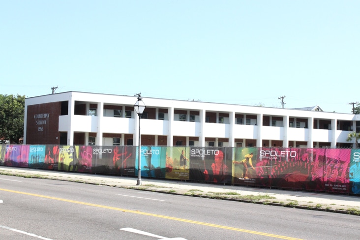
The street banners for Spoleto Festival USA are up and we can safely say that they are officially the largest pieces of print we’ve ever designed. 200 feet of color blocking along Meeting Street and 1,806 square feet on upper King Street. Spoleto is one of our favorite times of year, they truly do make everything more beautiful! Read the rest of this entry »
Client: Spoleto Festival USA
Communication Arts – Fresh
May 29, 2012
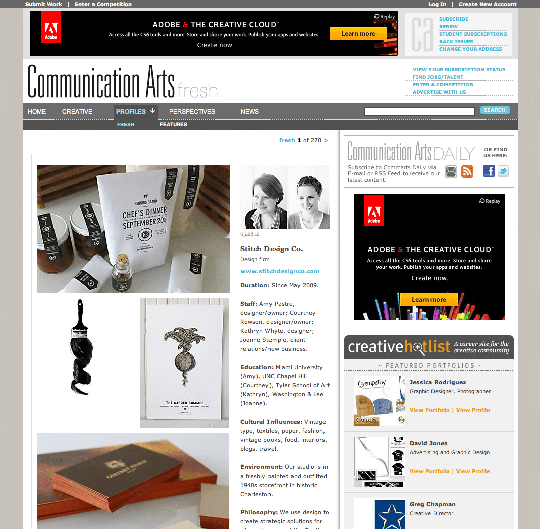
Very excited to see our Fresh profile up today on Communication Arts. See the full profile here. Quite an honor. Thank you CA!
Client: Stitch Design Co.
Seed House Stationers
May 23, 2012
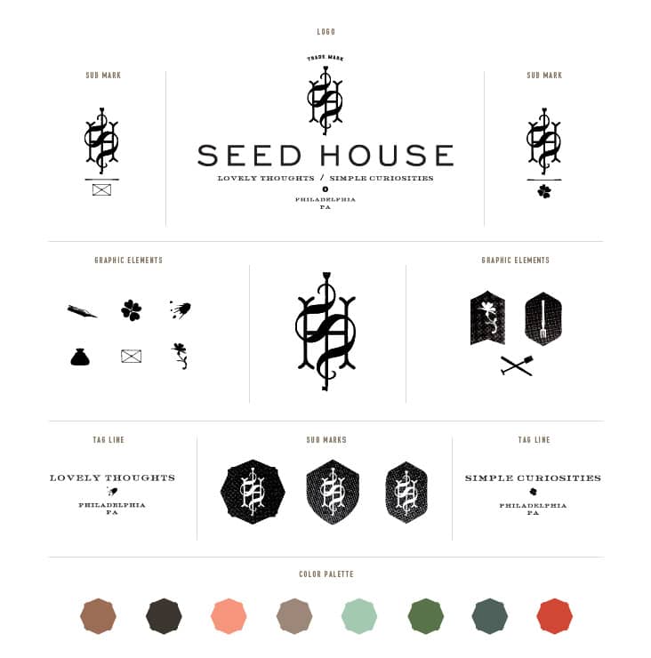
Shauna and Stephen are the husband and wife team behind Something’s Hiding in Here, Forage Haberdashery and now Seed House Stationers. Seed House was born out of the idea that their handmade tokens of affection could be the seeds of correspondences for others. We were thrilled to work with them on the branding for this exciting new stationery company. Read the rest of this entry »
Client: Seed House Stationers
Mushaboom
May 18, 2012
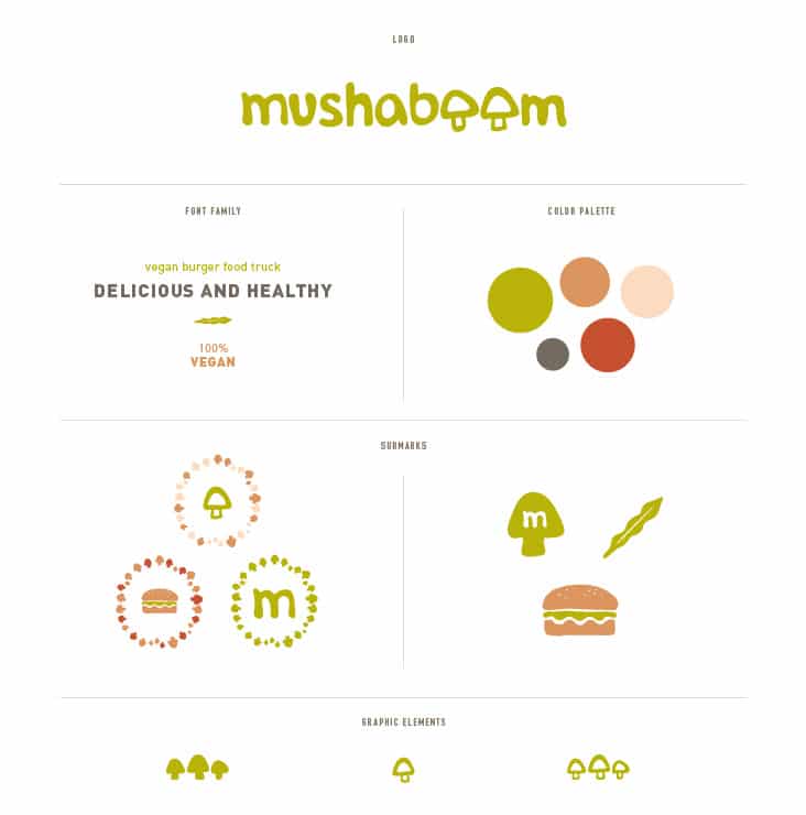
Mushaboom is a vegan burger truck which can be seen traveling around the South Florida coast. Kristina and Nicole, long time friends and recent college graduates, were fed up with the lack of vegan and vegetarian options in South Florida and came to Stitch to help give their great idea a visual voice. All of their burgers are handmade and fresh, using no frozen or boxed ingredients. We designed their logo and branding to feel fresh, youthful and fun. Read the rest of this entry »
Client: Mushaboom
Jessica Burke Photography Stationery
May 11, 2012
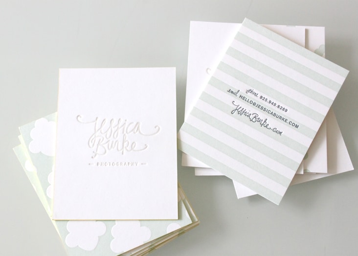
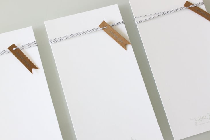
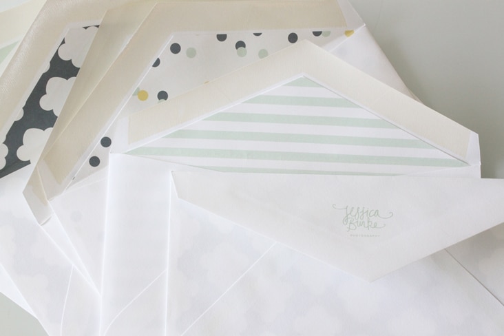
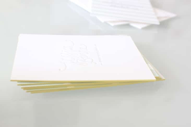
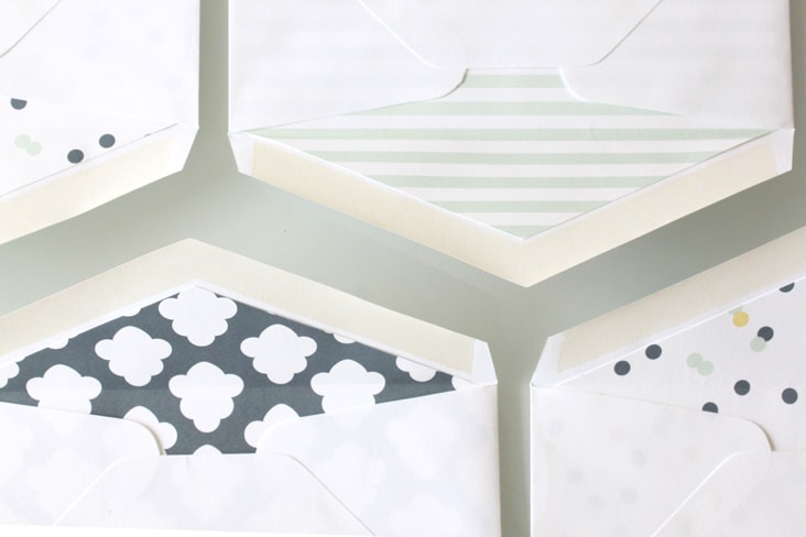
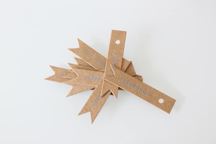
More fun branded pieces to share for Jessica Burke. Her stationery package, like her website, is whimsical, youthful and full of personality. Alternating patterns on business cards and envelope liners contrast the simple type and layouts of her materials. We also designed small kraft tags which Jessica uses to customize her notecards with conversational phrases like “Hello There” and “Congrats!”. Read the rest of this entry »
Client: Jessica Burke Photography
Dulcella
April 25, 2012
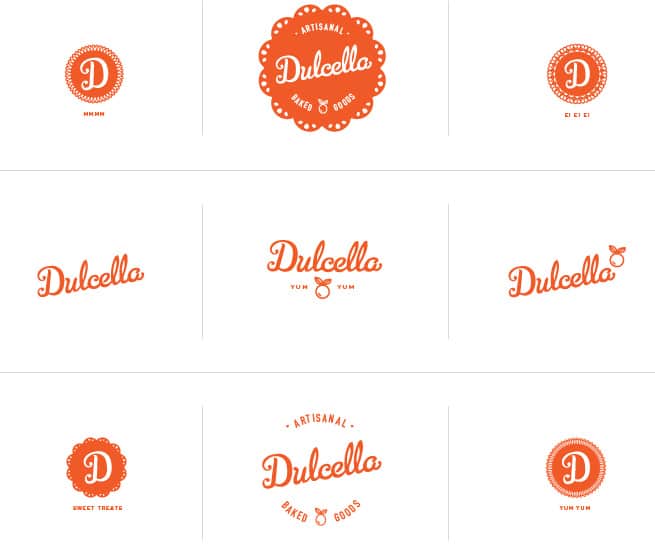
Mariela Perez-Ralston is an amazing baker. We’ve had the pleasure of taste testing many of her, her Grandmother’s, and her Great-grandmother’s recipes and are always left extremely satisfied and wanting more! Mariela, who is originally from Puerto Rico, came to us to design a logo for her inspired baked goods. We designed the logo for Dulcella to be reflective of her heritage, her attention to detail and her general love of baking for others. Our favorite part of the logo is the simplified illustration of a guava, an ingredient found often in her sweet treats. Yum!
Client: Dulcella
