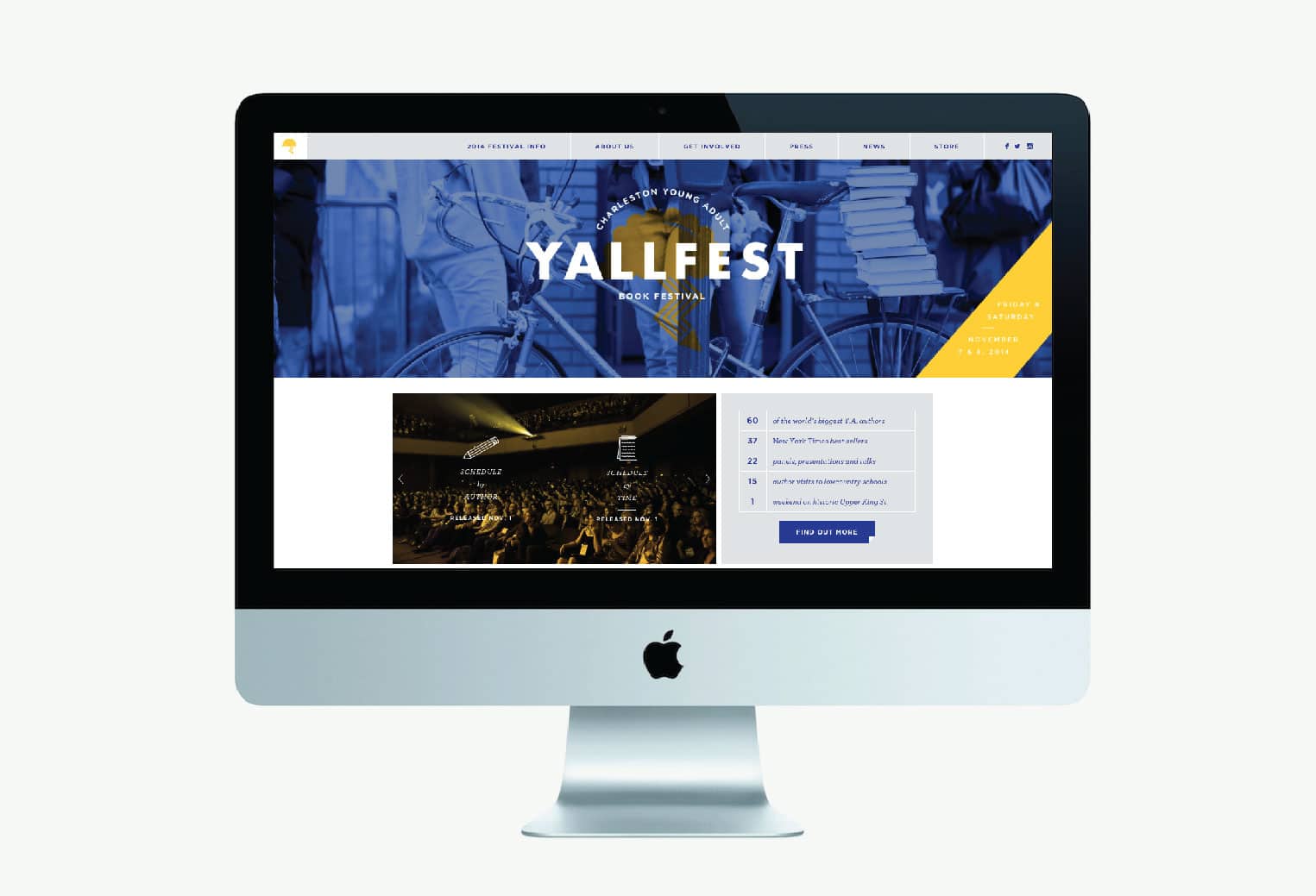
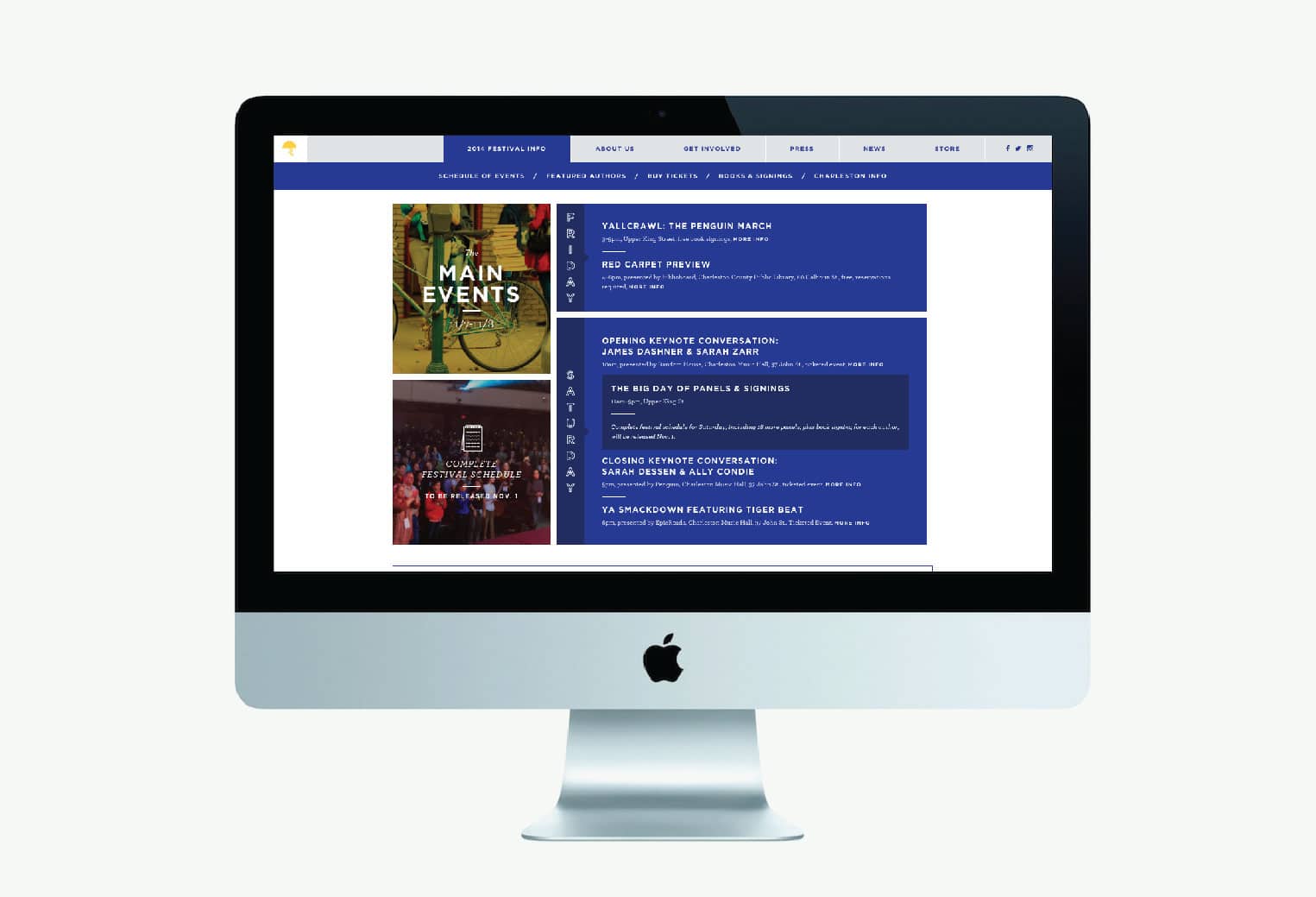
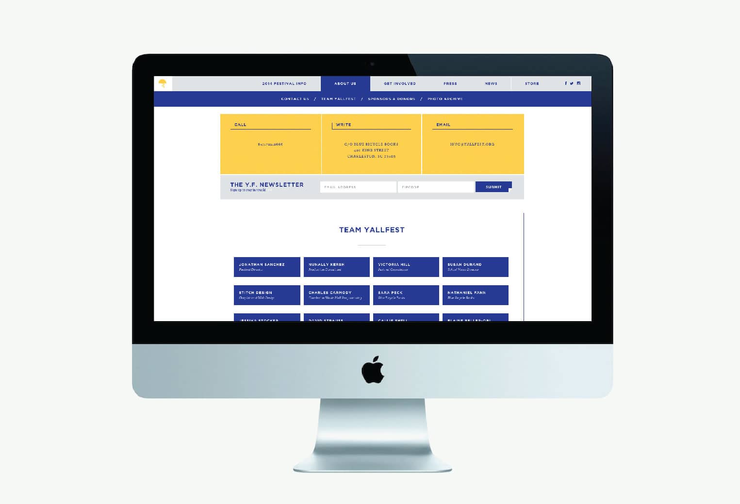
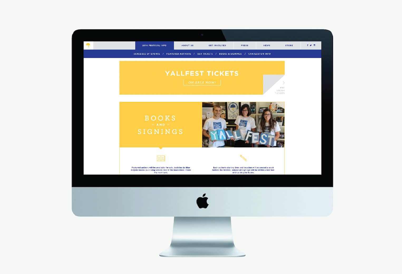
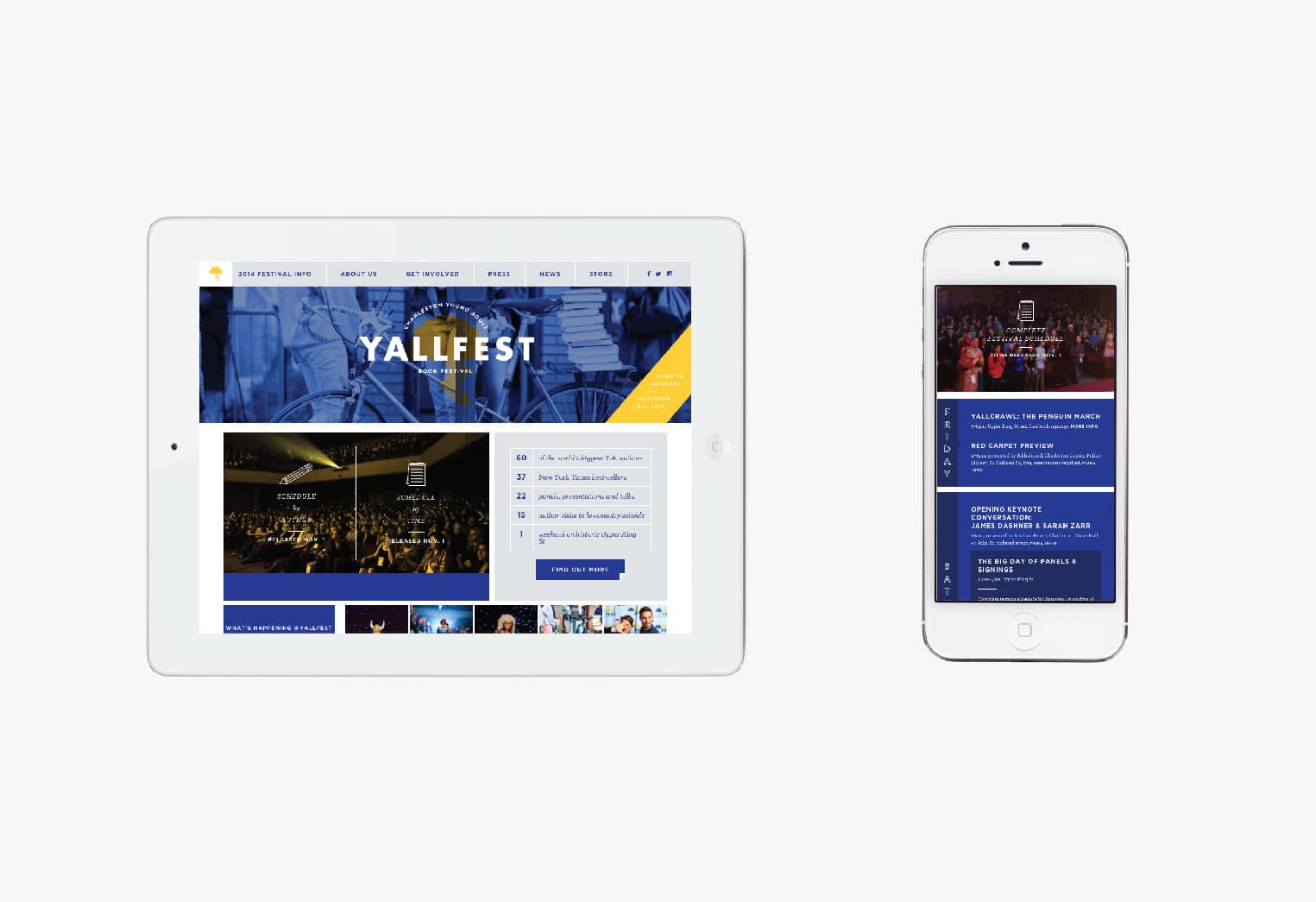
YALLFest is an annual celebration of children’s and young adult literature. The festival is held in Charleston each year for a weekend of panels, presentations, and signings on three stages. YALLFest has a history of bringing in the countries top young adult authors, often including the New York Times bestsellers. We’re excited for this year’s festival November 7-11th and thrilled to see the site we designed and developed up and running!
Haus Candles
October 16, 2014
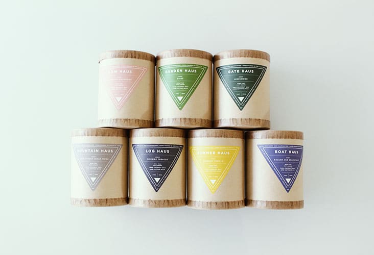
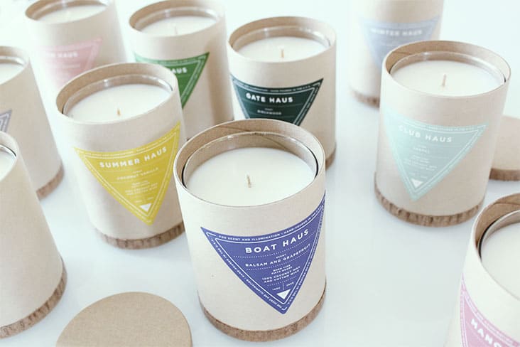
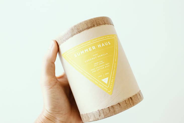
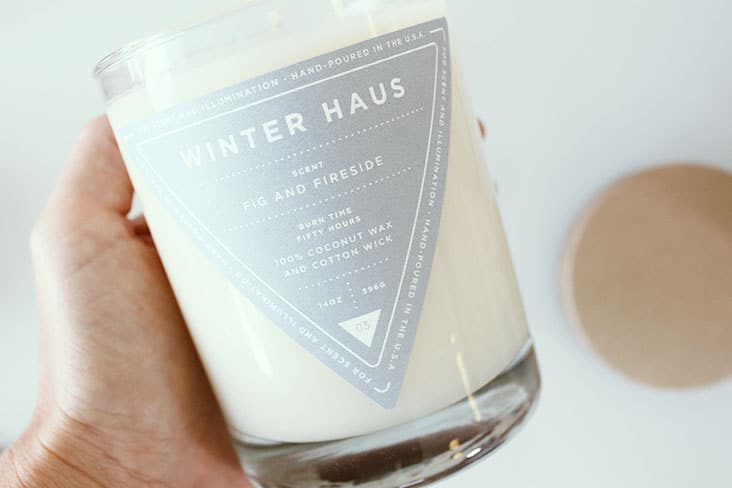
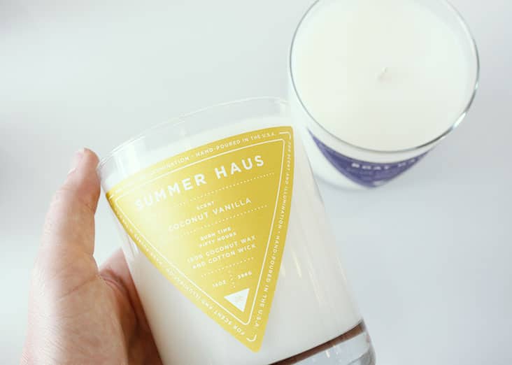
Haus Interior is a full service boutique interior design firm with offices in both New York City and Los Angeles. They also have a great candle line that is inspired by their interior design expertise. We recently redesigned the labels for their perfectly scented candle line. We love the simplicity of these labels, and of course, all the beautiful colors!
Client: Nina Freudenberger
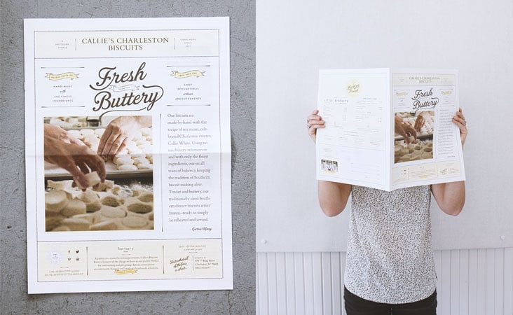
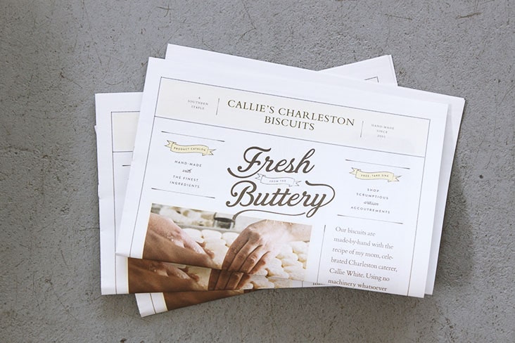
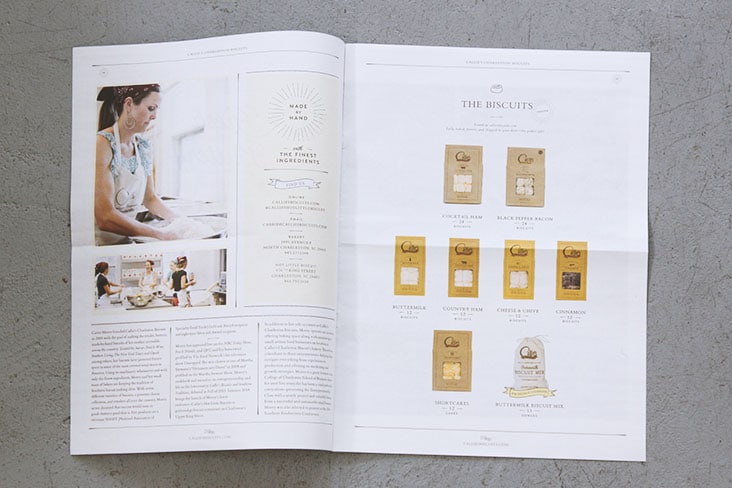
Fresh from the Buttery
October 14, 2014
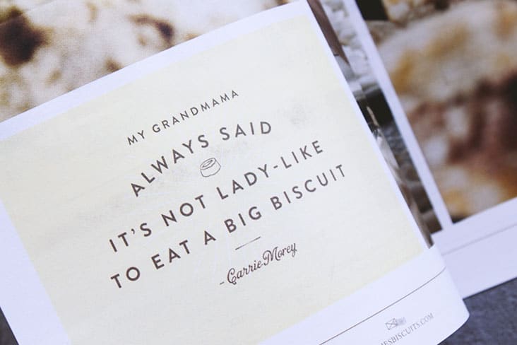
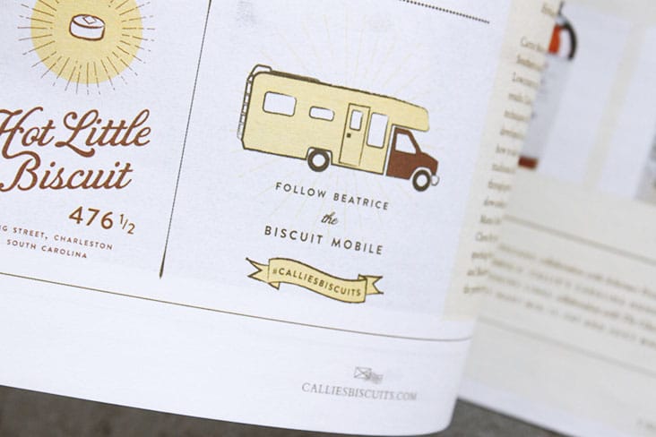
A new brochure for Callie’s Charleston Biscuits.
Client: Callie's Charleston Hot Little Biscuit
fonts.com
October 6, 2014
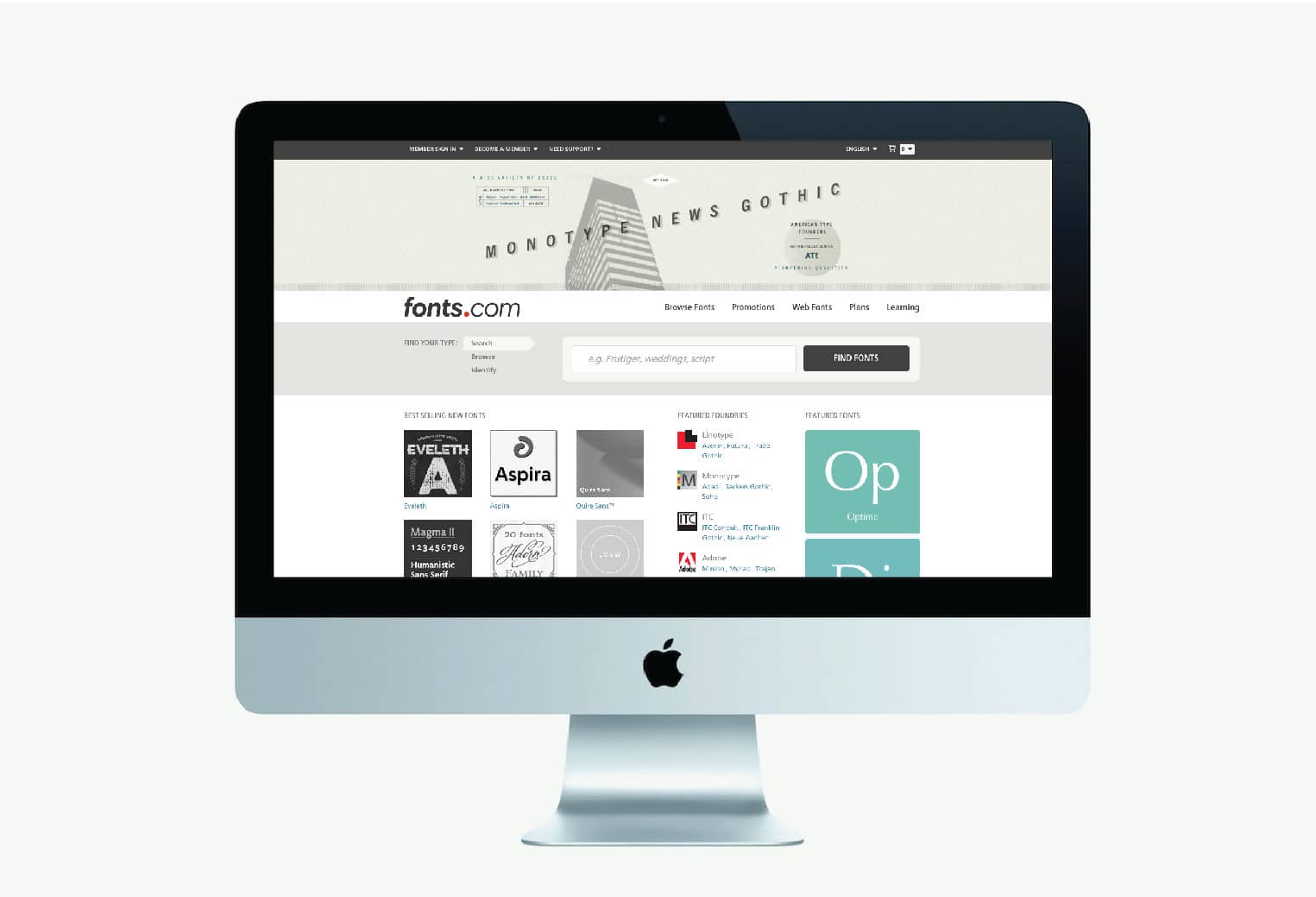
We consider ourselves to be type junkies so when fonts.com asked us to pick a typeface and create an image for them we jumped at the chance. Thanks fonts.com! It was fun!
Client: fonts.com
Biscotti Brothers New Logo and Brand Identity
October 2, 2014
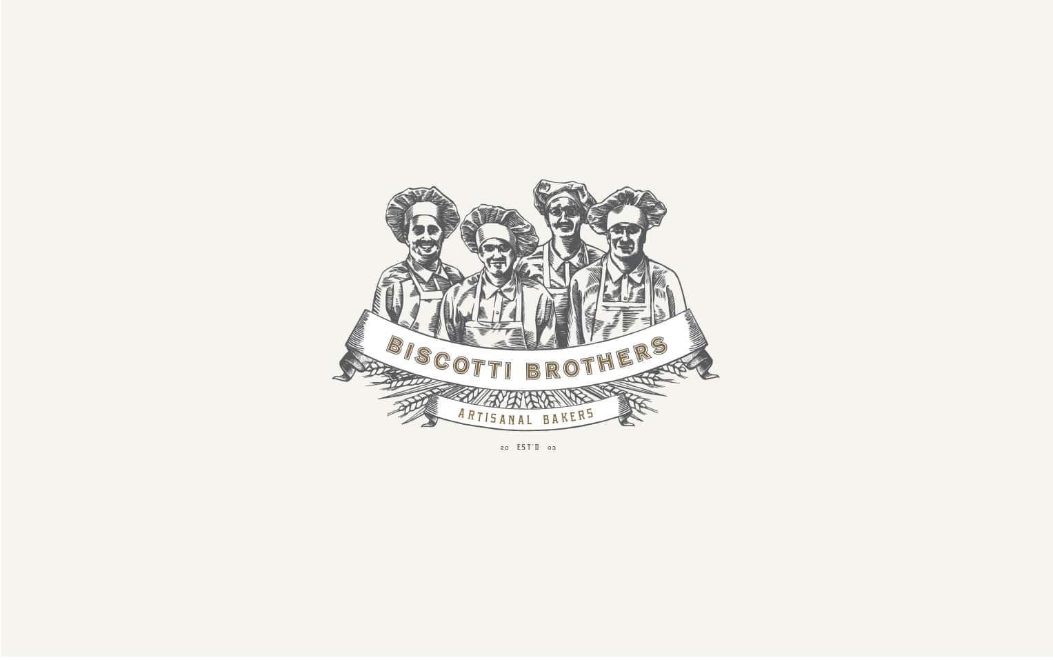
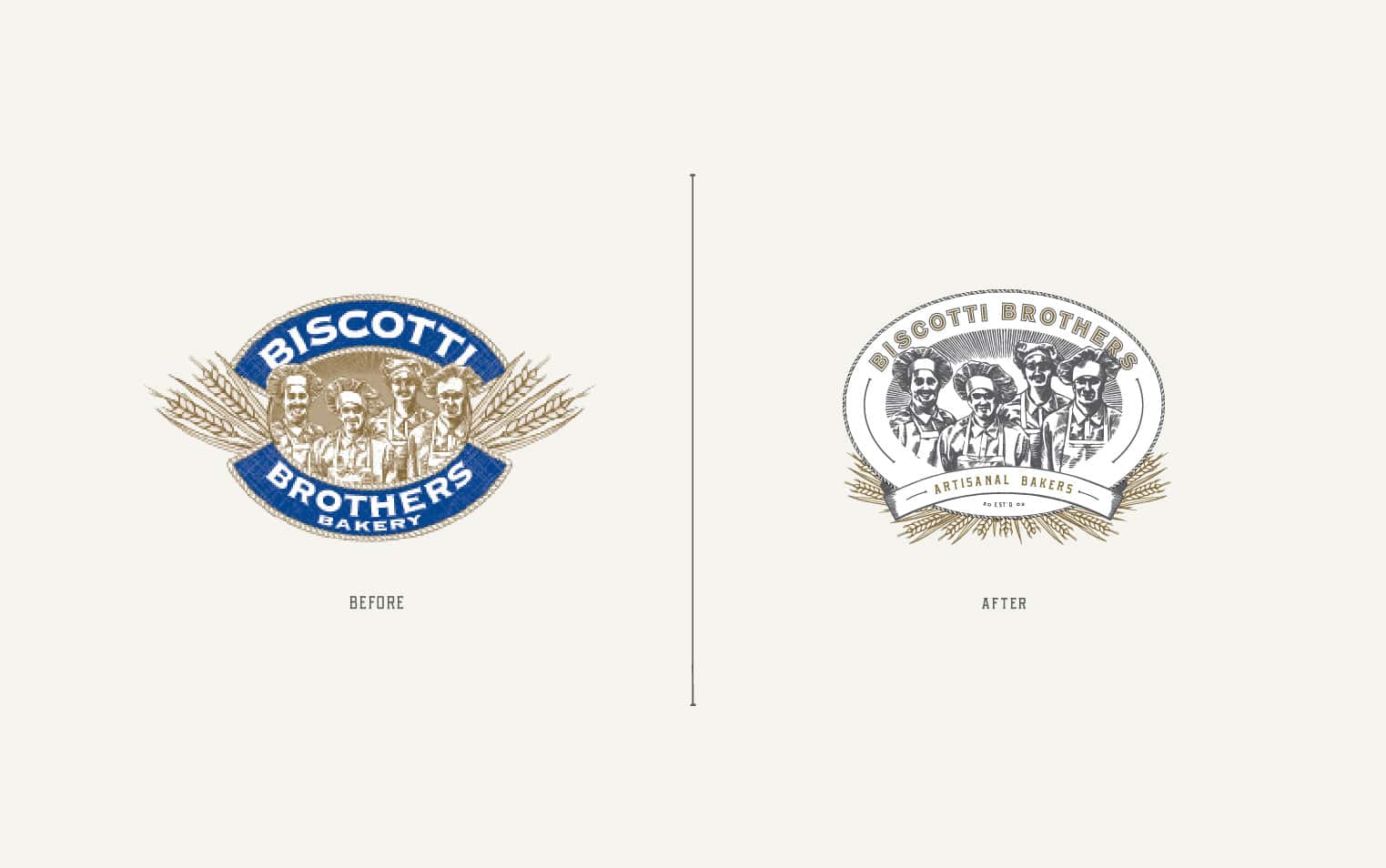
We’ve been working with the team at Biscotti Brothers over the past several months on updating their brand. Biscotti Brothers specializes in baking traditional italian cookies. They maintain the artisanal quality of their biscotti by using the freshest natural ingredients, keeping their batches small and insuring that each cookie is actually touched by the hands of a baker. There were many elements and aspects of their existing brand which we thought were successful. We wanted to make sure to enhance those elements and bring a fresh perspective to the brand. We introduced new graphic elements and type as well new and different variations of the logo and sub marks. We’re in the process of redesigning their packaging now and are enjoying our collaboration more and more with each project.
Client: Gerry Bennett
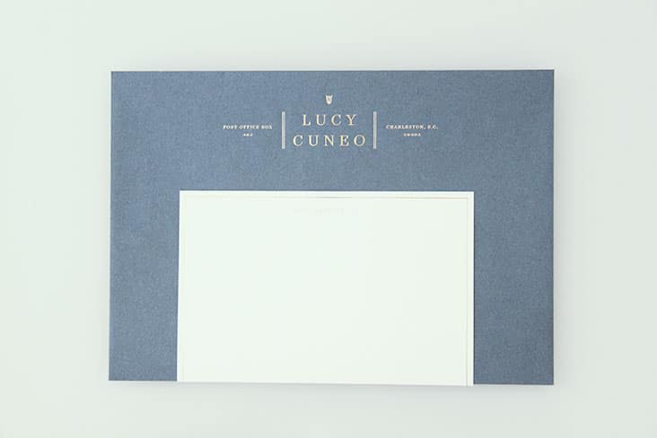
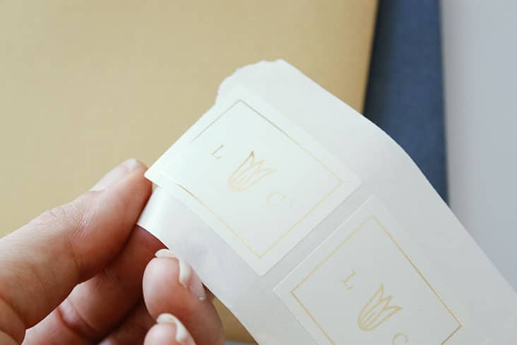
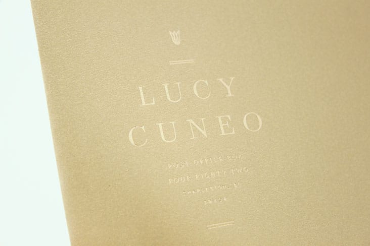
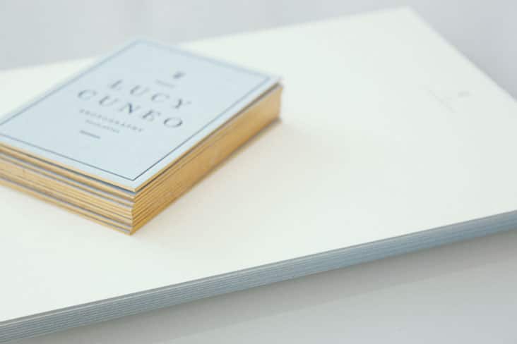
Lucy Cuneo Photography Identity
September 30, 2014
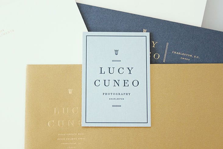
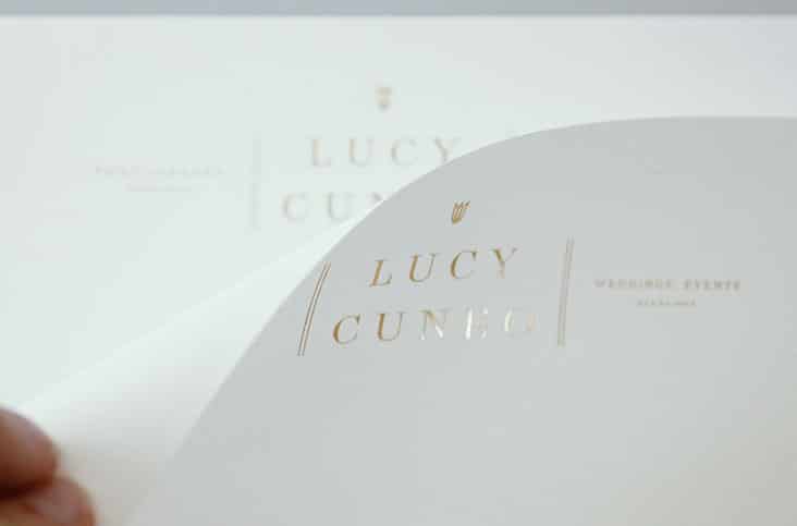
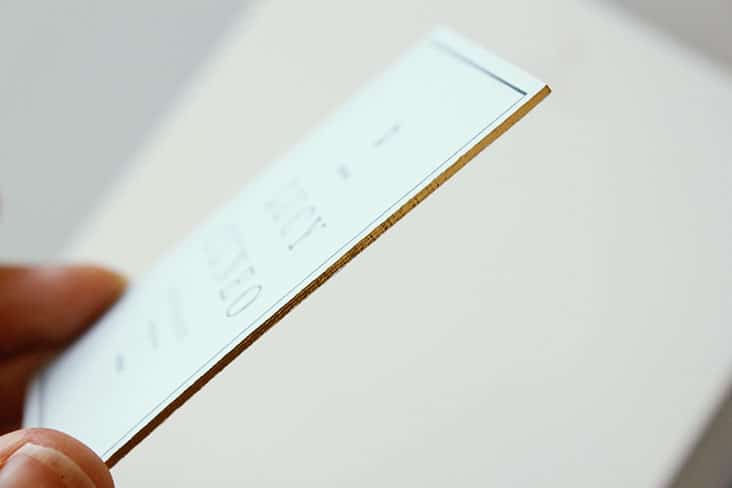
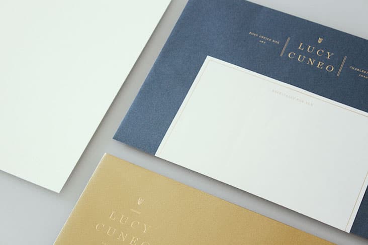
New work for Lucy Cuneo, a photographer based in Charleston. She takes an artist’s approach to her photography using film and natural light. We have had a lovely time creating a logo and identity for her growing business. More loveliness and projects in the works for this sweet and talented photographer to share soon!
Client: Lucy Cuneo
Poppies and Posies Website
September 25, 2014
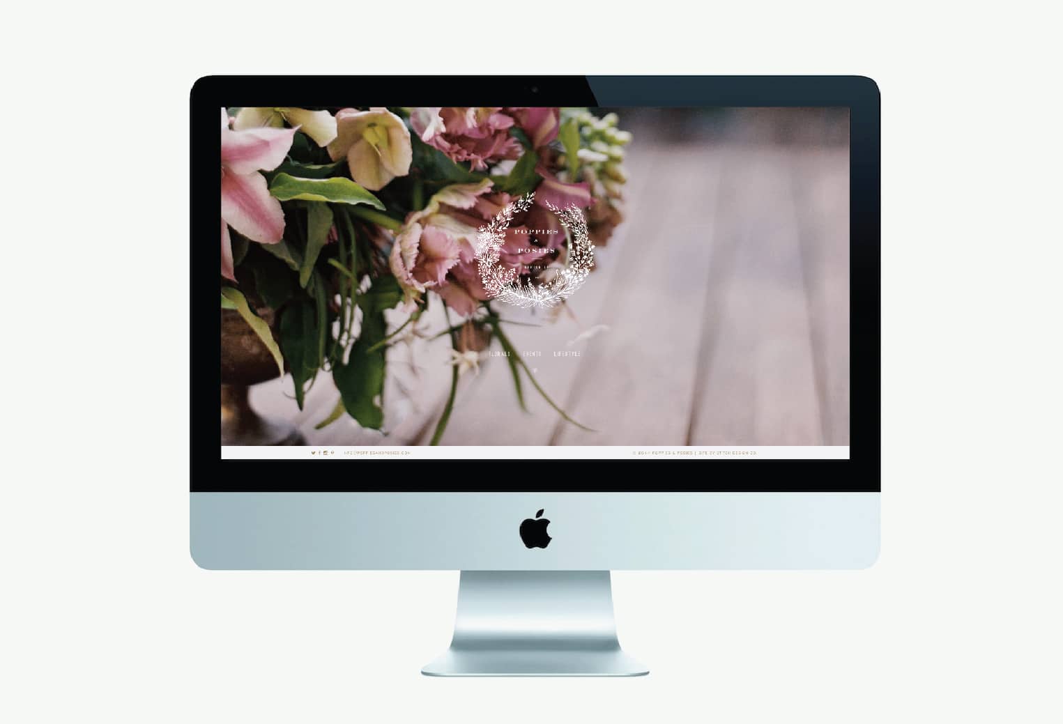
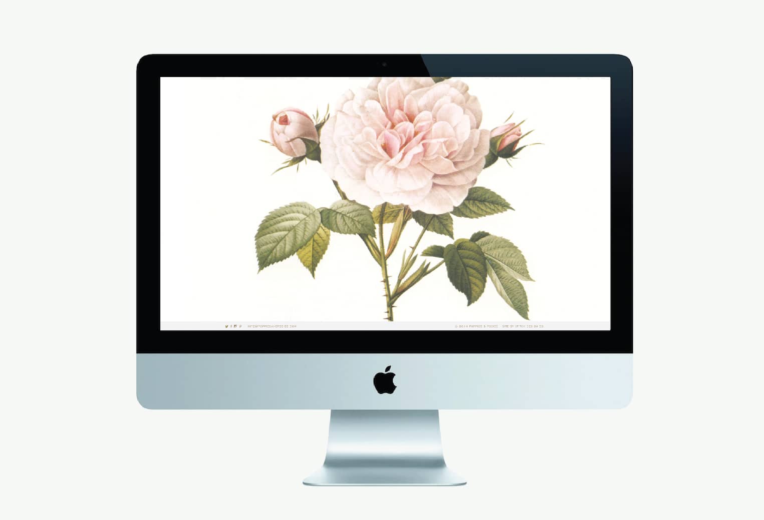
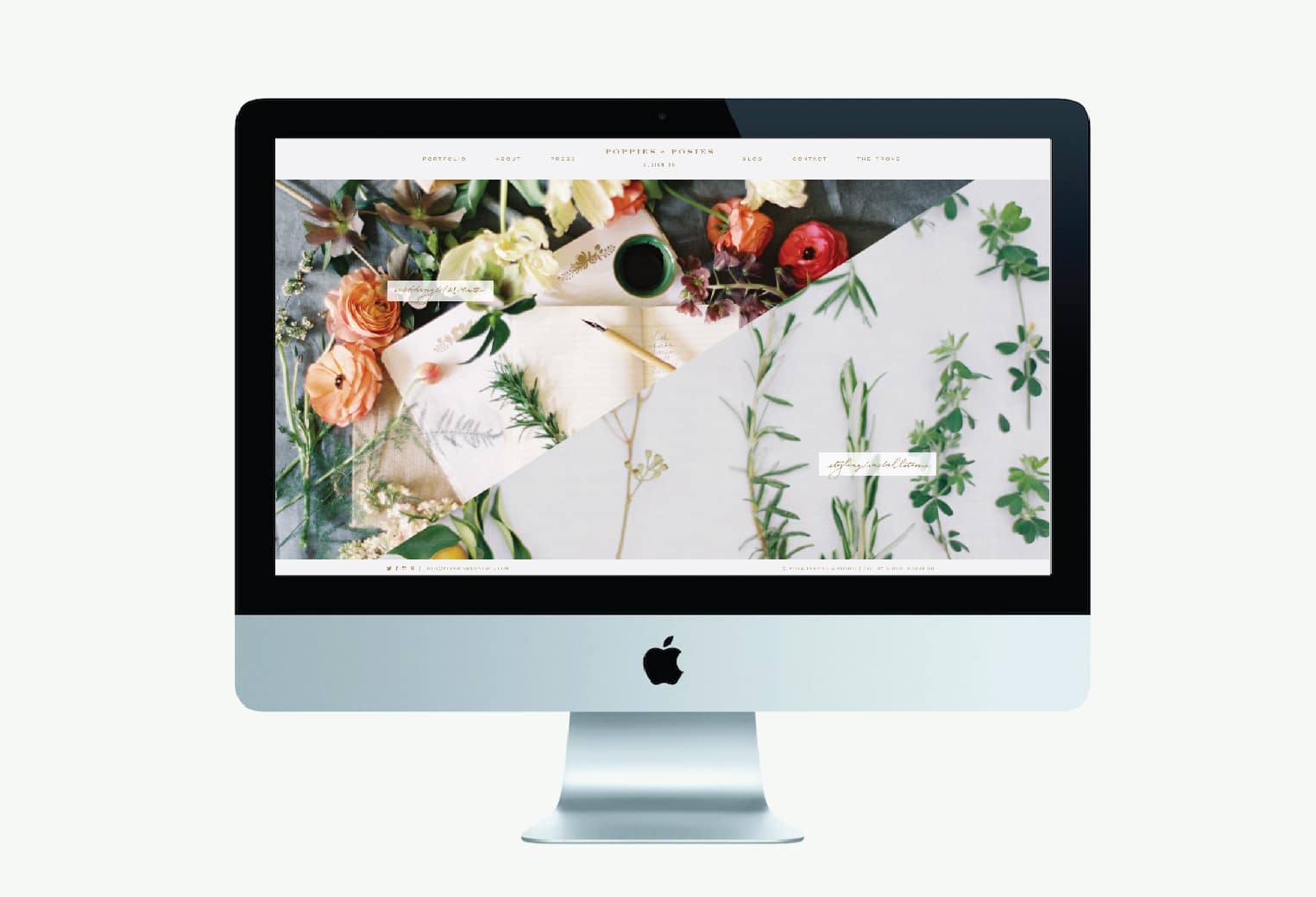
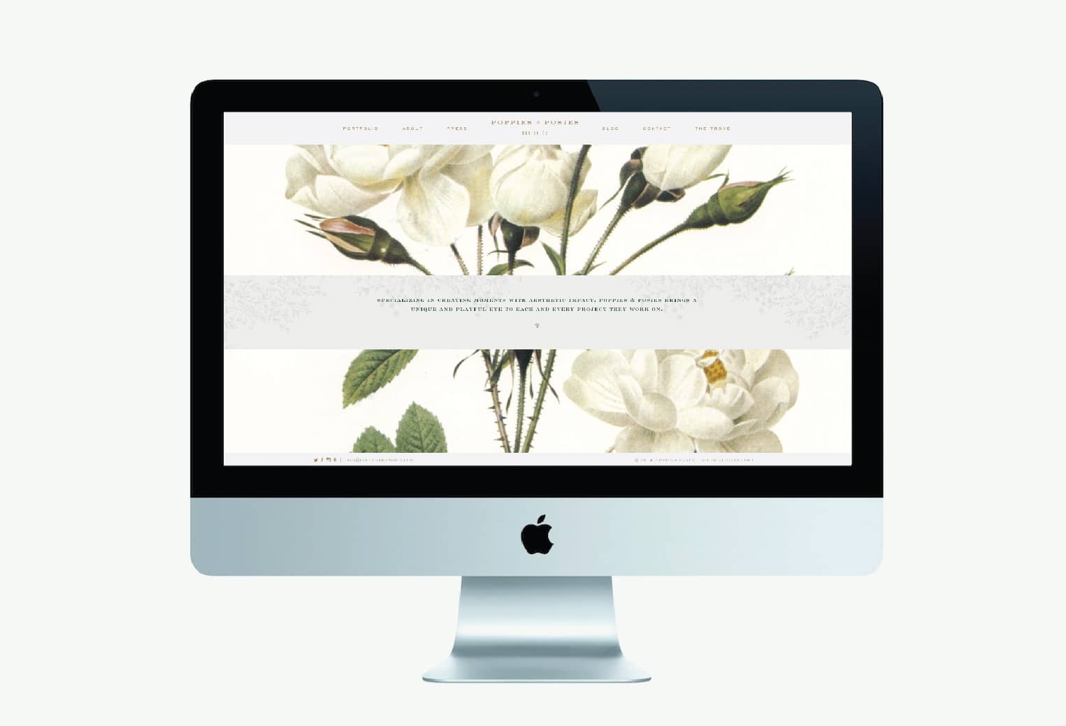
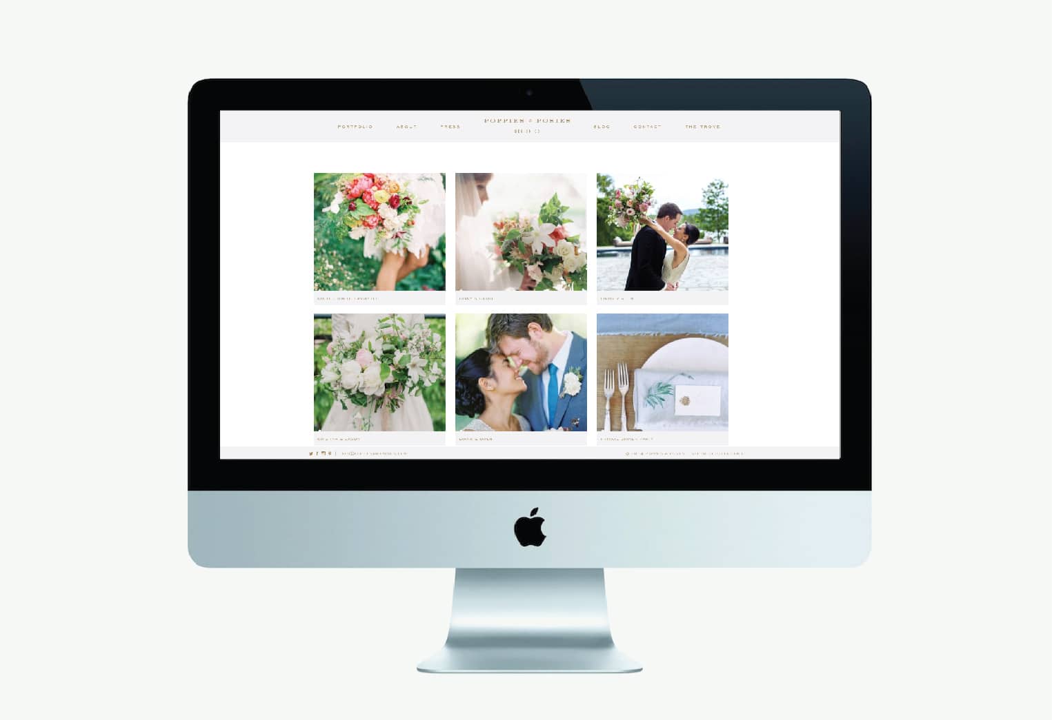
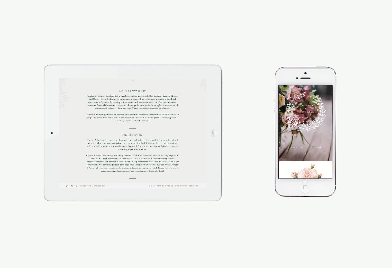
Poppies and Posies is a boutique floral design firm based in New York City & New England. The design of their new site utilizes photography and graphics in a large and impactful way. We wanted to be sure to use the site as a platform to showcase the beauty of their work. In addition to the photography, we layered in antique botanicals and handwritten type as design elements to enhance the classic and romantic nature of their work.
Client: Sierra Steifman
Garden & Gun Jubilee
September 23, 2014
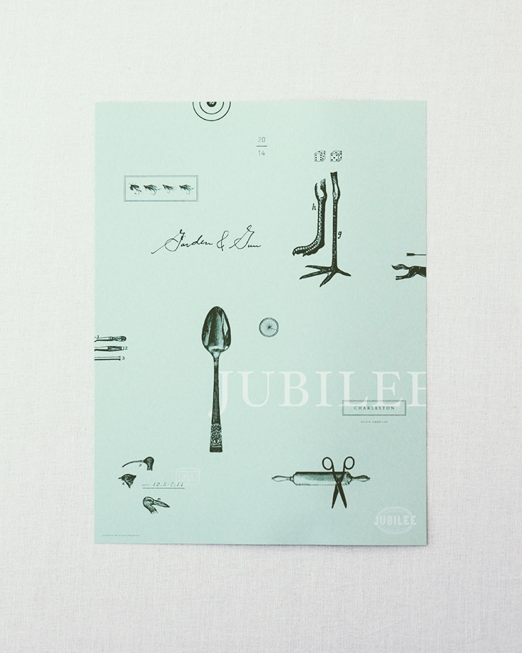
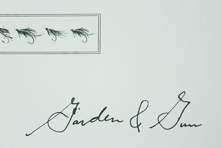
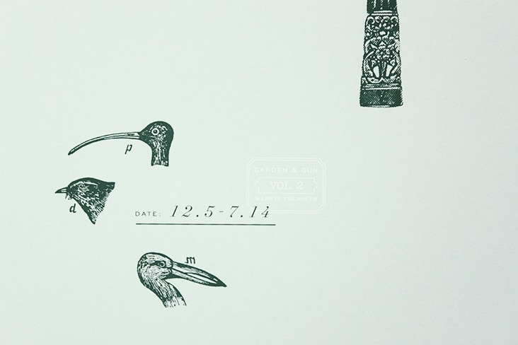
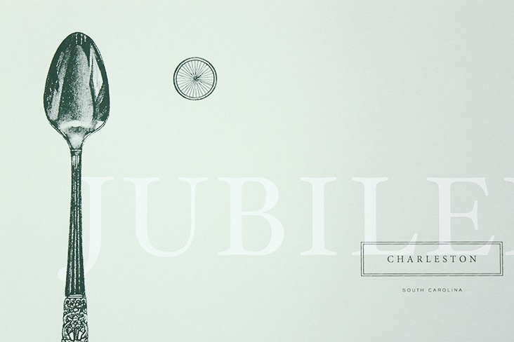
The 2014 Jubilee poster has arrived and is another successful collaboration with Garden & Gun. We are thrilled with the outcome. Special thanks to our friends at The Half and Half who did a beautiful job silkscreening this piece for us.
The tickets are on sale and now through the end of September everyone using promo code POSTER will receive one of these for each ticket purchased.
Client: Garden & Gun
Bees Wrap
September 18, 2014
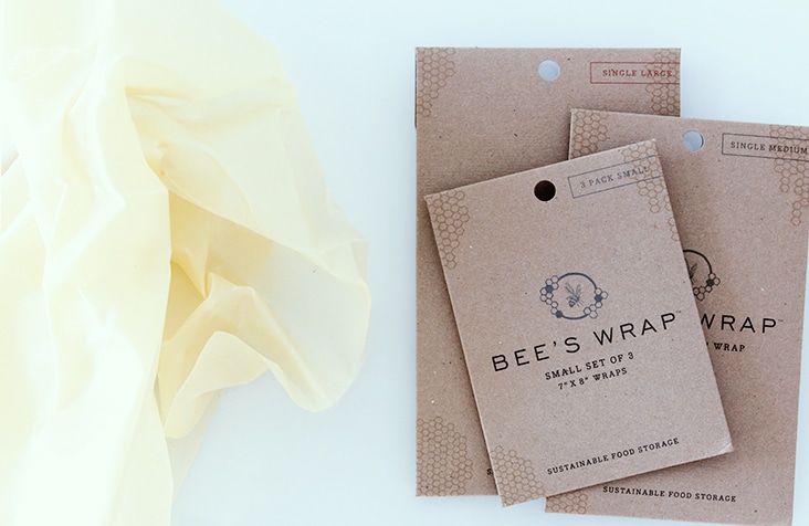
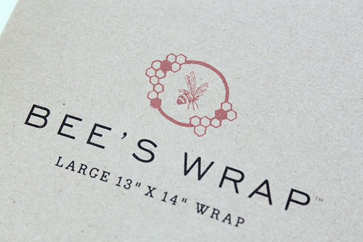
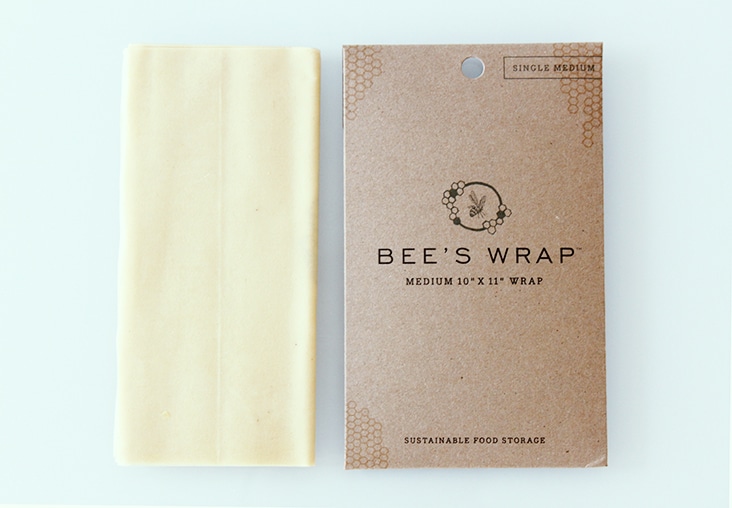
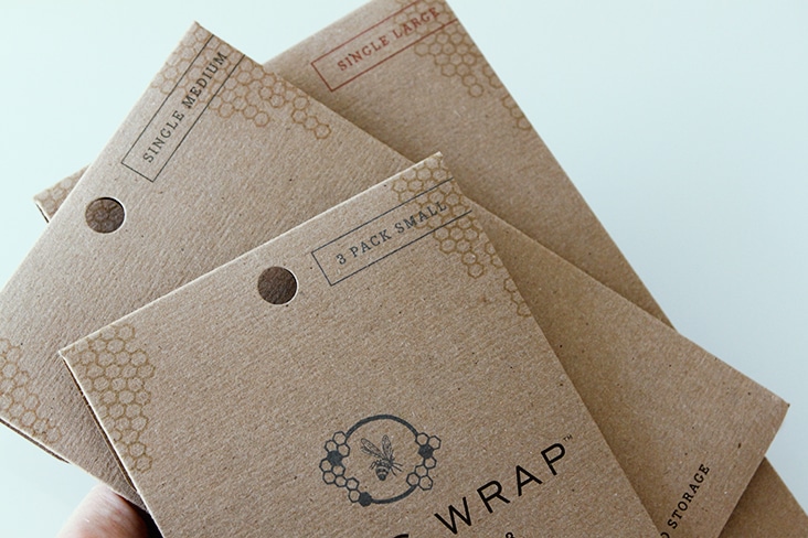
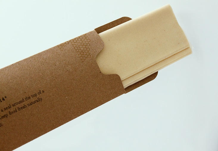
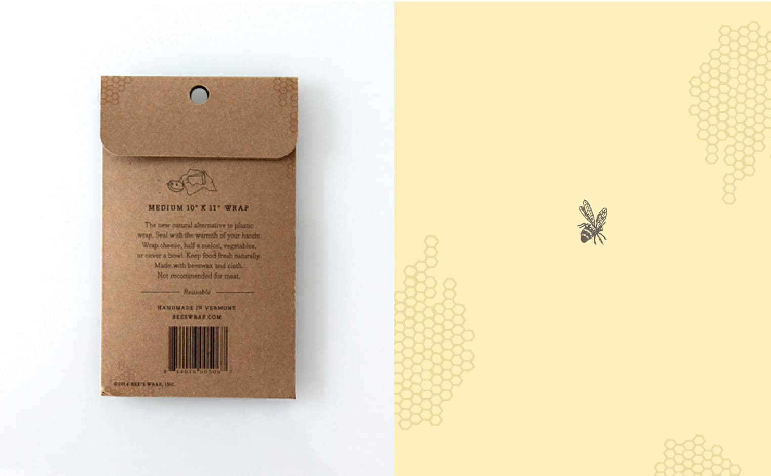
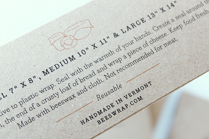
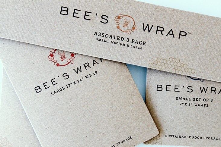
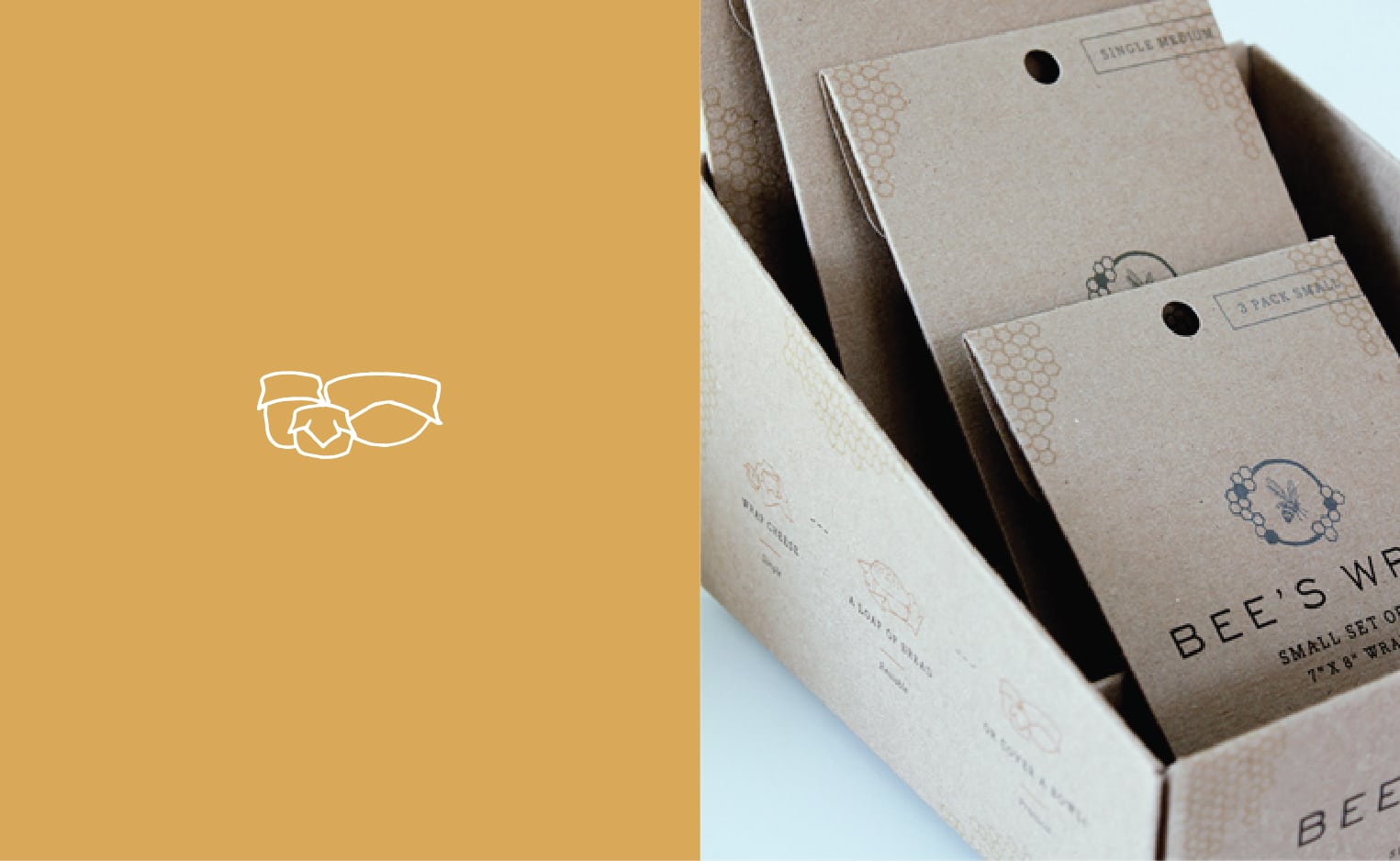
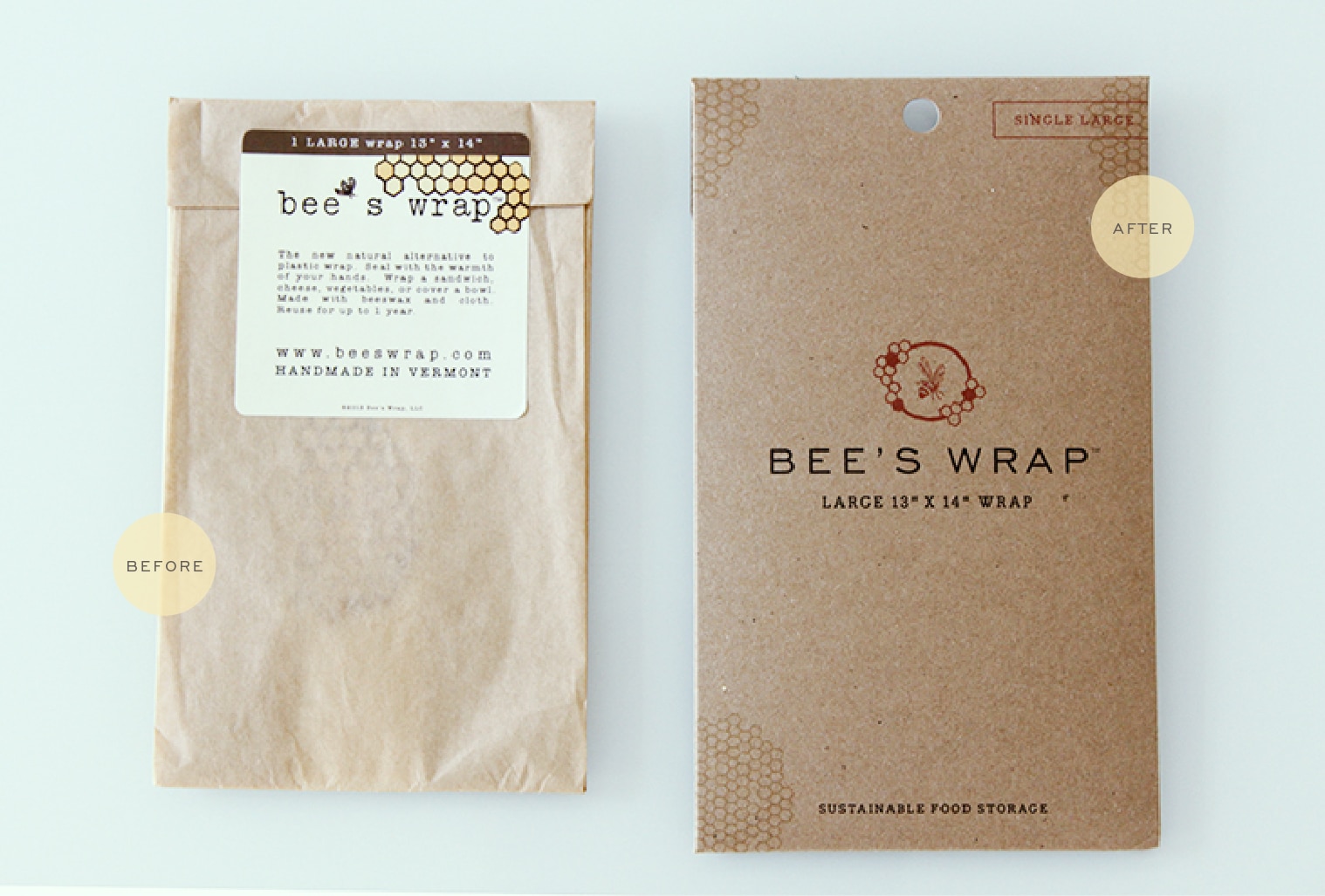
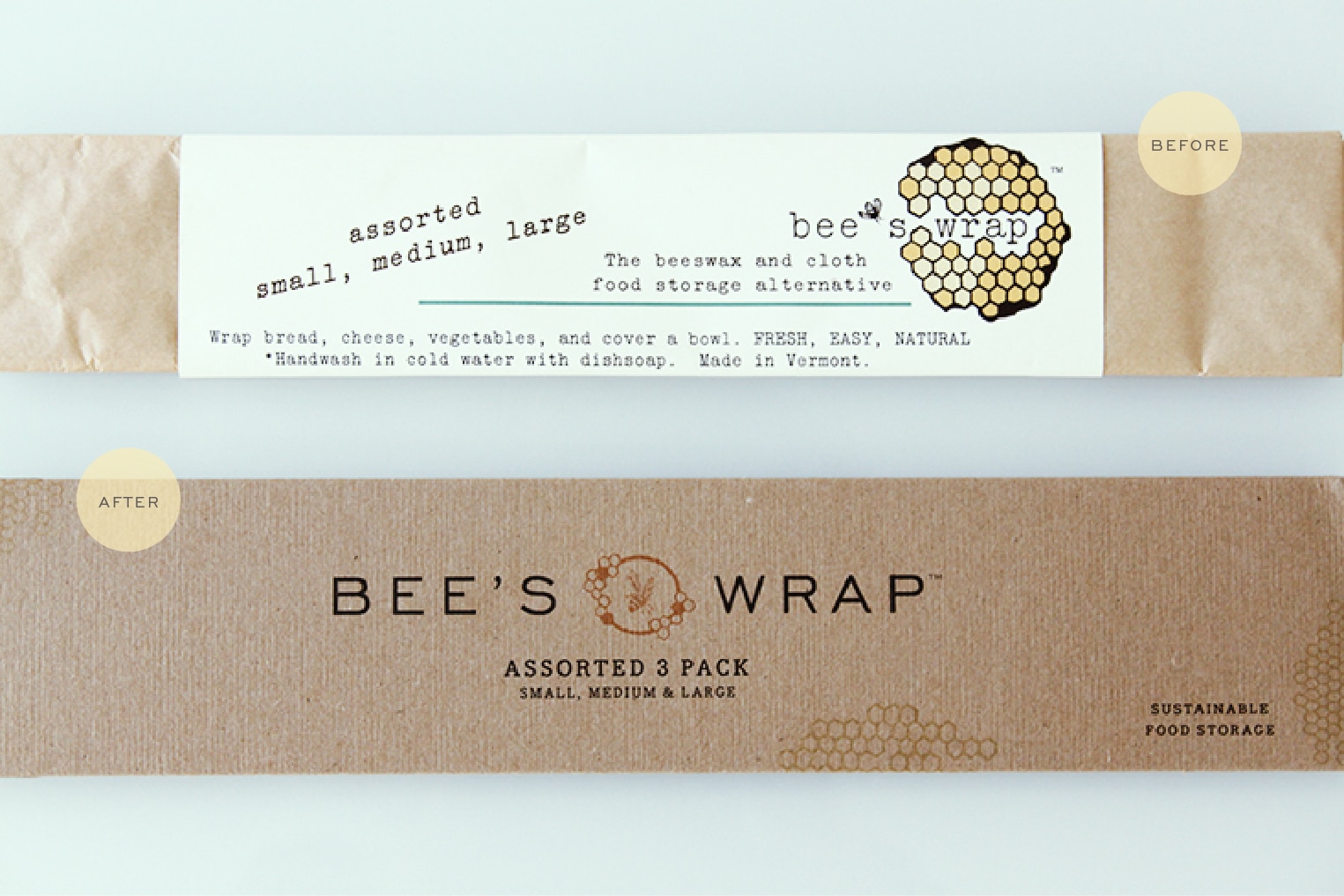
Bee’s Wrap is the new natural alternative to plastic wrap. You can simply seal it with the warmth of your hands. Wrap a sandwich, cheese, half a melon, or cover a bowl. Made with beeswax and cloth, we love the natural simplicity of this product. Bee’s Wrap hired us to come up with a packing system that was sustainable (like the product) and more visually appealing to the consumer. They were also was looking to simplify their labor costs without sacrifice to the visual appeal. Each available size was printed converted chipboard pouch using a color coding combination of two inks.
Client: Sarah Kaeck
Communication Arts Design Annual
September 16, 2014
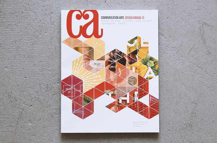
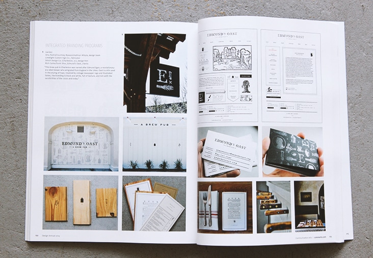
Proud and excited to have our work for Edmund’s Oast included in the integrated branding section of the 2014 Design Annual. Congratulations Edmund’s Oast and thank you to Communication Arts! See the work here, here, here and here.
Client: Rich Carley and Scott Shor
