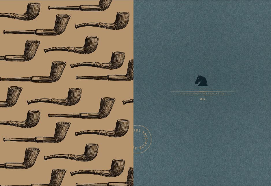
Set to open in the Spring of 2015, The Spectator Hotel will be a new kind of boutique hotel in the heart of historic Charleston. Evoking the opulence and sophistication of the roaring twenties, the hotel will offer Charleston’s best address for luxury accommodations. Beginning with naming, logo and brand development we’re thrilled with the way this brand is taking shape. There will be more Spectator to share soon! See the ground breaking invitation here.
Archive for October, 2014
Jack Rudy Signature
October 23, 2014
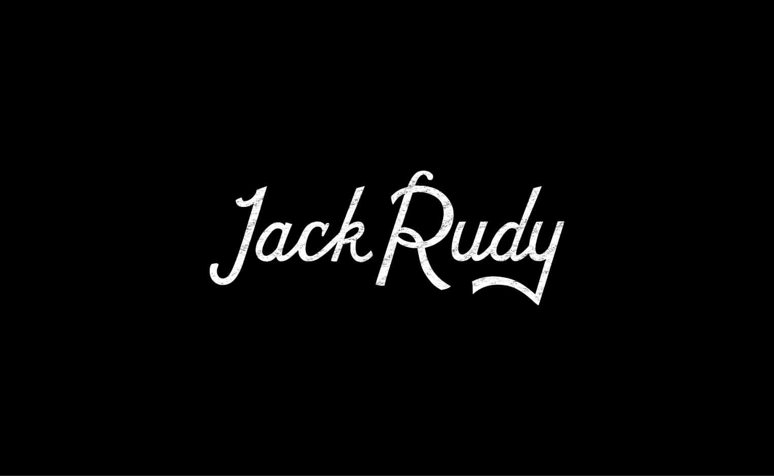
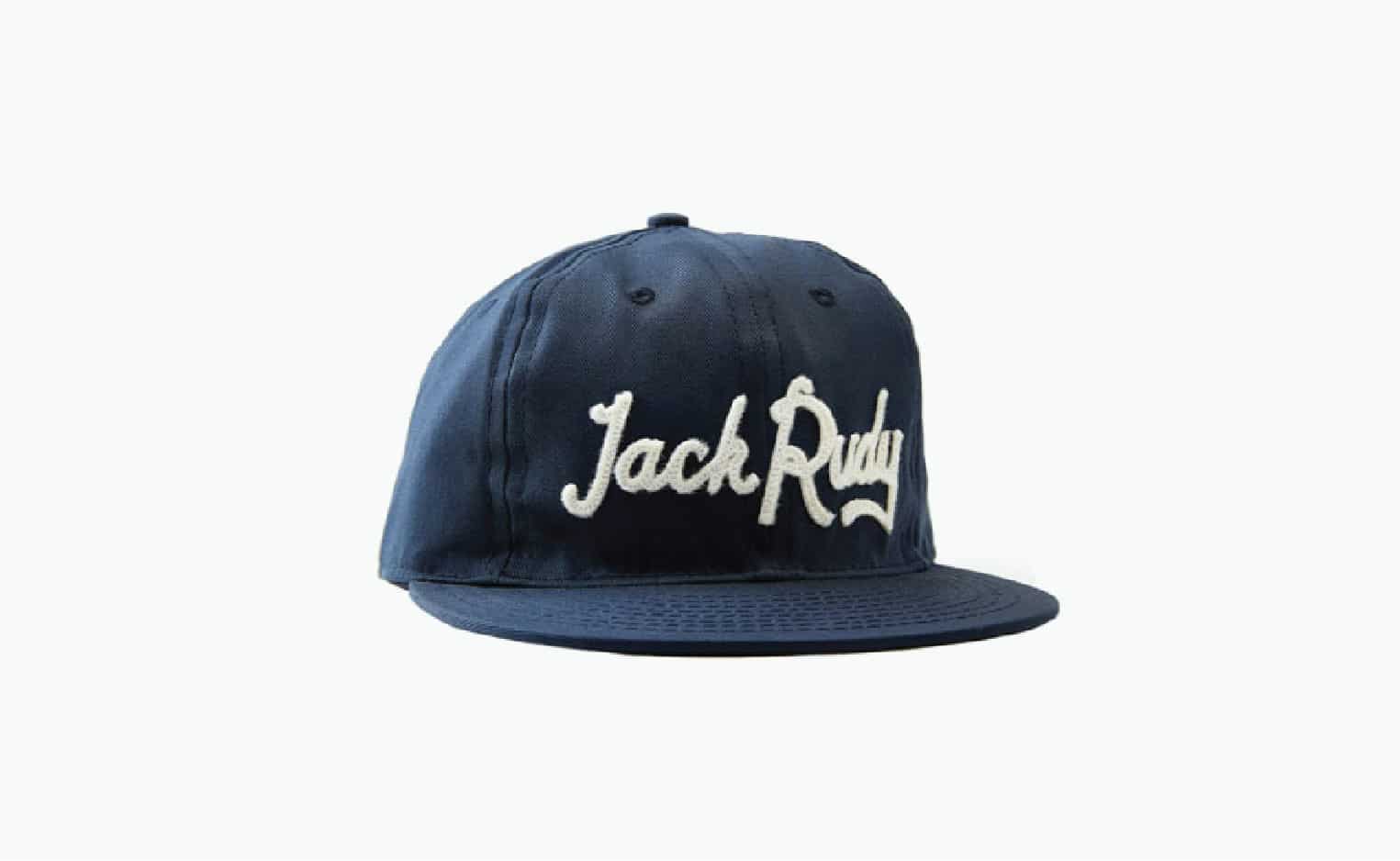
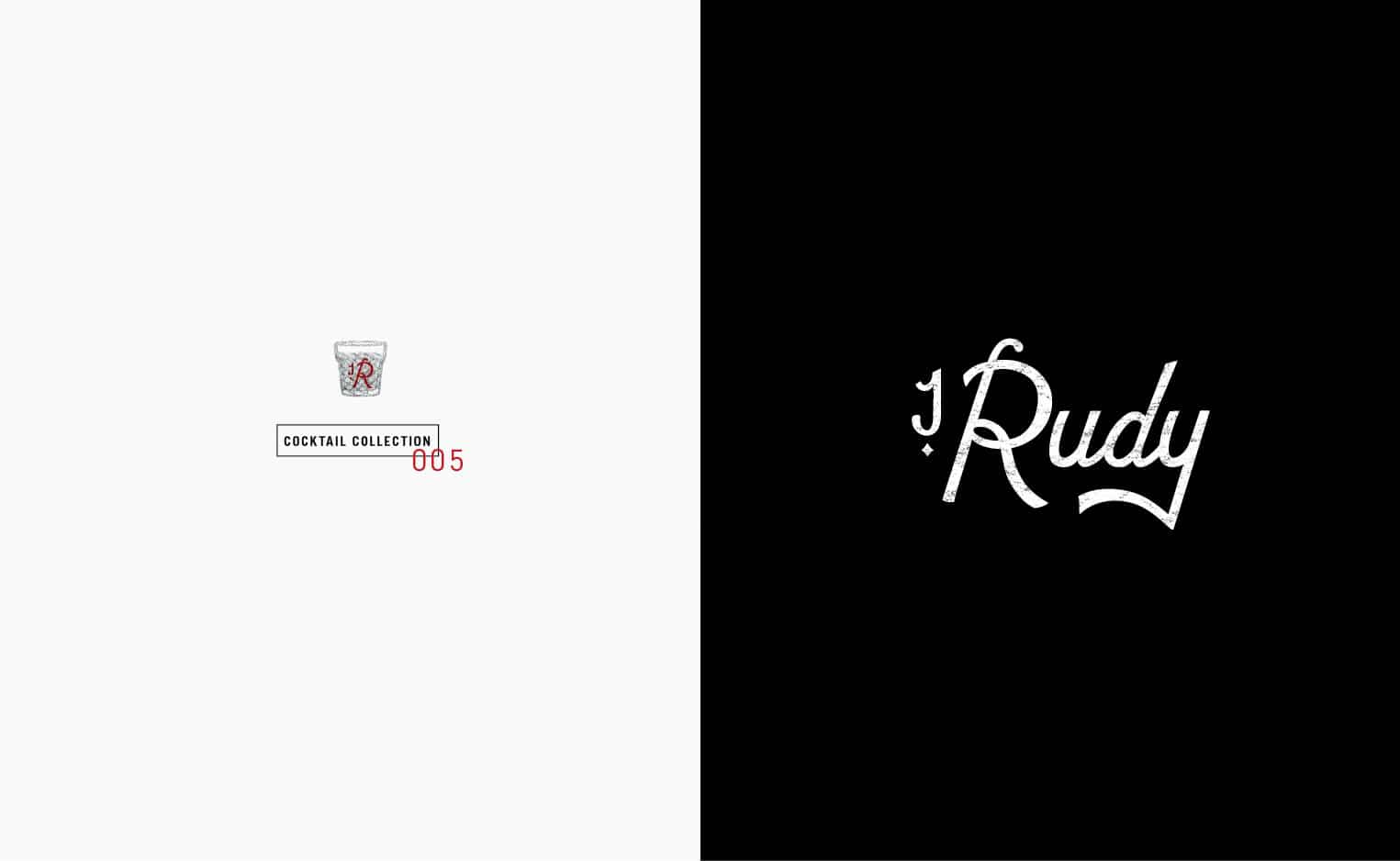
Inspired by Jack Rudy’s own signature, we developed this custom script for our favorite cocktail co, Jack Rudy. You can now wear his “signature” on this, made in the USA premium cotton twill, cap made in collaboration with Ebbets Field Flannels.
Client: Brooks Reitz
Haus Candles
October 16, 2014
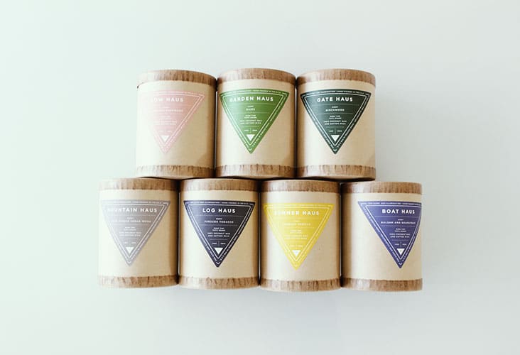
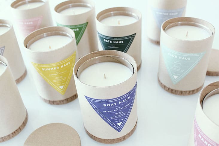
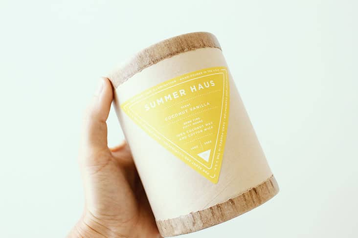
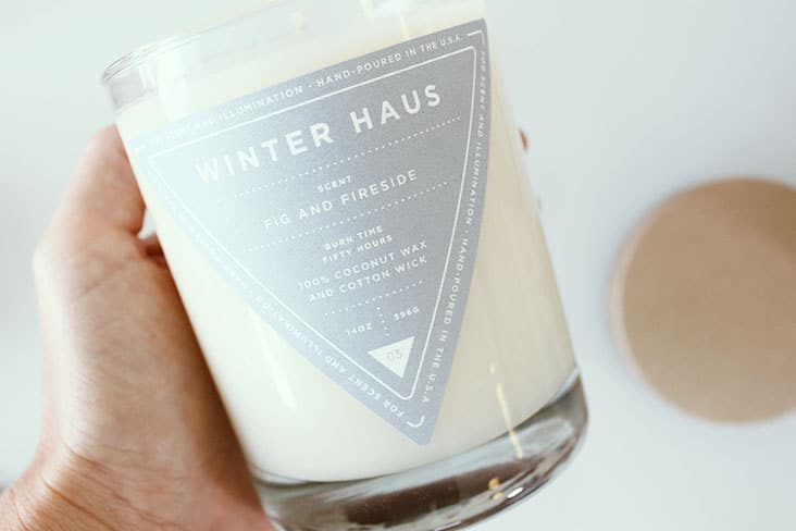
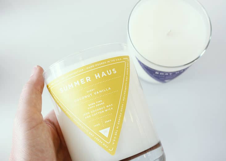
Haus Interior is a full service boutique interior design firm with offices in both New York City and Los Angeles. They also have a great candle line that is inspired by their interior design expertise. We recently redesigned the labels for their perfectly scented candle line. We love the simplicity of these labels, and of course, all the beautiful colors!
Client: Nina Freudenberger
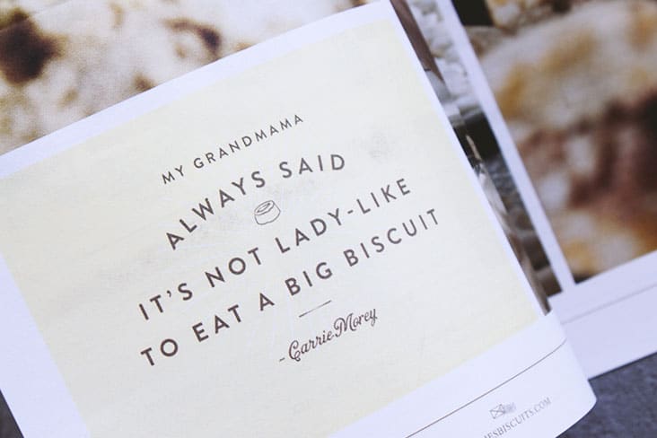
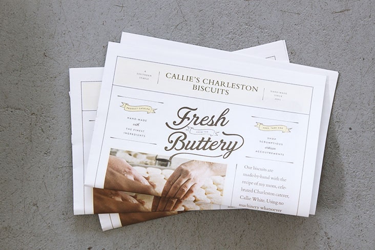
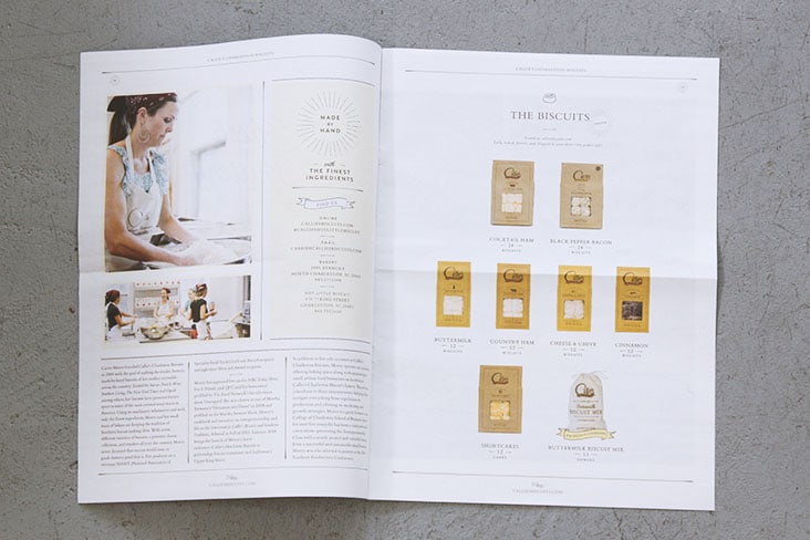
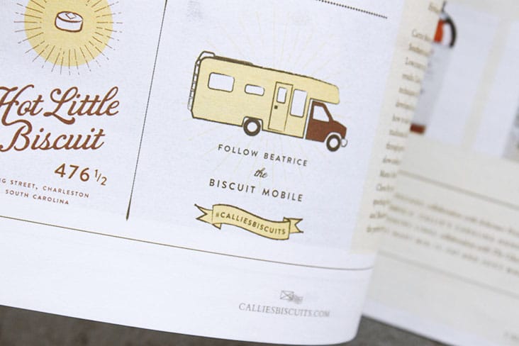
Fresh from the Buttery
October 14, 2014
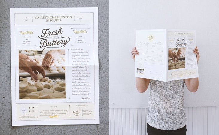
A new brochure for Callie’s Charleston Biscuits.
Client: Callie's Charleston Hot Little Biscuit
fonts.com
October 6, 2014
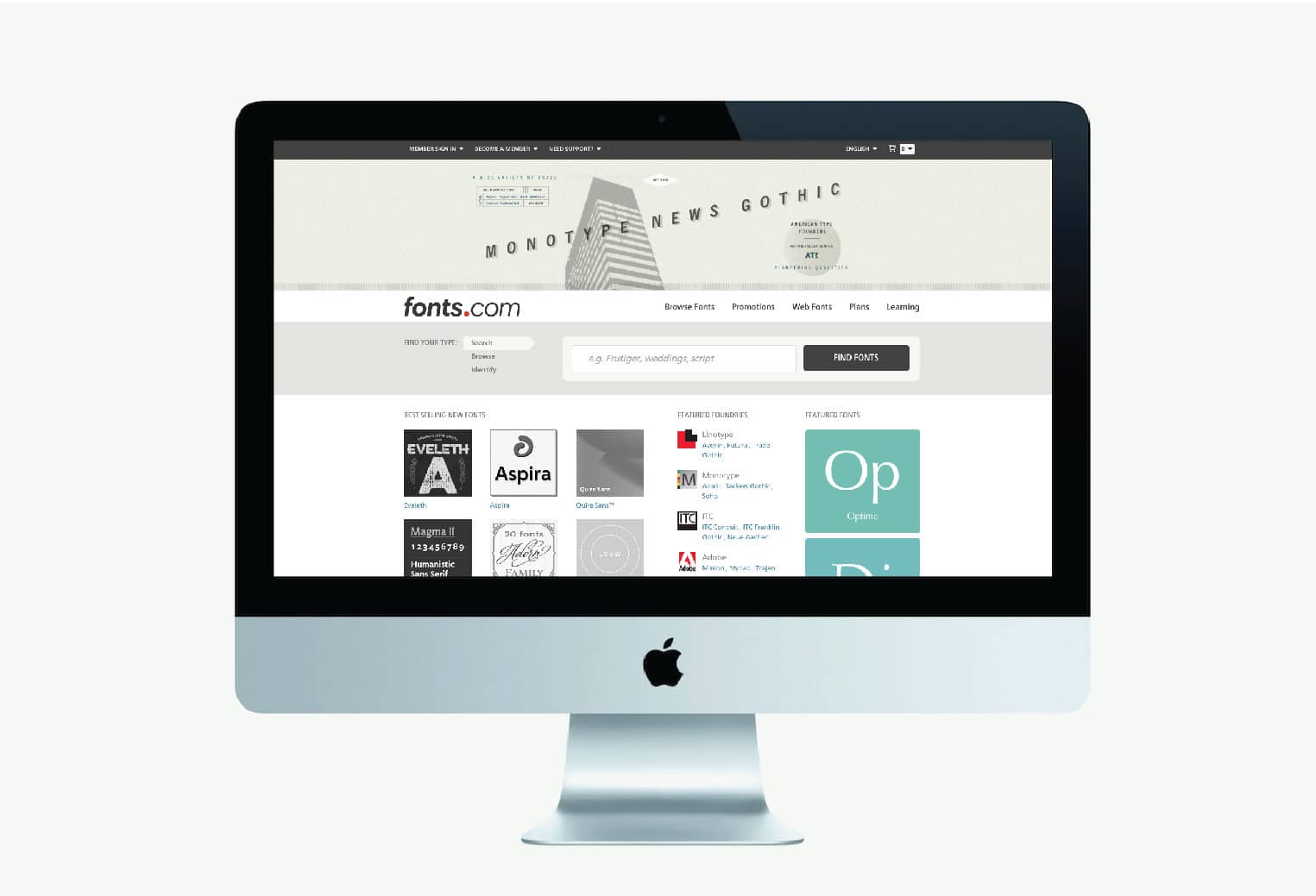
We consider ourselves to be type junkies so when fonts.com asked us to pick a typeface and create an image for them we jumped at the chance. Thanks fonts.com! It was fun!
Client: fonts.com
Biscotti Brothers New Logo and Brand Identity
October 2, 2014
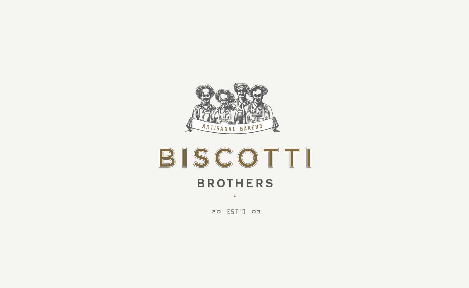
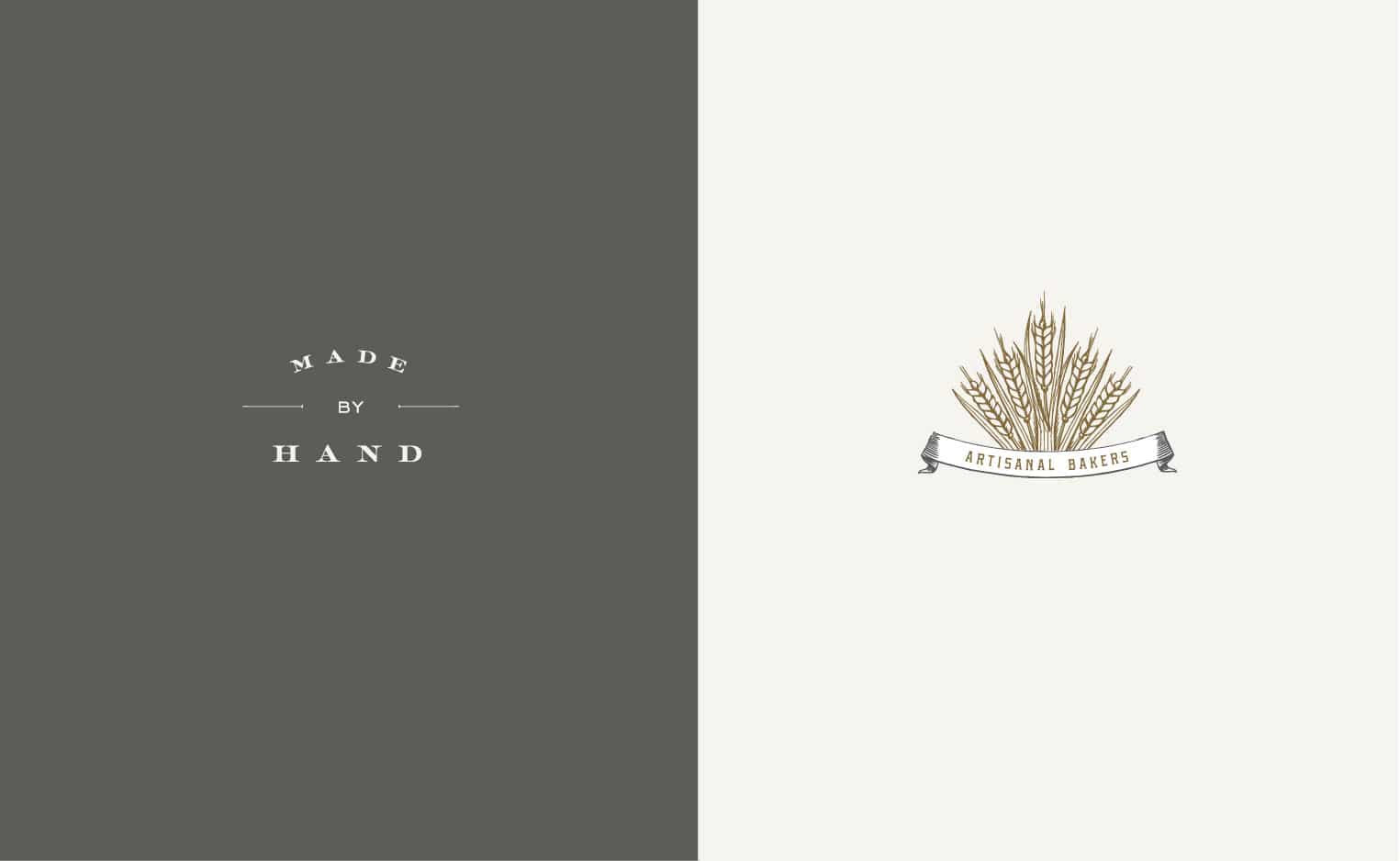
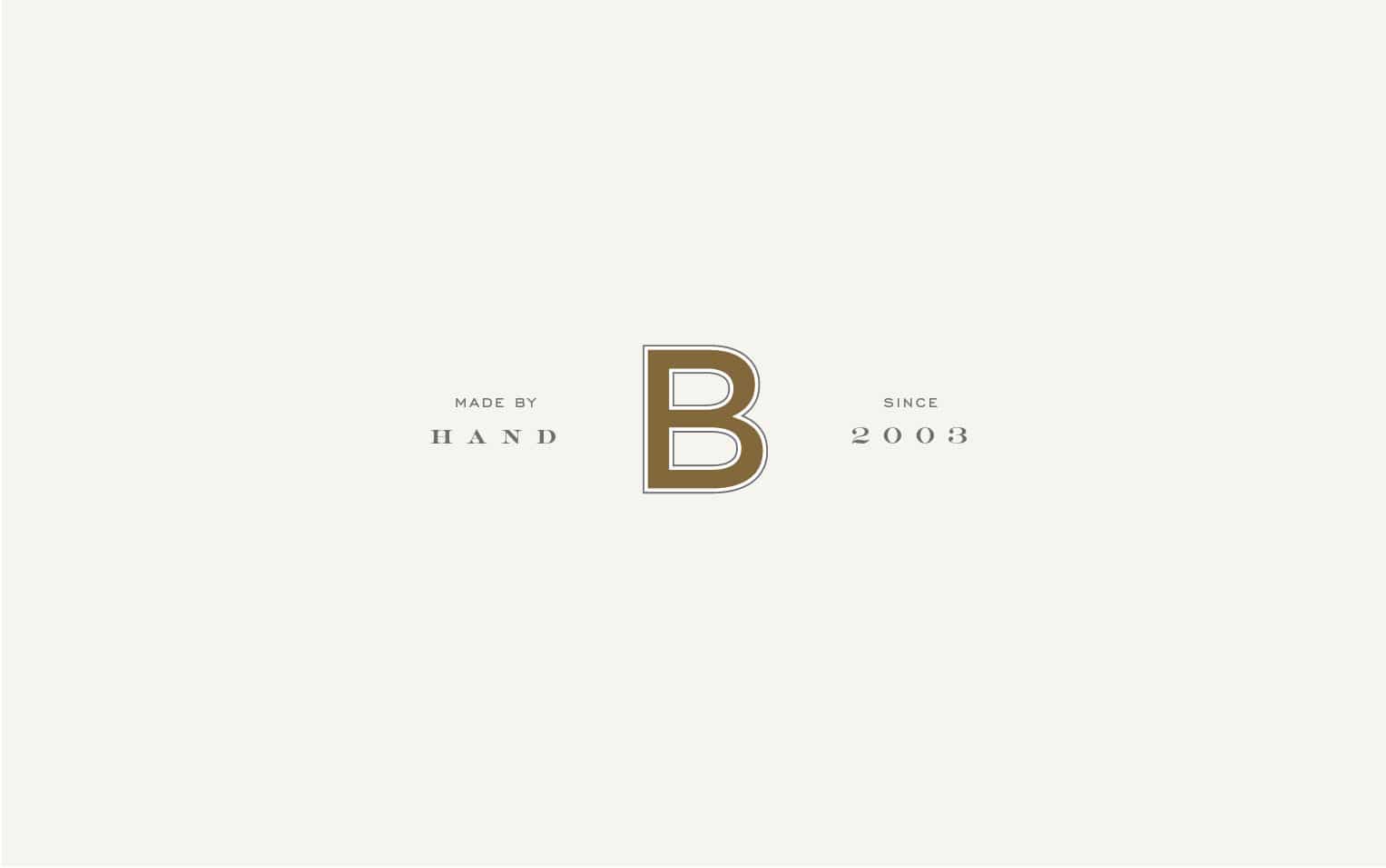
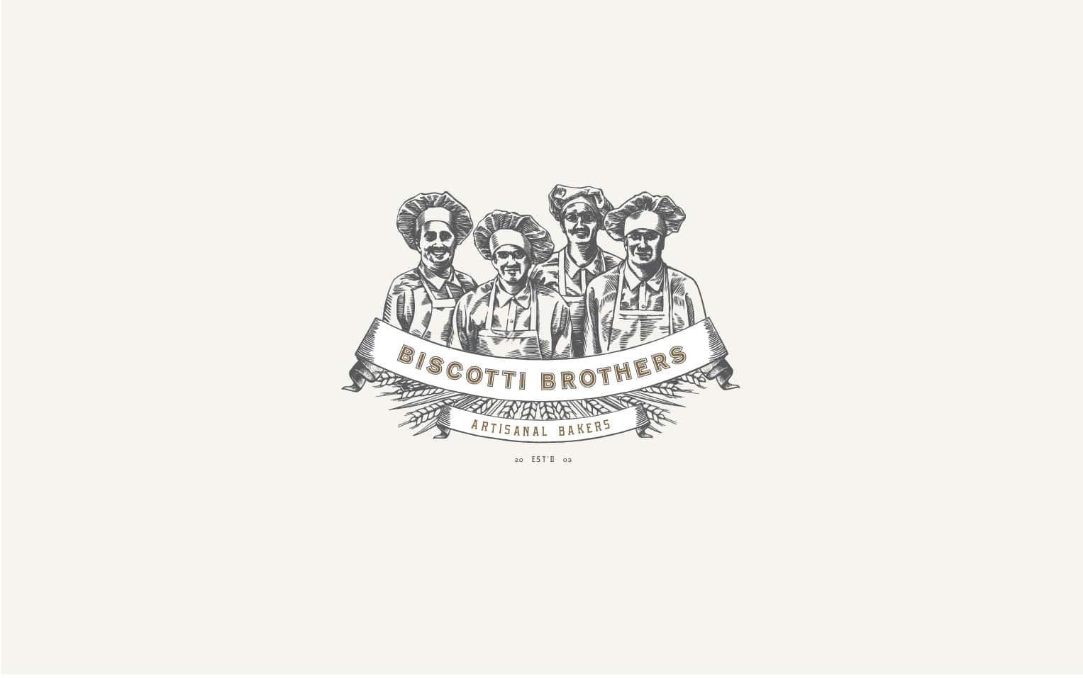
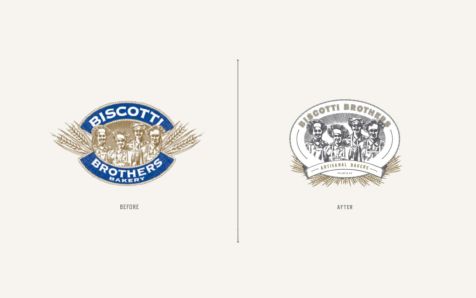
We’ve been working with the team at Biscotti Brothers over the past several months on updating their brand. Biscotti Brothers specializes in baking traditional italian cookies. They maintain the artisanal quality of their biscotti by using the freshest natural ingredients, keeping their batches small and insuring that each cookie is actually touched by the hands of a baker. There were many elements and aspects of their existing brand which we thought were successful. We wanted to make sure to enhance those elements and bring a fresh perspective to the brand. We introduced new graphic elements and type as well new and different variations of the logo and sub marks. We’re in the process of redesigning their packaging now and are enjoying our collaboration more and more with each project.
Client: Gerry Bennett
