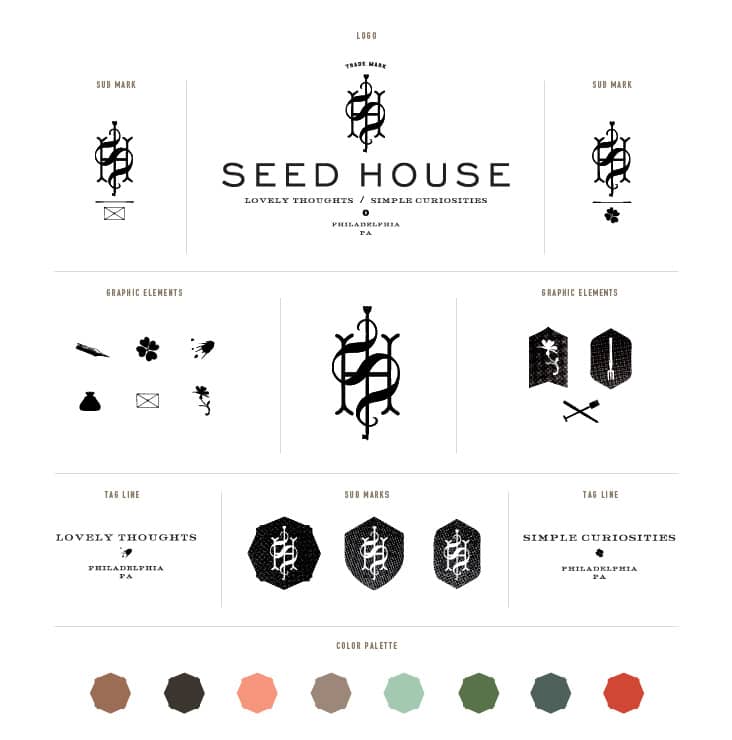
Shauna and Stephen are the husband and wife team behind Something’s Hiding in Here, Forage Haberdashery and now Seed House Stationers. Seed House was born out of the idea that their handmade tokens of affection could be the seeds of correspondences for others. We were thrilled to work with them on the branding for this exciting new stationery company.
Shauna and Stephen showed their first collection this week at the National Stationery Show in NYC. Their collection is full of vintage charm mixed with a fresh aesthetic. Small, delicate and unexpected details are what their unique stationery items are all about. We designed their branding to reflect that unique approach. A curated collection of monograms, icons, sub-marks and tag lines all come together to create a family of elements that Shauna and Stephen will use as they see fit. Shauna and Stephen are extremely creative and talented. It was a joy to work with them and we can’t wait to watch Seed House grow!

The typography is just beautiful! I have both of those typefaces and love to use them. Haha This is so very fitting for their brand. Love it Stitch!
[…] a logo to life down pat and i love looking to their blog for inspiration on logos + branding. the above branding is for the company seed house stationers, a stationery collection full of vintage charm mixed with […]