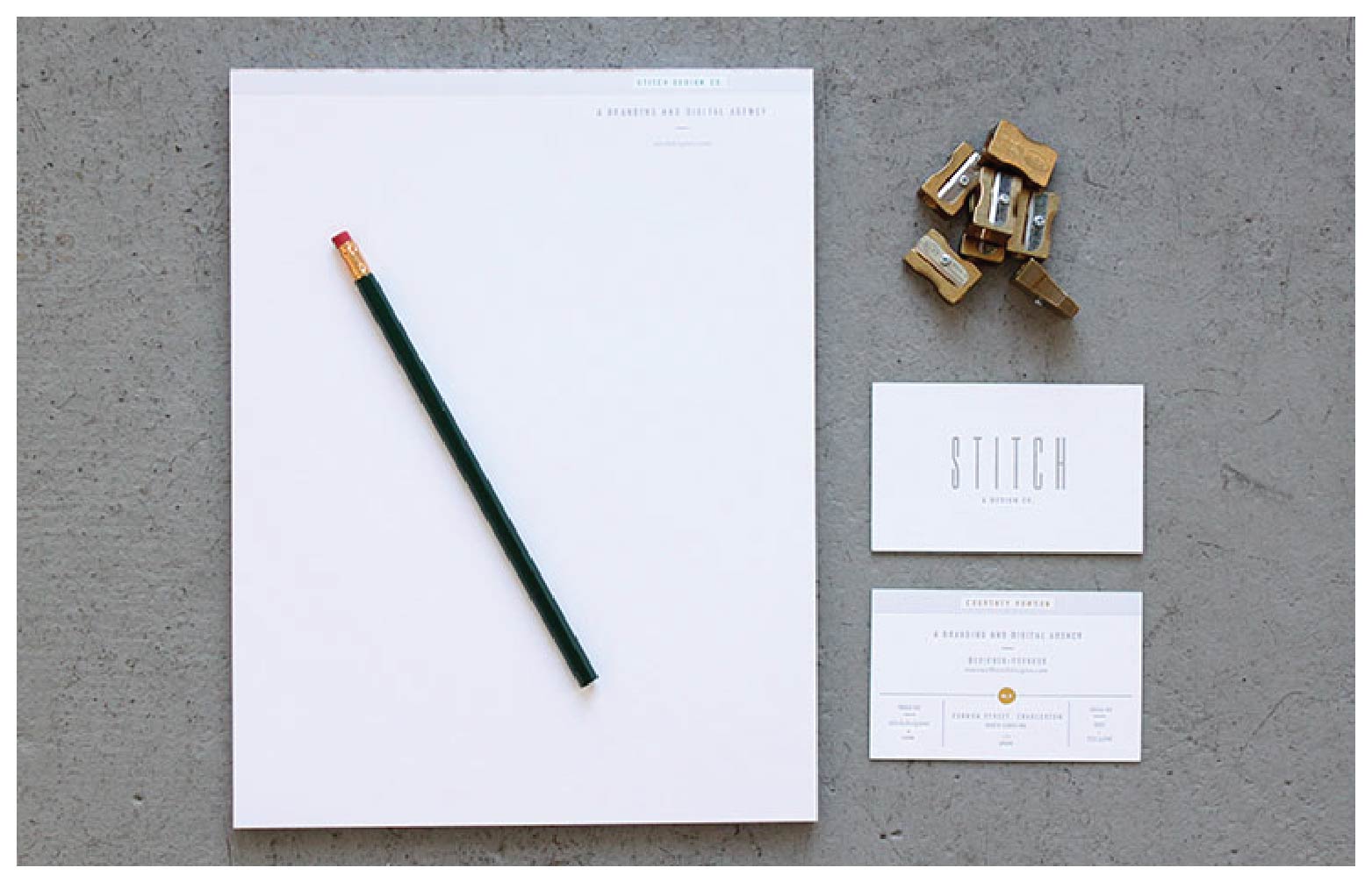
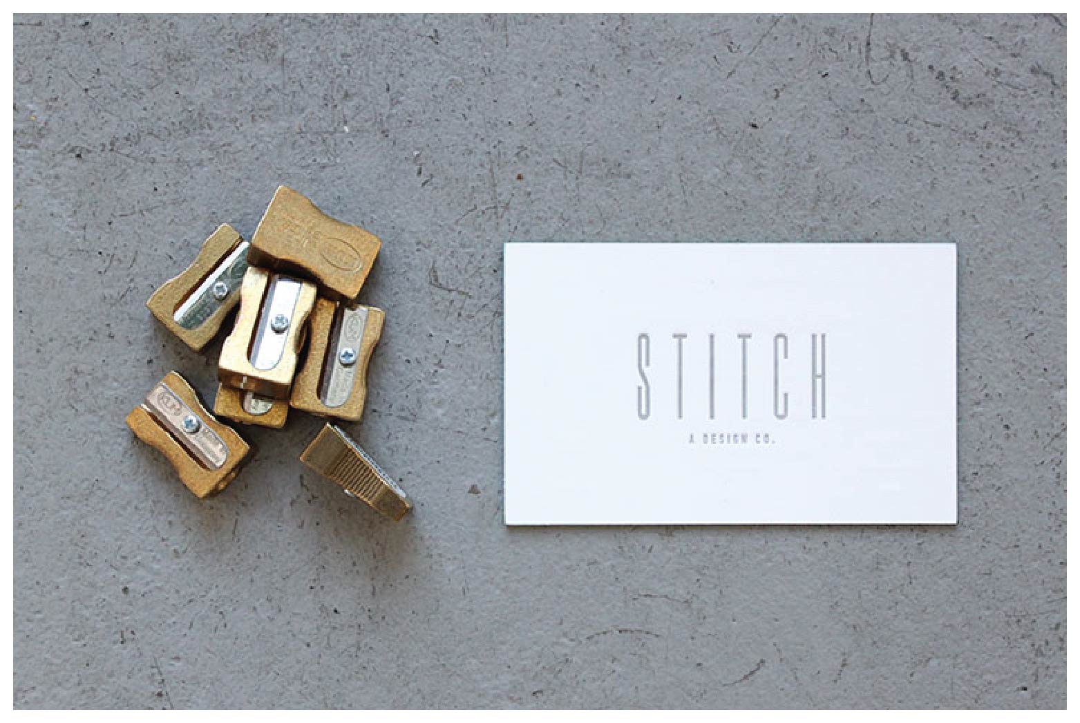
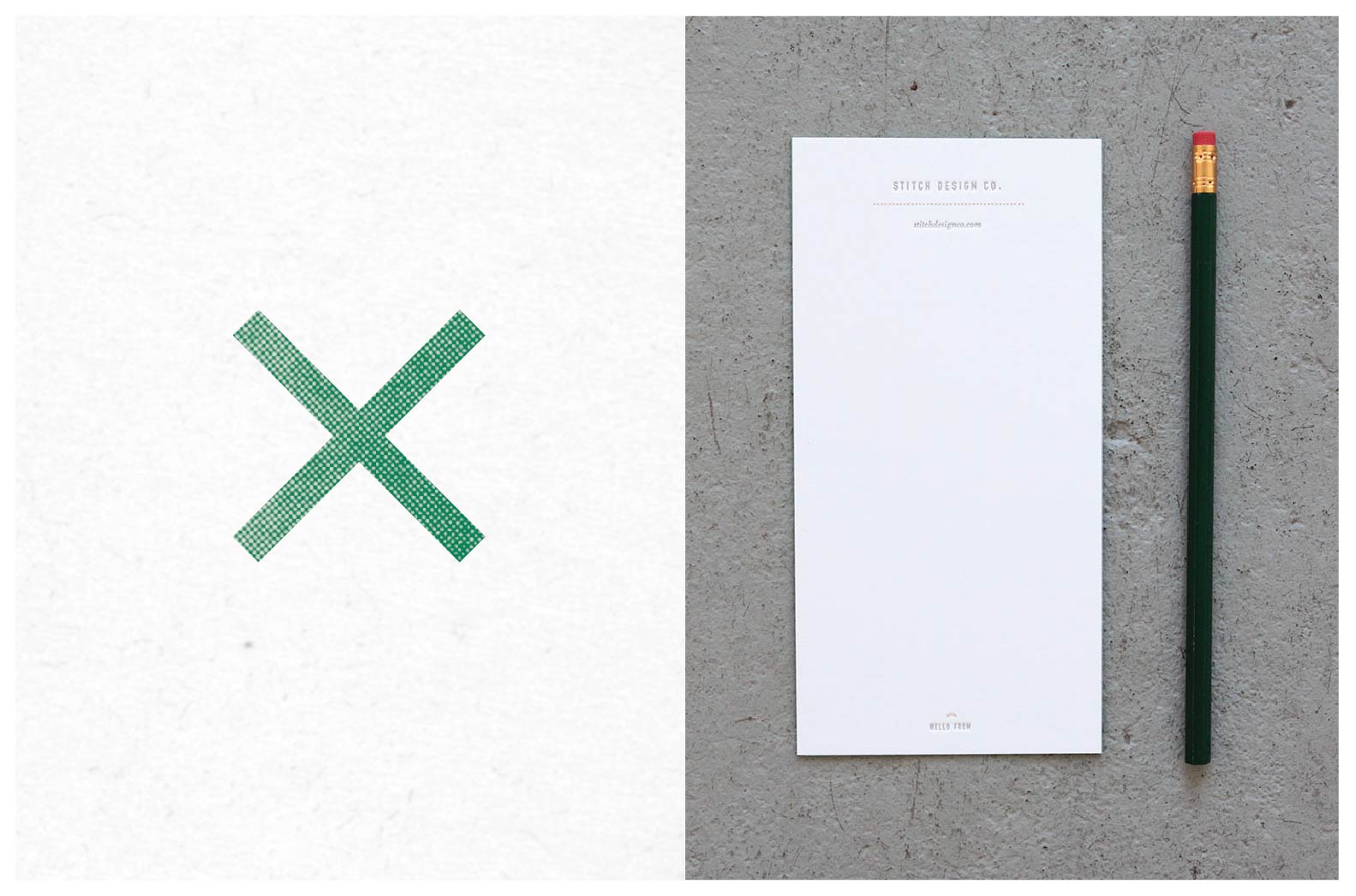
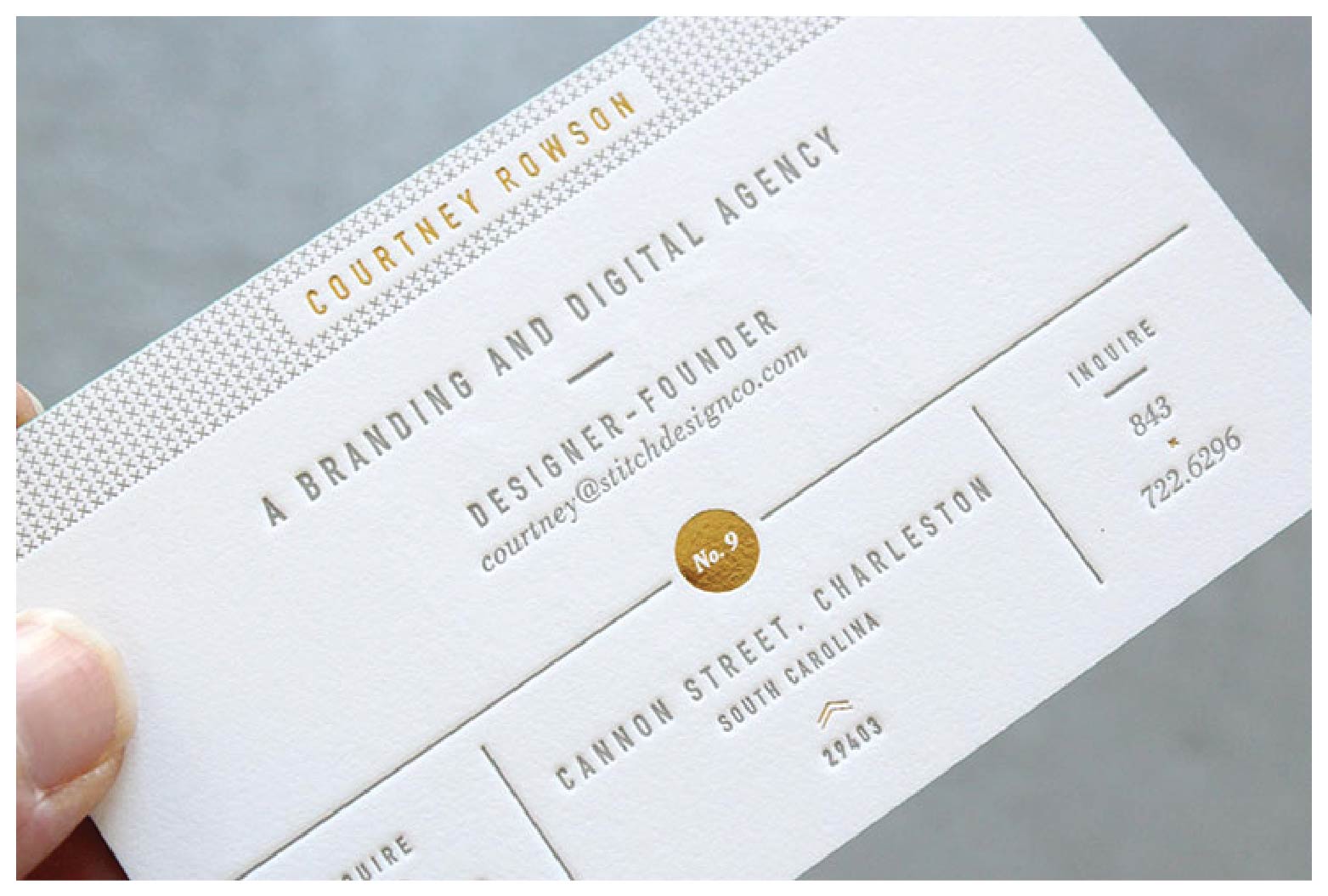
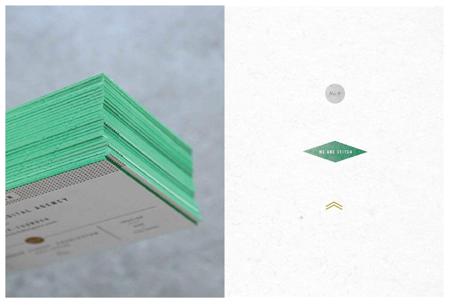
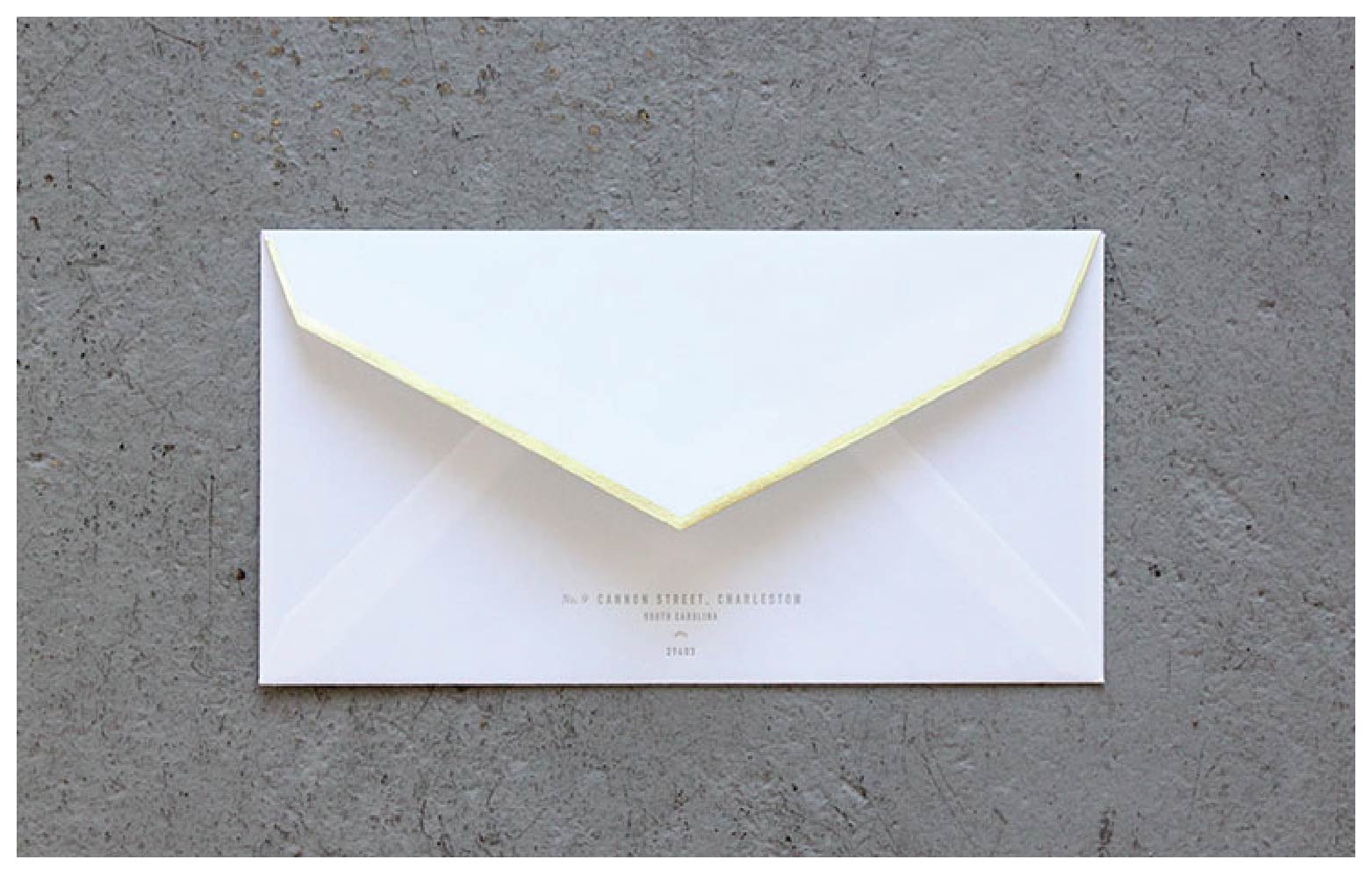
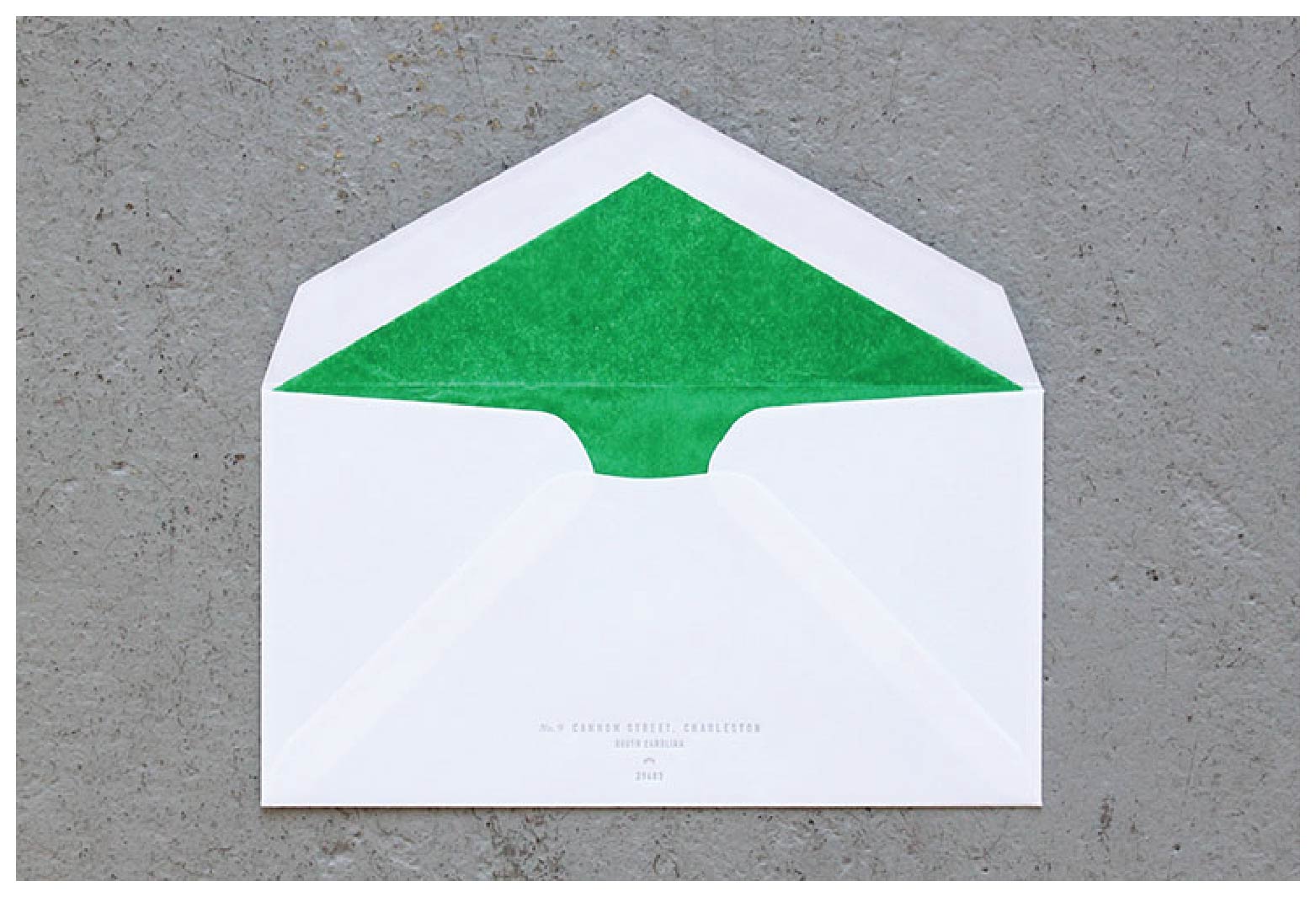
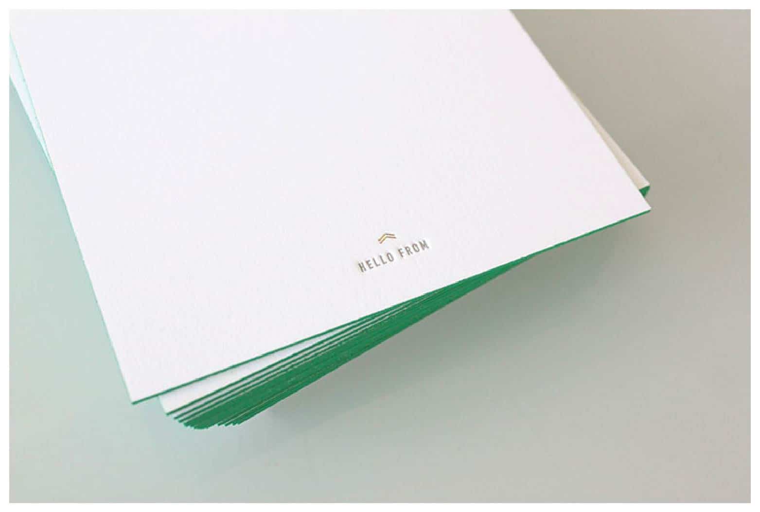
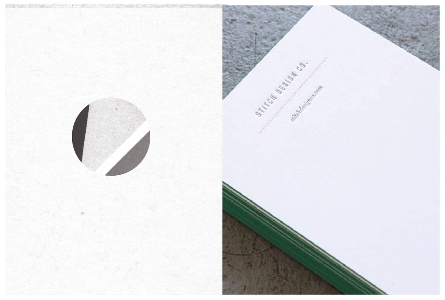
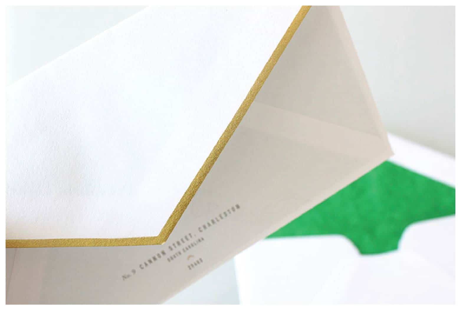
Along with a new website and blog, we’ve recently updated our stationery package. Gold foil, letterpress, green edging and tiny details are the elements that define our new look. We are currently infusing the new look into our office. We’ve changed the door to green and covered our store front windows with tiny gold “x’s” .
Posts Tagged ‘Stationery Package Design’
Hob Nob Stationery Package
December 11, 2012
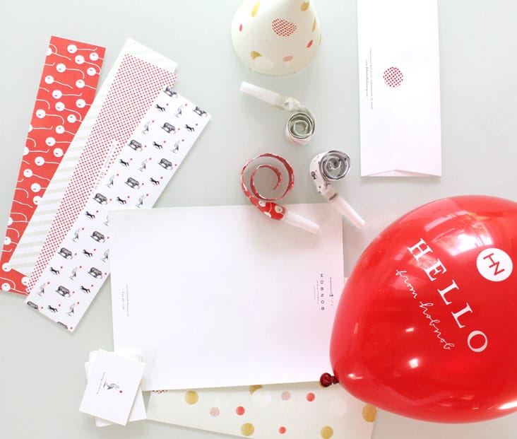
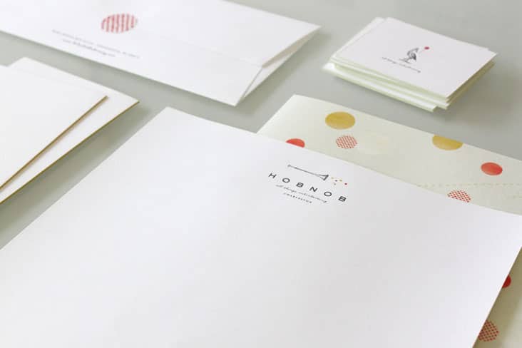
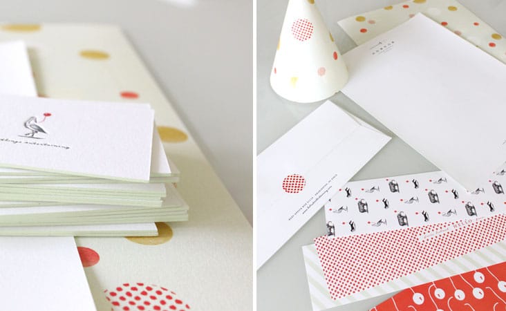
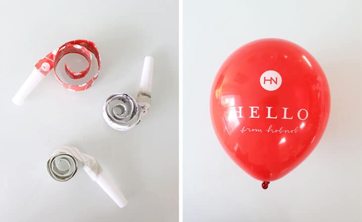
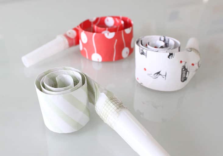
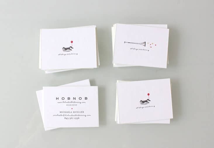
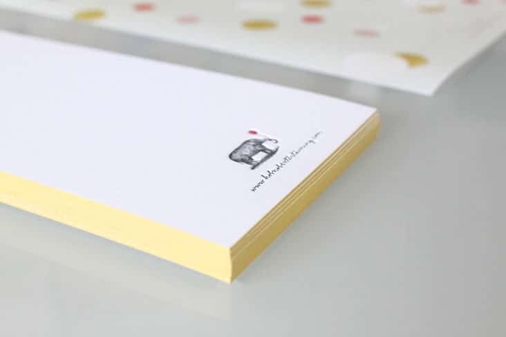
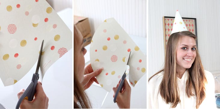
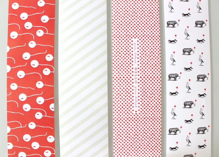
With a name and company like Hob Nob (see their branding here), we knew we couldn’t just design your standard stationery package. We designed this suite to feel unique, fun and interactive. The letterhead transforms into a party hat. The note card comes with a balloon attached and custom printed party blowers were a must have item to be included in this suite. Etched animals with balloons in tow adorn the fronts of the business cards. Read the rest of this entry »
Client: Hob Nob
Sunday Entertainment
August 21, 2012
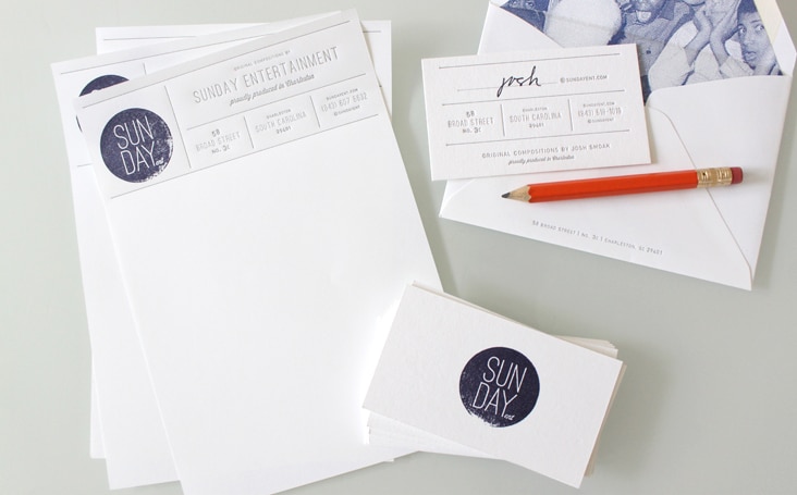
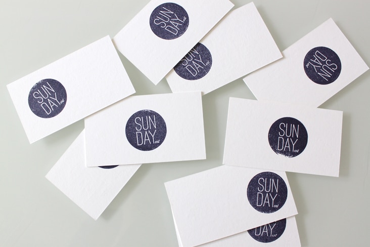
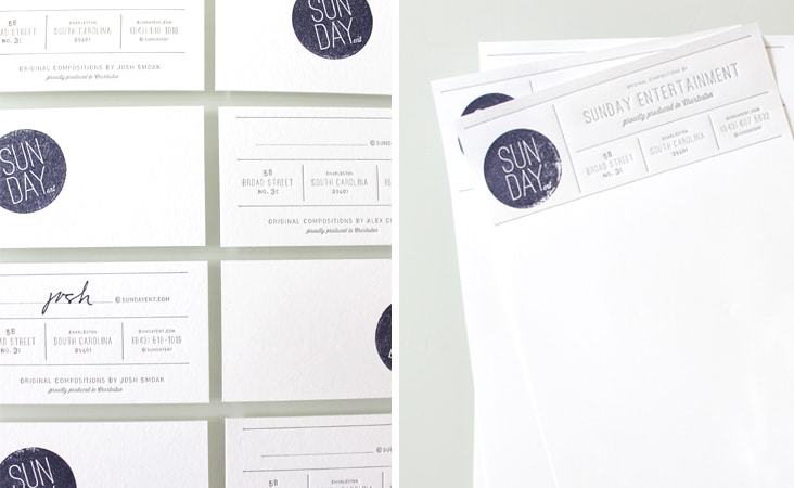
Josh and Alex of Sunday Entertainment are two inspiring dudes! They create original compositions for advertising, film trailers, brand films, and documentaries. We helped them freshen up their logo and apply it to some everyday letterpressed stationery. Check out their work, many of their catchy tunes will sound familiar!
Client: Sunday Entertainment
