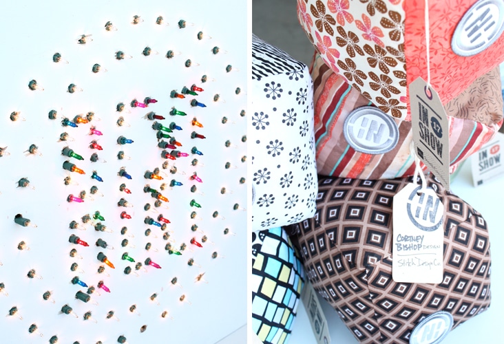
This past Friday we traveled up to Columbia for the 17th annual AIGA South Carolina InShow. We had fun hanging with our creative colleagues from across the state and were excited to bring home some awards for our clients including The Howie (Best In Show) for The Indie Grits Festival. Congratulations to: Cortney Bishop Design, Portland General Store, Sideshow Press, King Bean Coffee and The Indie Grits Festival.
Archive for the ‘Blog’ Category
Rewined
November 3, 2011
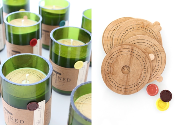
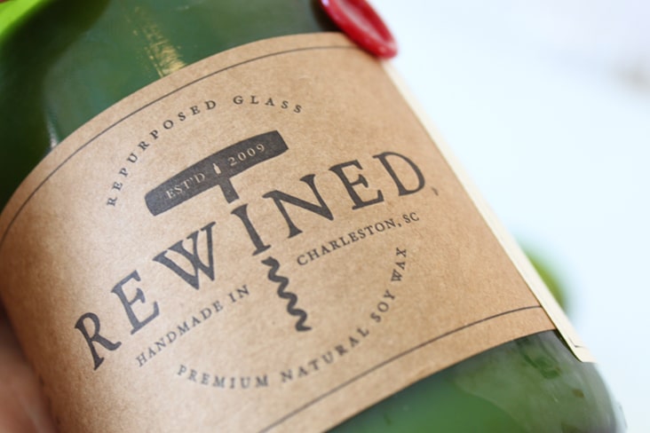
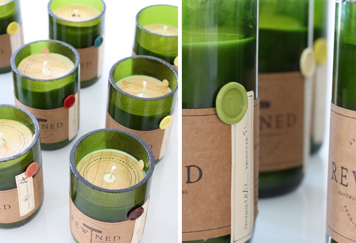
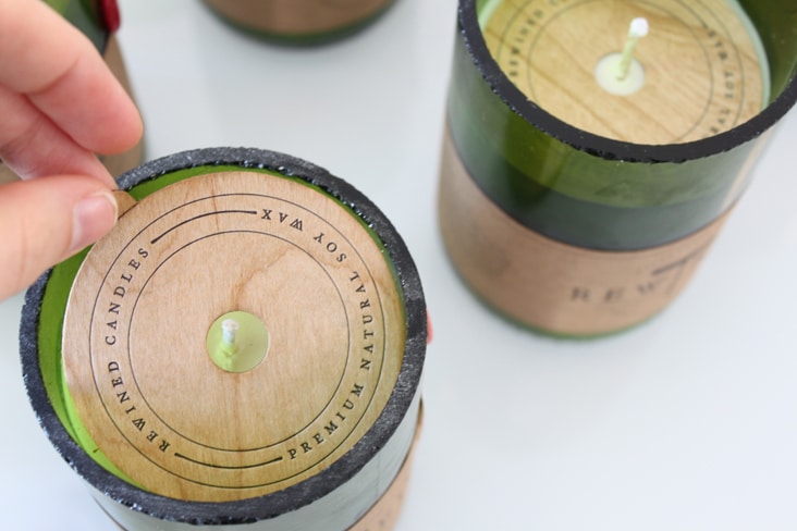
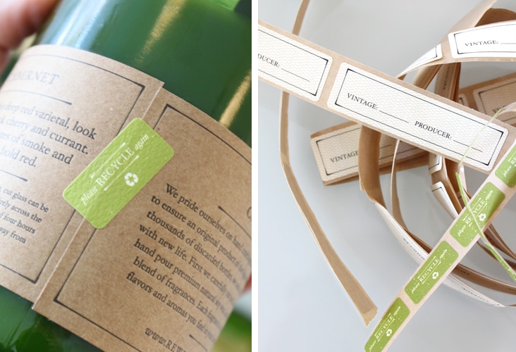
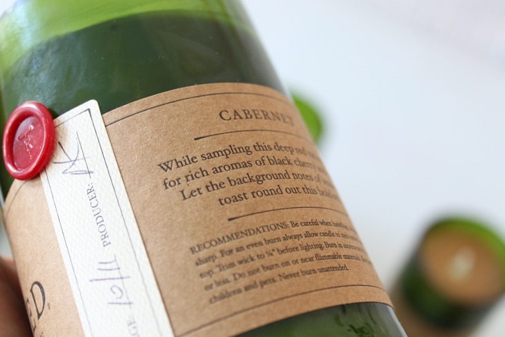
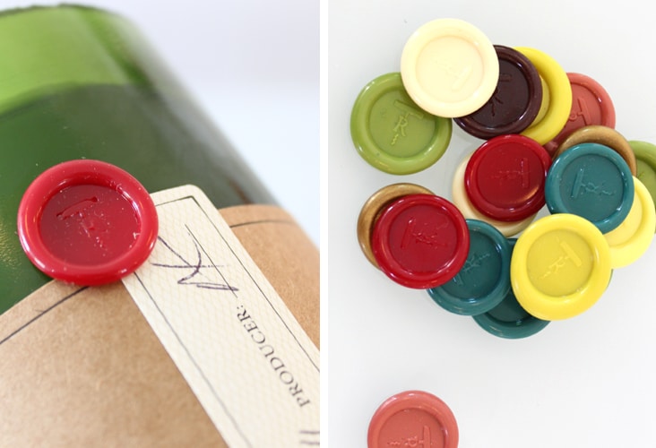
Rewined Candles are smart, smell great and now have a brand new logo and packaging. These handsome candles are all natural soy wax candles poured into discarded wine bottles. They have a family of intoxicating scents which are all designed to mimic flavors and aromas you find in your favorite varietals of wines. Adam came to us looking to enhance his current packaging. We redesigned his logo using hand-drawn type and redesigned his kraft paper labels with simple typography and a layered labeling system. Each candle has a “vintage and producer” label, allowing each candle to be signed and dated by the candle maker. A wood veneer wax topper sits on top of the candle to keep them clean and free of dust before use. Read the rest of this entry »
Client: Rewined Candles
Read Brothers
October 31, 2011
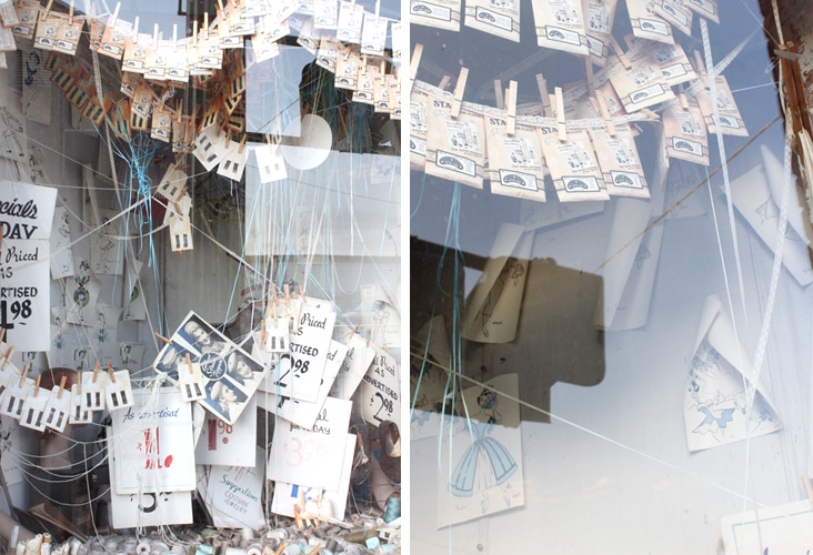
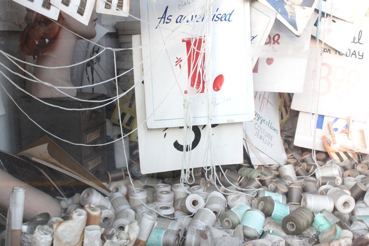
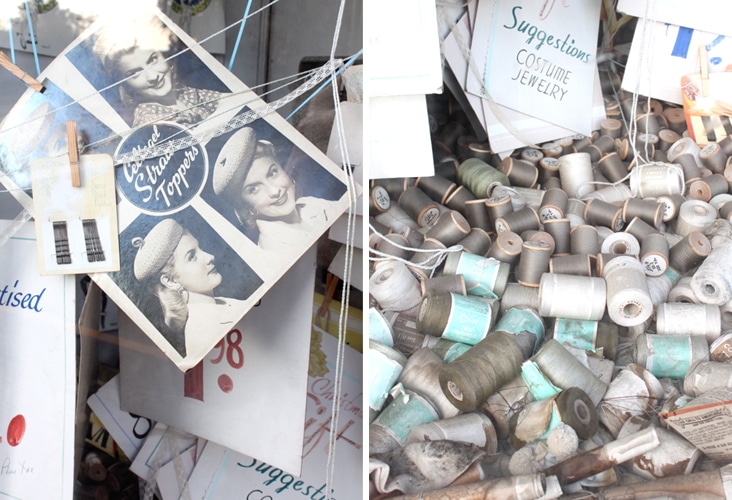
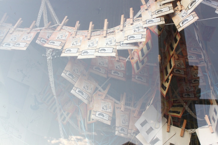
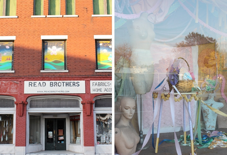
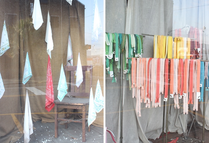
Read Brothers at 539 King Street is just around the corner from our office. It is one of our favorite spots in Charleston and has by far the best window displays in the whole city! We frequent the shop and it’s eclectic collection of merchandise for inspiration. It’s such a unique place, we just had to share. Read the rest of this entry »
Wilson Point
October 24, 2011
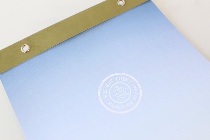
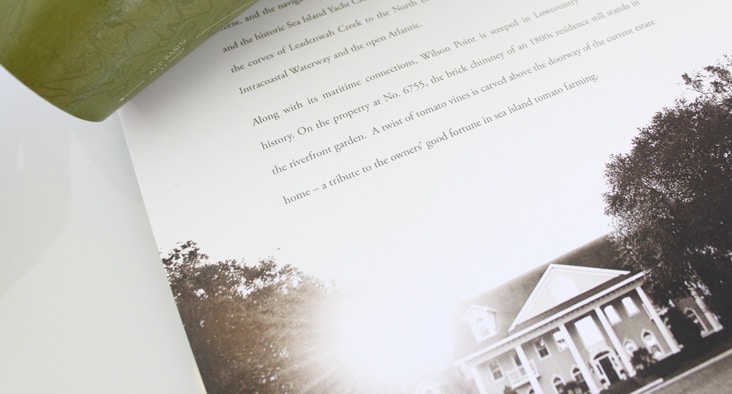
Wilson Point is a beautiful piece of property located on a winding saltwater creek just 20 miles South of Charleston. After nearly 300 years of ownership in the same family a 15 acre piece of land and home located on Wilson Point went up for sale. We worked with Sandy Lang (writer) and Ben Williams (photographer) to create a sales piece for this unique piece of property. Read the rest of this entry »
Client: Billy Walpole
The Gibbes Museum of Art – Linda Fantuzzo
October 17, 2011
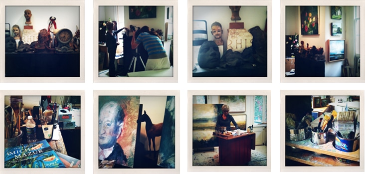
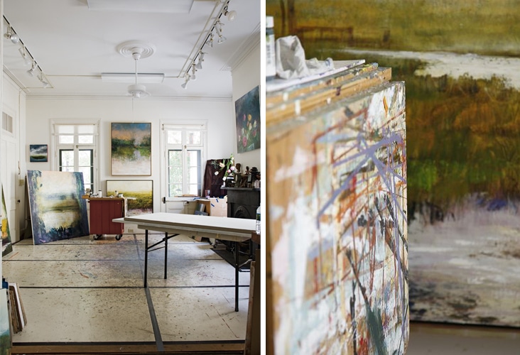
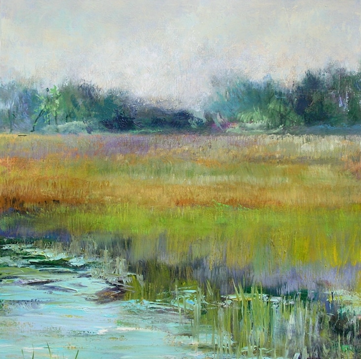
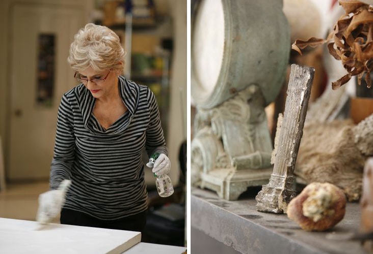
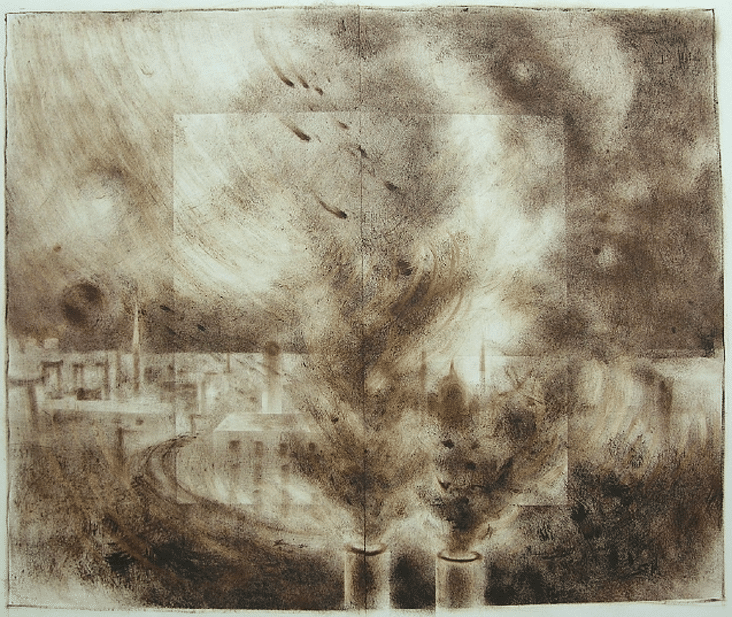
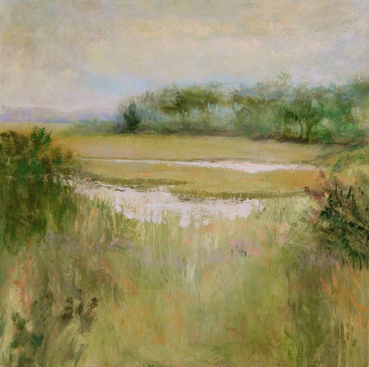
We recently formed an exciting new relationship with the Gibbes Museum of Art. As of August of this year, we’ve been helping them out with all of their design needs including exhibition title panels, banners, their quarterly magazine Signature and more. The talented artist, Linda Fantuzzo, was the cover story for the most recent issue of Signature. We have been long time admirers of Linda’s work so it was an extra special treat to be invited into her studio to see her inspiring work environment. Read the rest of this entry »
Client: Gibbes Museum of Art
Olde Savannah Flooring
October 10, 2011
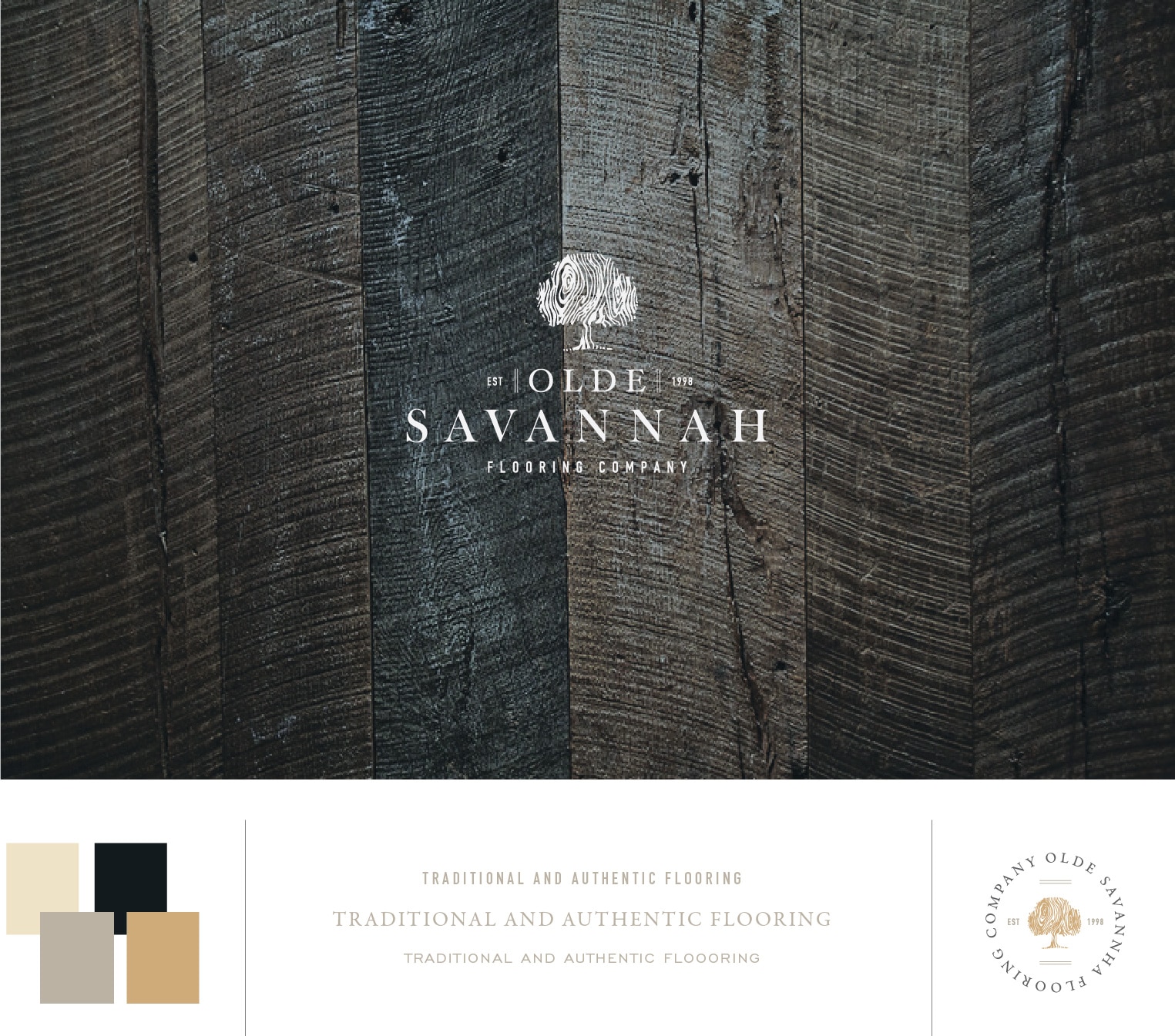
Olde Savannah Flooring is a custom wood flooring company out of Atlanta Georgia. Their hardwood floors are crafted by hand using European and old world techniques for distressing and finishing. Everything from floor patterns to color and finishing is completely custom and always executed to perfection. Their body of work was truly inspiring to us as we worked on their logo. We sought to capture their attention to detail in their new brand. We are in the process of re-designing their stationery package and website and look forward to sharing those with you soon.
Client: Olde Savannah Flooring
Lunch & Recess
October 6, 2011
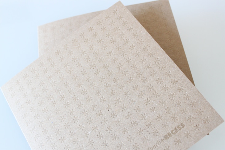
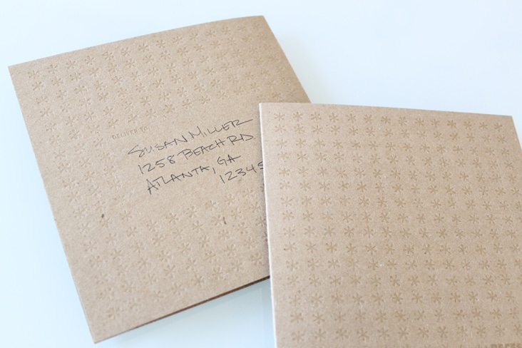
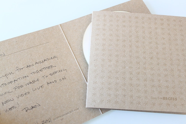
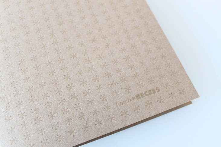
Lunch & Recess is a creative house who specializes in visual content. Their finished products take shape into TV spots, webmercials, brand films and webisodes. The came to us with an existing brand but needed a few additional pieces to help round out their presentation materials. We came up with the idea that serves multiple purposes; DVD Packaging, a thank you note, and a self mailer are all in one piece. Read the rest of this entry »
Client: Lunch & Recess
HOW Magazine
October 4, 2011
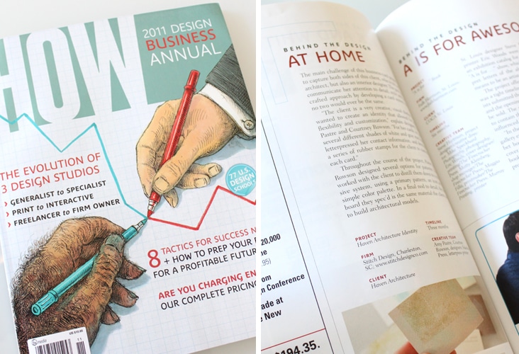
Exciting to see the Haven business cards featured in “Behind the Design” in this months issue of HOW Magazine.
Client: Stitch Design Co.
California African American Museum
September 29, 2011
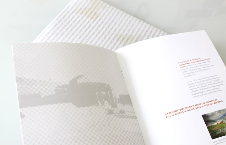
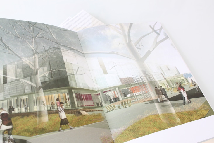
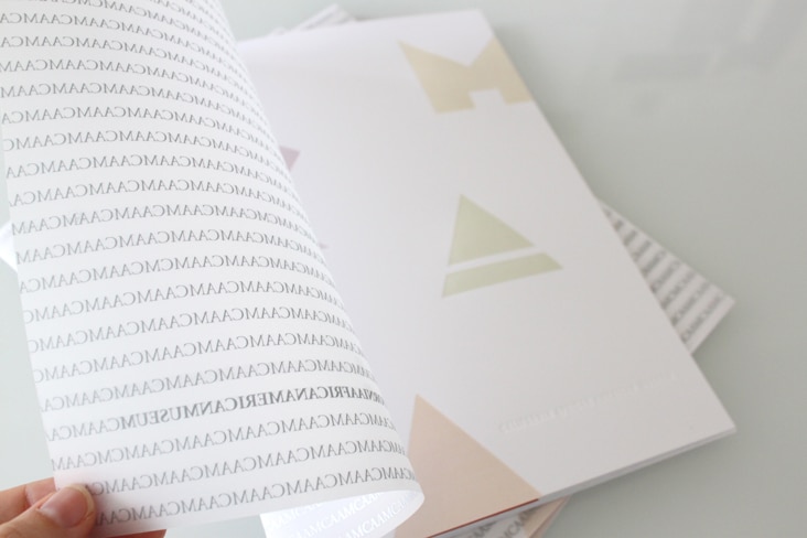
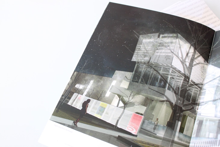
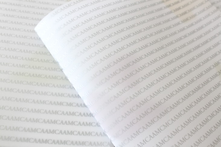
The California African American Museum (CAAM) is in the midst of a major expansion that will enable the museum to expand its programming and curatorial activities. We were honored to be asked to help showcase the new design in this brochure we recently completed for them. The expansion of the building is beautifully designed by Huff + Gooden Architects. We worked closely with the team at Huff + Gooden while designing this piece. A key feature of the design of this new building is an exterior translucent glass scrim “word wall” which is reflective during the day but at night is backlit causing it to have a luminous glow. Read the rest of this entry »
Client: California African American Museum
Rockport Publishers
September 26, 2011
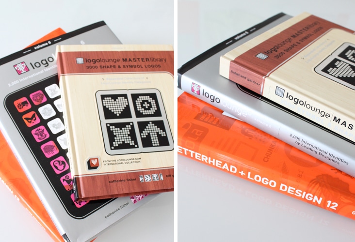
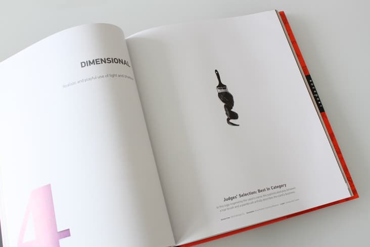
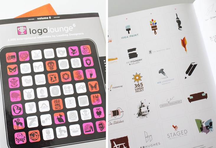
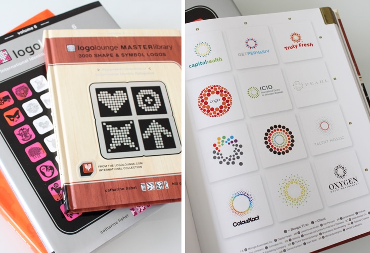
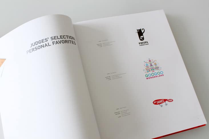
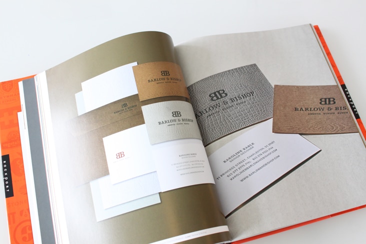
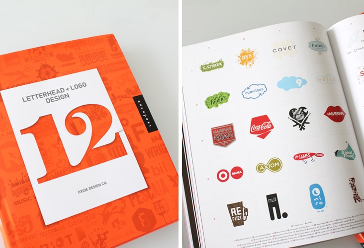
We did a little shopping online the other week and our package finally arrived! We were excited to receive Logo Lounge, Master Library 3000 Shape & Symbol Logos (page: 95), Logo Lounge Volume 6 (pages: 94, 118, 146, 168, 169) and Letterhead + Logo Design 12 (pages: The Cover, 9, 58, 59, 61, 64, 78, 86, 91, 92, 104, 127, 128, 130, 169, 201, 208, 210). We are thrilled to see our work in print in each of these three great publications. Read the rest of this entry »
Client: Stitch Design Co.
