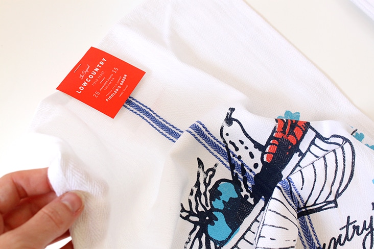
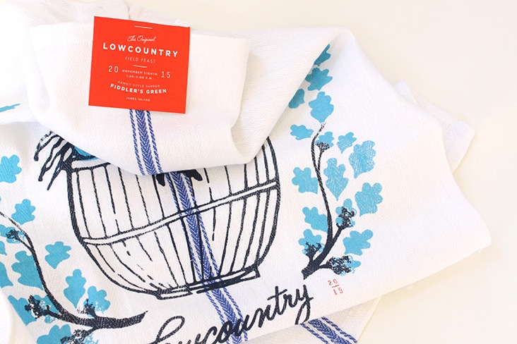
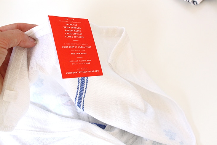
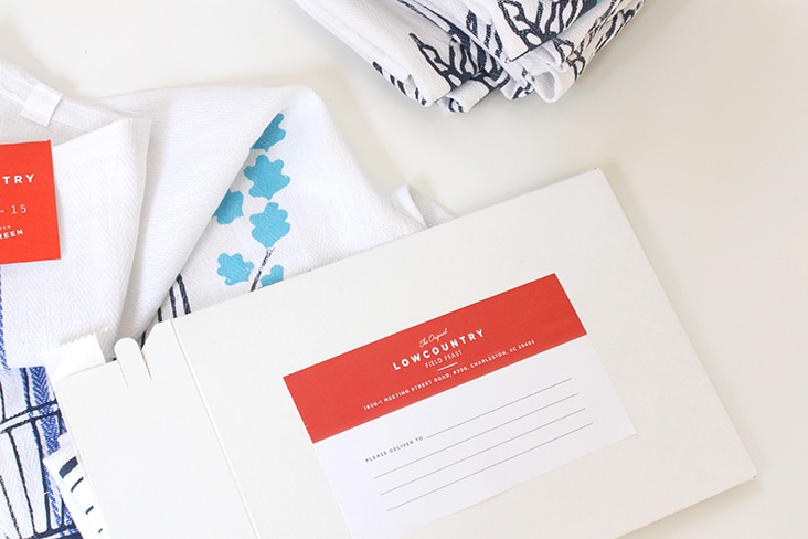
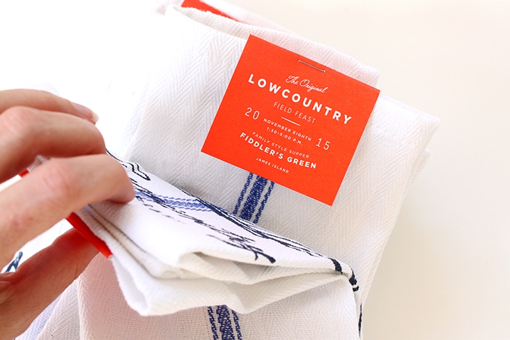
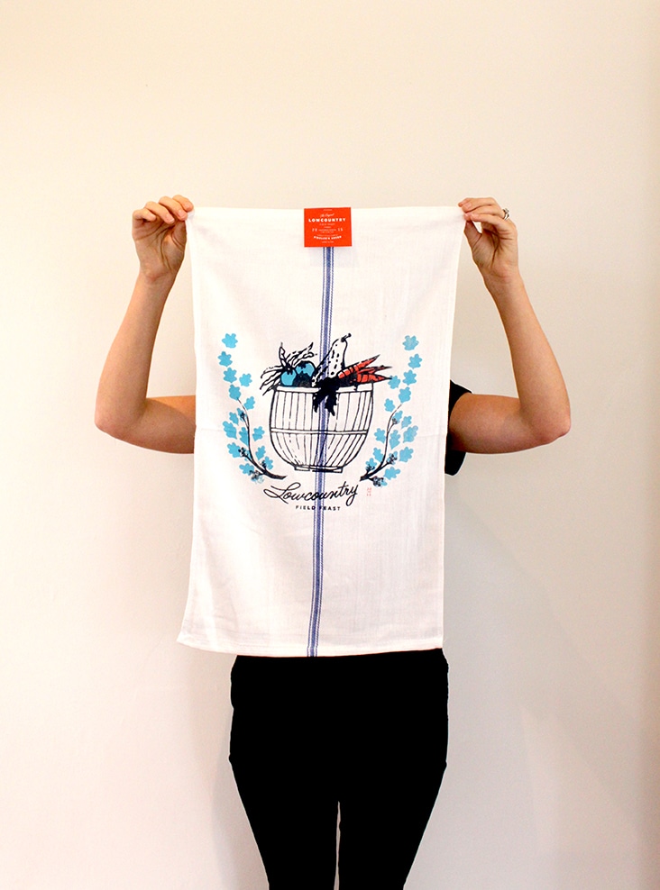
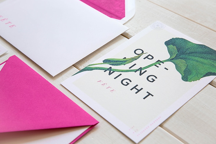
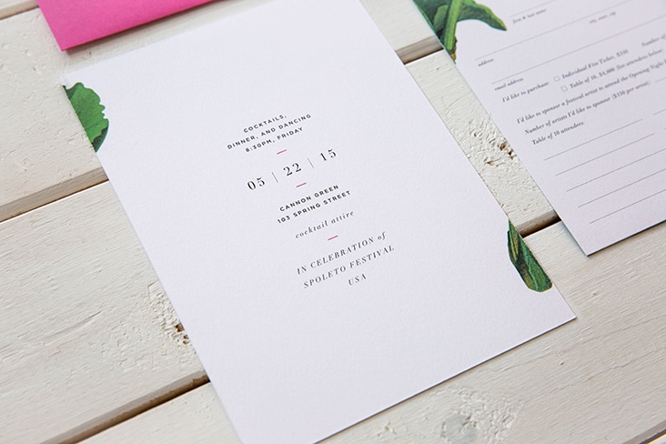
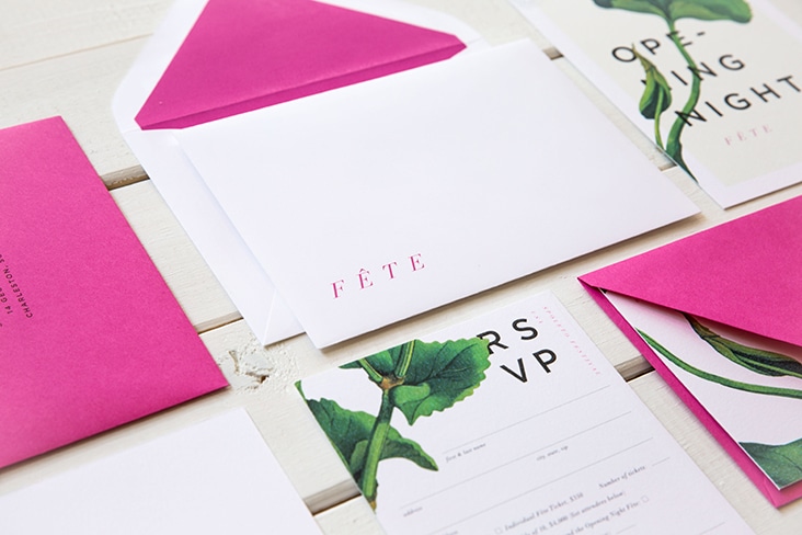
It’s that time of year again! The 2015 Lowcountry Field Feast invites are assembled and arriving at doorsteps this week. This year’s invite comes disguised as a kitchen towel. Our friends at Sideshow Press silkscreened and letterpressed these beauties. See invites from year’s past (2010, 2011, 2012, 2013, 2014).
Archive for the ‘Print’ Category
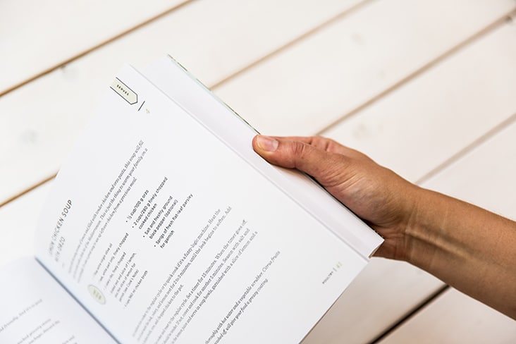
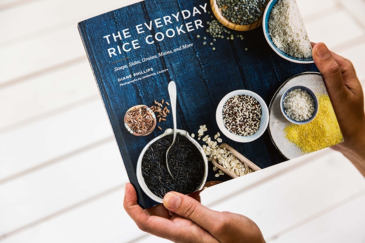
The Everyday Rice Cooker
July 23, 2015
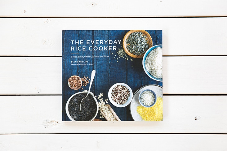
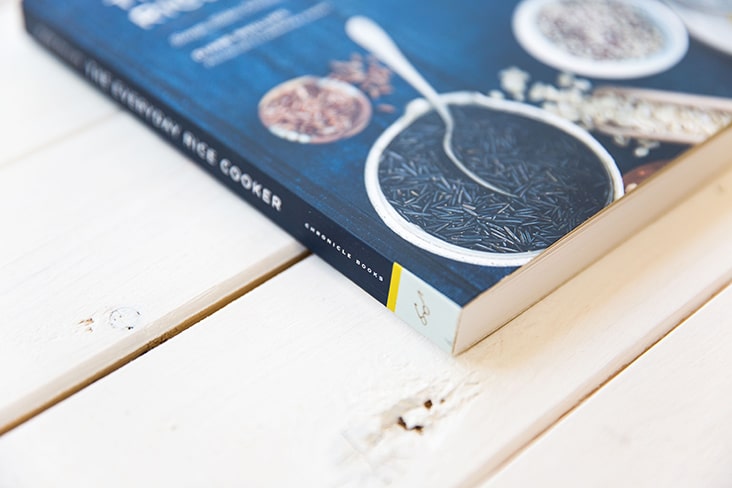
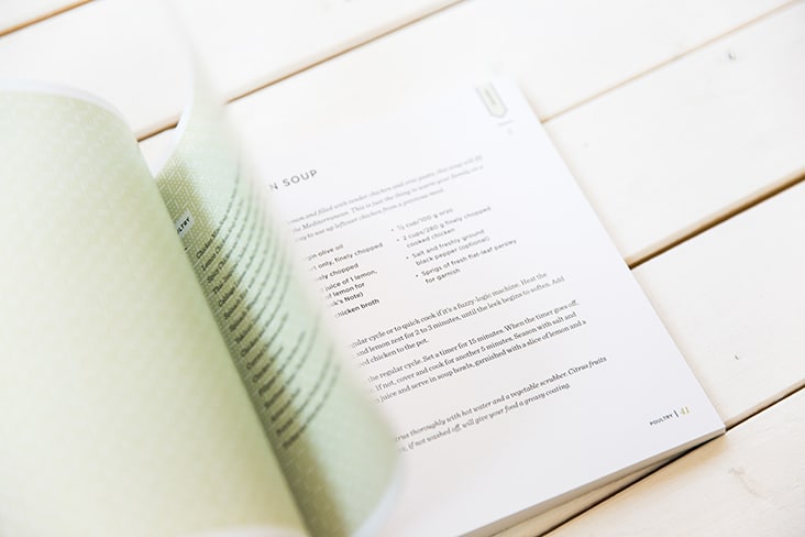
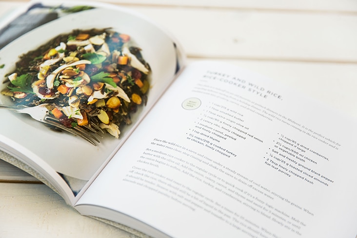
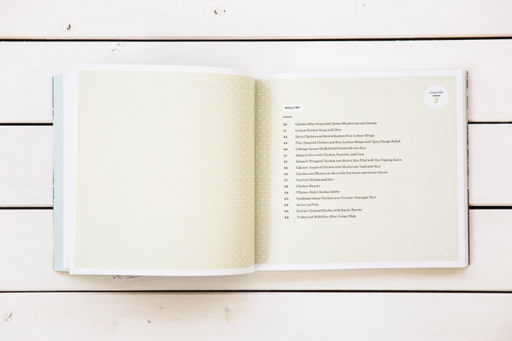
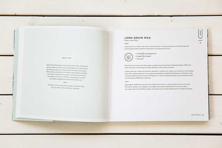
We were delighted to work with Chronicle Books on the design of The Everyday Rice Cooker by Diane Phillips. The book is full of simple yet delicious rice-cooker dishes. We created a range of rice inspired patterns that pair nicely with the books beautiful photography by Jennifer Causey.
Client: Chronicle Books
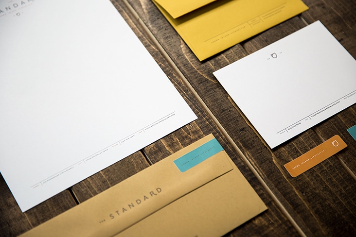
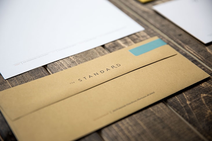
The Standard Identity Package
May 19, 2015
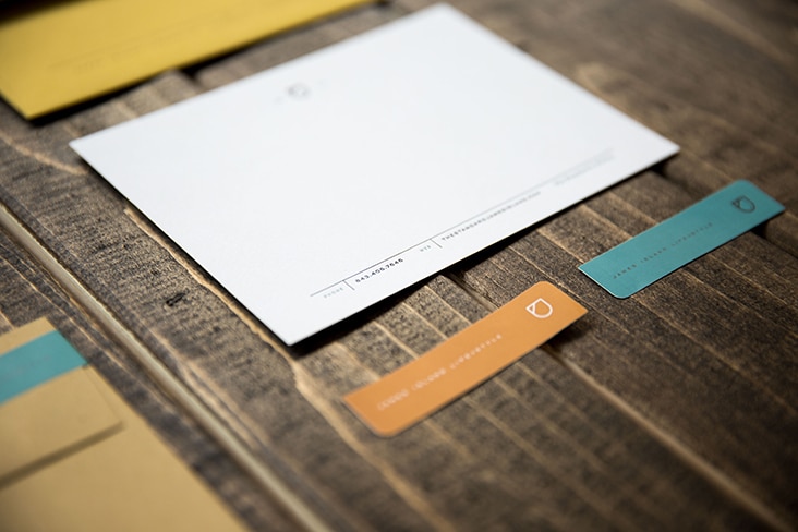
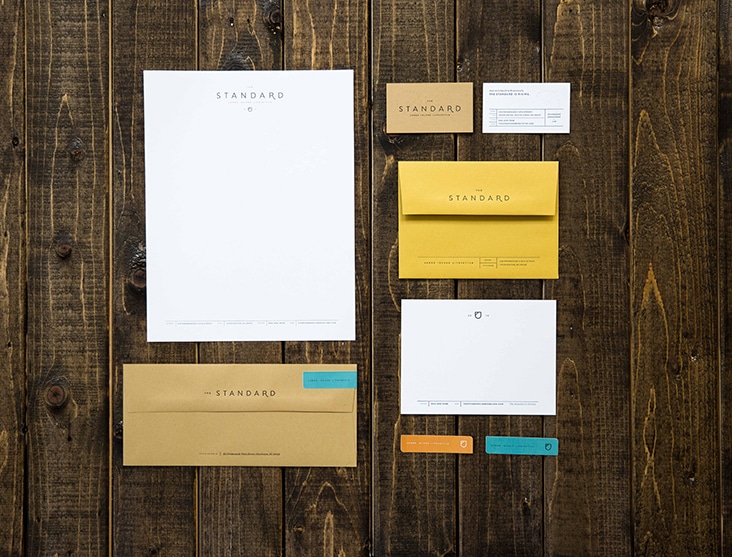
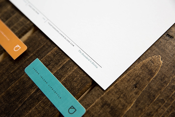
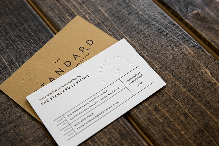
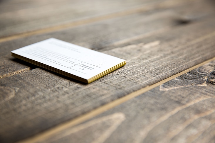
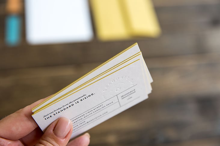
The Standard is a live/work development under construction now on James Island in Charleston. The stationery suite utilizes a mix of papers and printing processes to communicate the quality of this development as well as the casual, easy-living lifestyle that James Island has to offer.
Client: Mike Schwarz
The Pressery
April 2, 2015
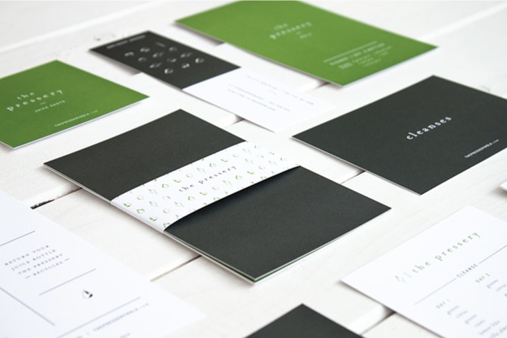
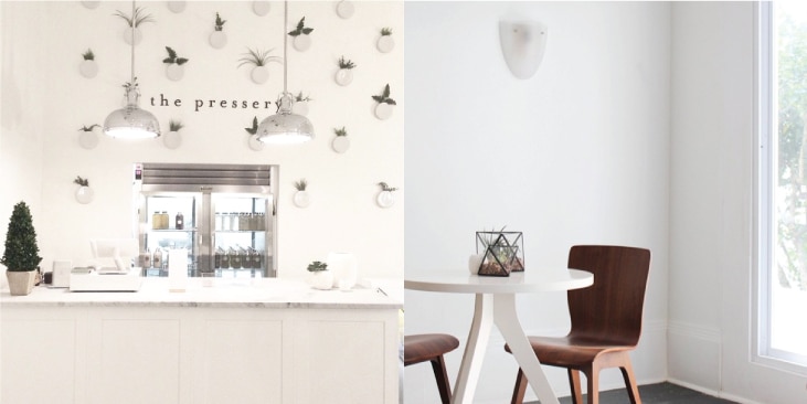
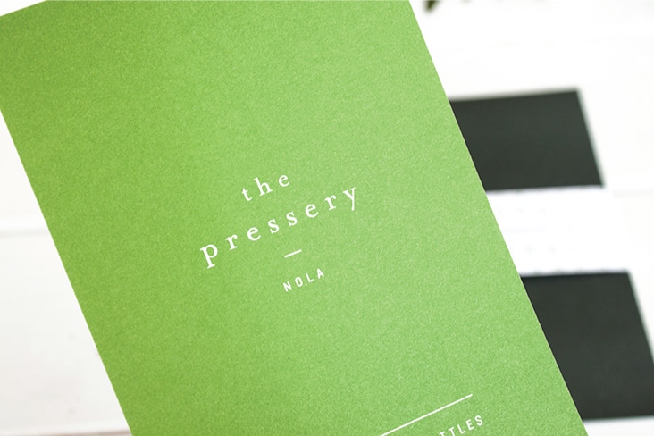
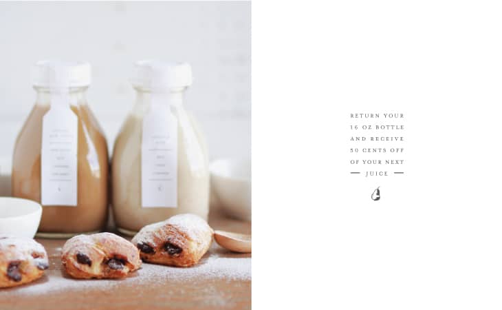
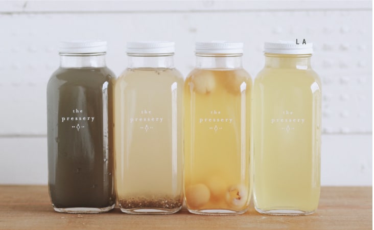
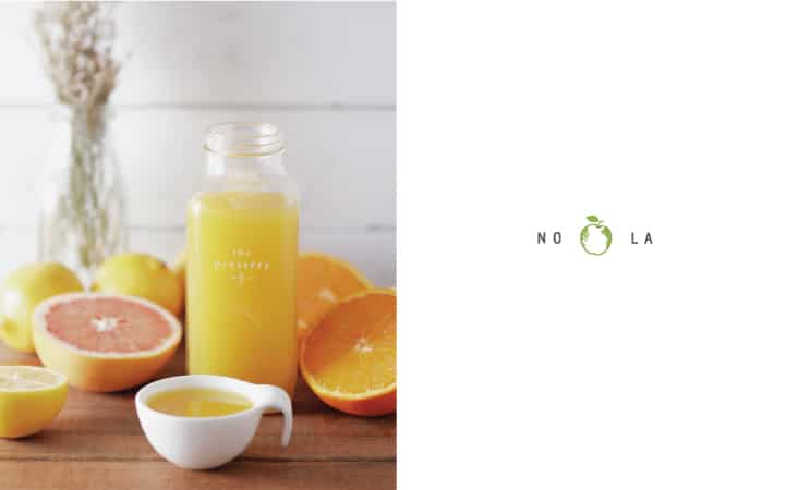
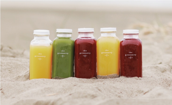
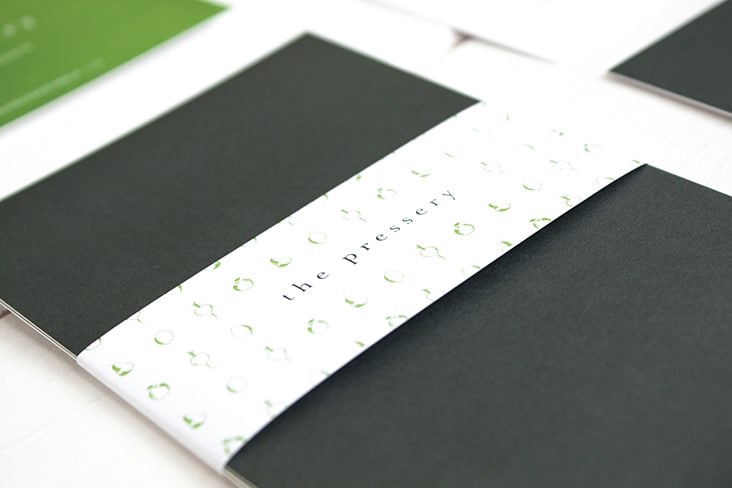
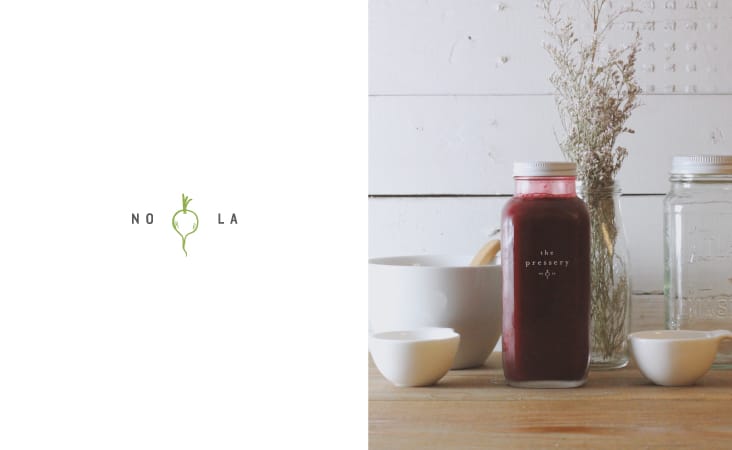
Located on Magazine Street in New Orleans, The Pressery is a new restaurant and juice bar serving organic cold-pressed juice and fresh meals. A clean design aesthetic was utilized on all branded elements. From logo development to signage to packaging design – a simple and fresh approach was used to complement the cleansing juices and meals served daily.
Packaging Photography by Thao Tran
Client: Kim Nguyen
Legends Vol. 26
March 12, 2015
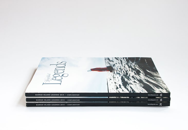
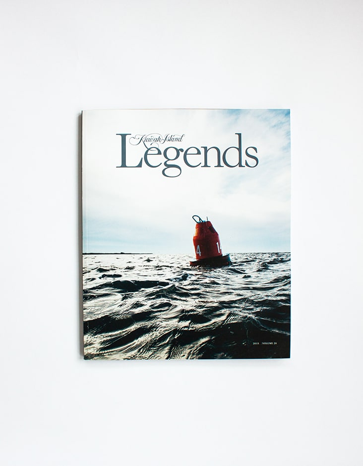
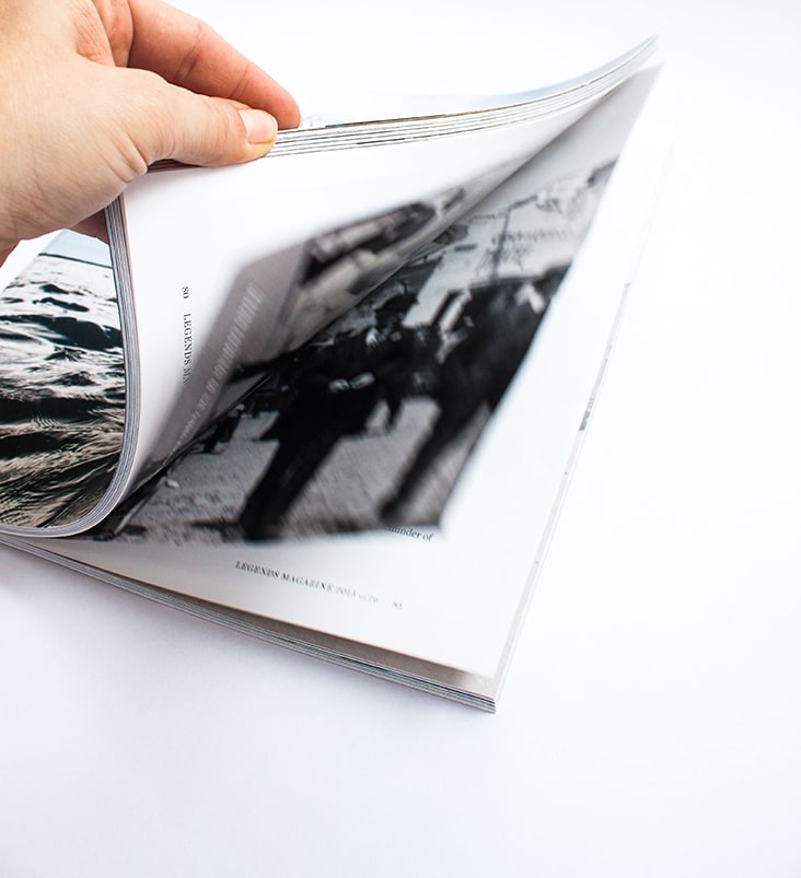
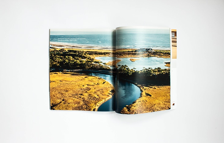
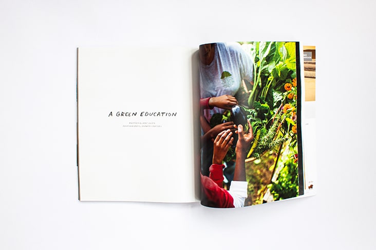
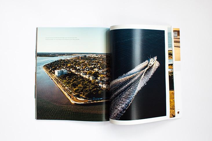
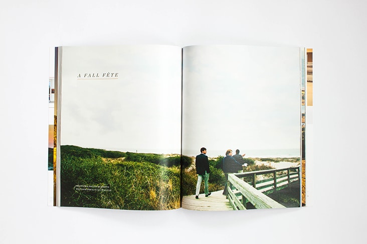
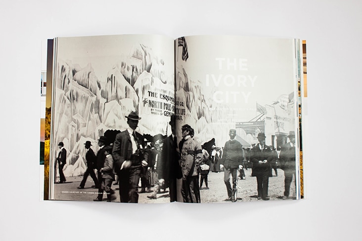
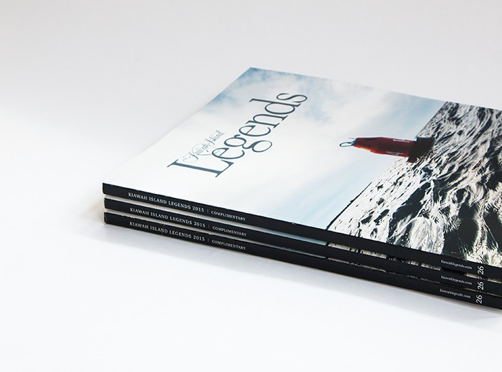
Another issue of Legends Magazine is published. We are honored to have the opportunity to design this publication from start to finish each year with the thoughtful guidance of Editor Hailey Wist. This year’s issue is a collection of articles which capture the lifestyle, the culture, and the vibrant community of Kiawah Island.
Legends 26 cover image: Peter Frank Edwards
Client: Kiawah Island
Stationery Package for Salt & Co.
February 3, 2015
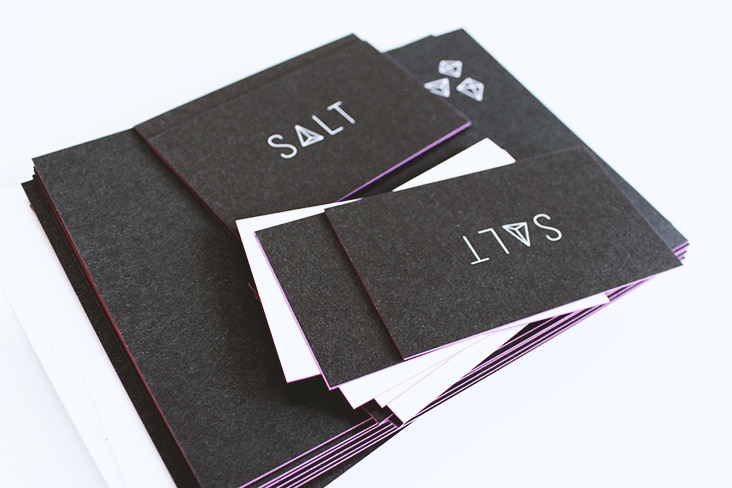
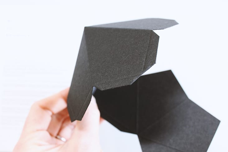
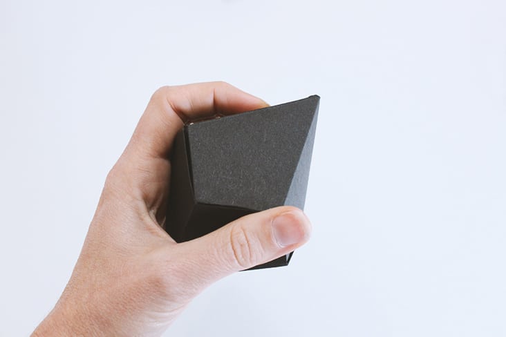
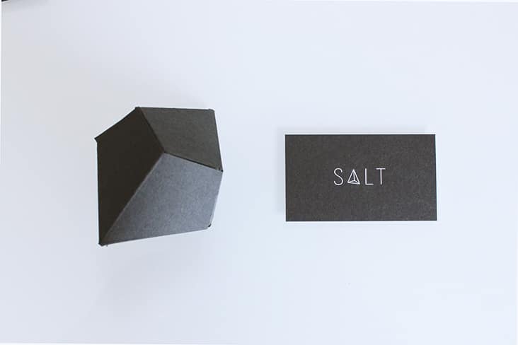
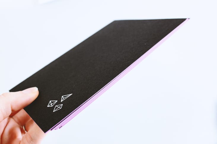
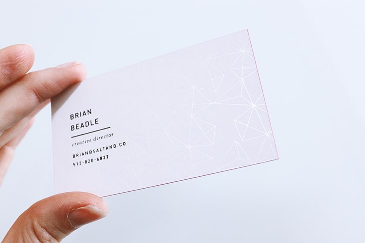
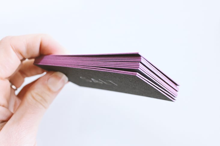
More new work to share from Salt & Co. Duplexed paper, foil stamp and edging along with die-cut, three dimensional crystals bring this re-brand to life.
Client: Brian and Allison Beadle
The Cedar Room
January 27, 2015
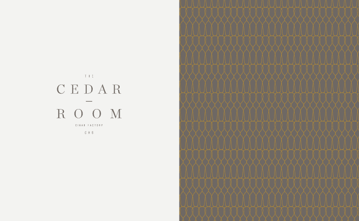
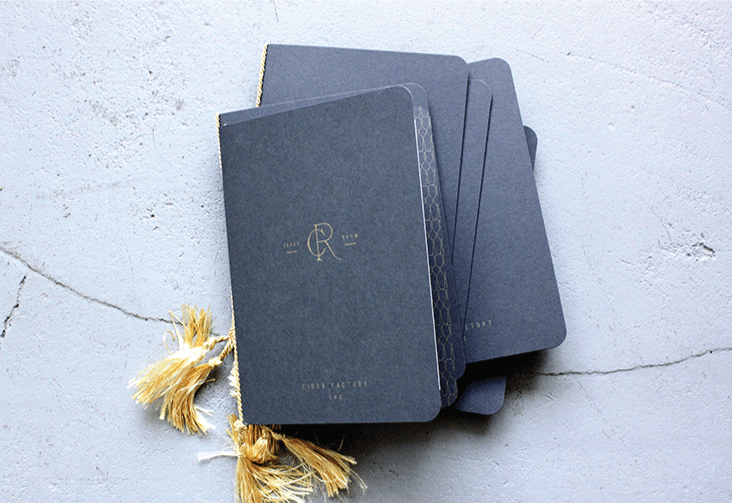
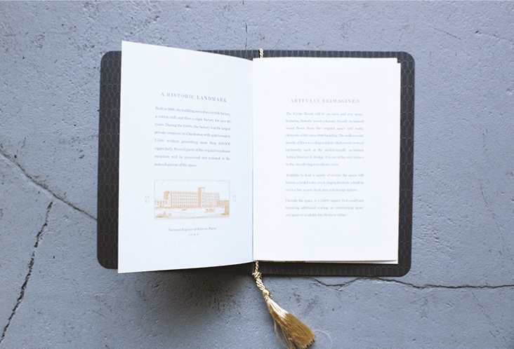
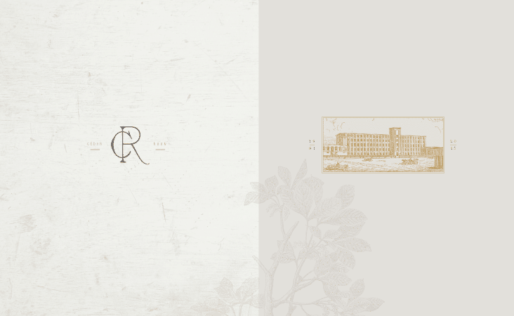
The Cedar Room at the Cigar Factory will be an open and airy space in a historic circa 1880 building. We’ve had the pleasure of working on this project from the beginning, starting with the naming, logo creation and a teaser piece to help promote the space that will open this Spring. We used a handsome palette, metallic inks and traditional type to establish the tone for this inspiring space.
Client: The Cigar Factory
Spoleto Festival USA 2015
January 15, 2015
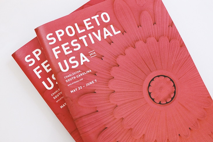
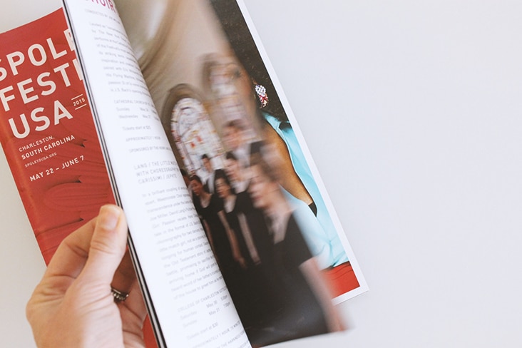
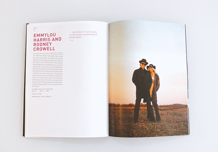
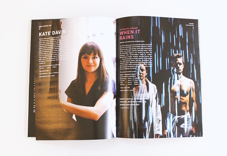
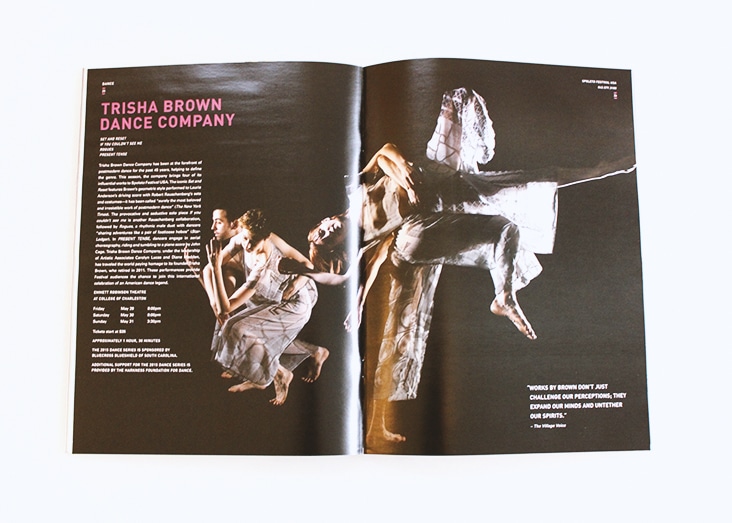
The 2015 Spoleto ticket brochures have arrived. This year is another fabulous line up of performances. Bold type and color pop against beautiful performance imagery.
Client: Spoleto Festival USA
