Archive for the ‘Blog’ Category
Woodsfolk Logo Process
January 30, 2013
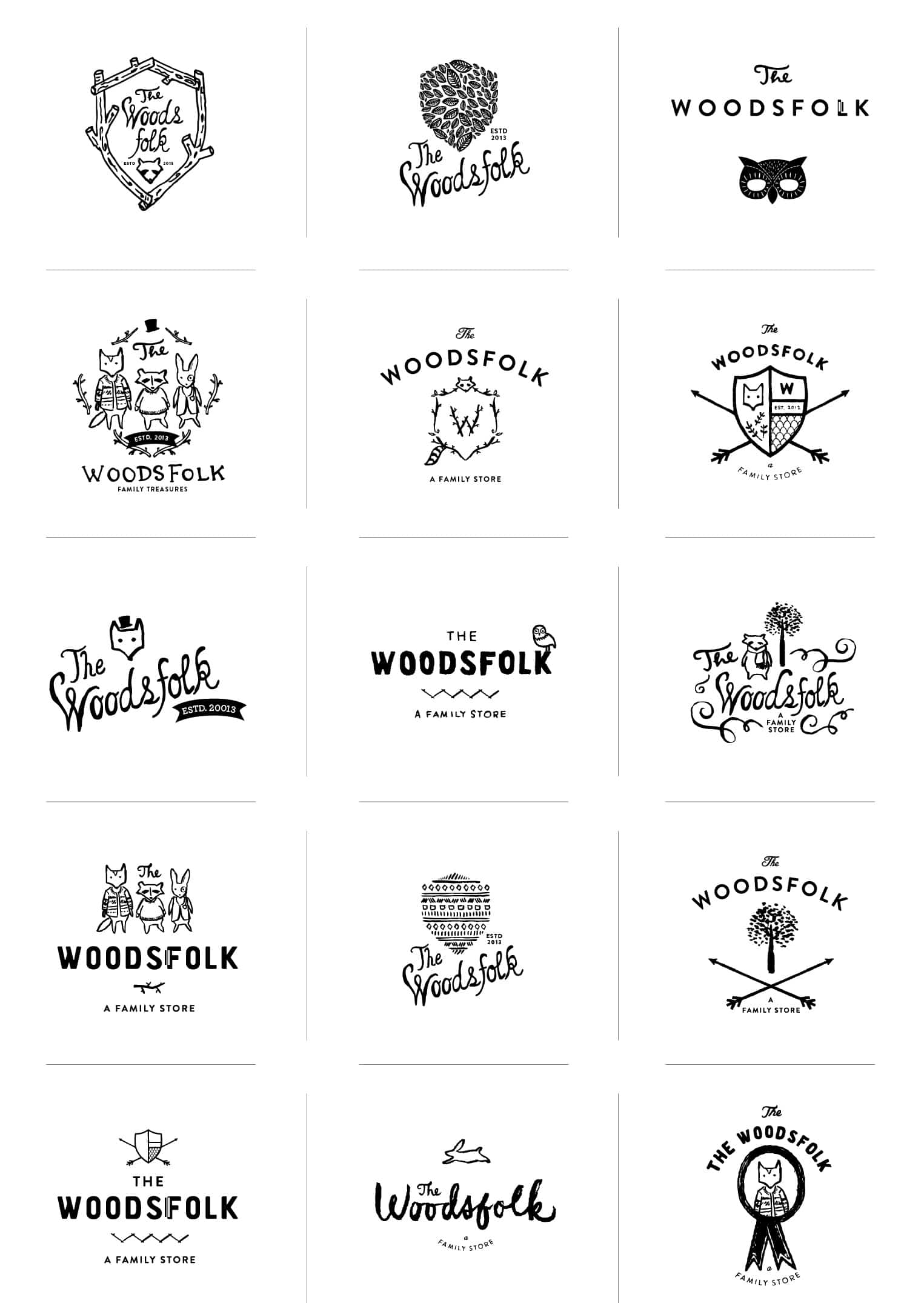
These collection of logos are from a recent branding exercise for The Woodsfolk, a family store in Melbourne Australia. The Woodsfolk is a destination store with houseware items curated to appeal to the design conscious family. The name quickly conjured up many great ways to illustrate the fun and whimsical store. So many so, it was hard to stop! We can’t wait to share the finished brand…soon!
Client: The Woodsfolk
Dovetail & Co.
January 28, 2013
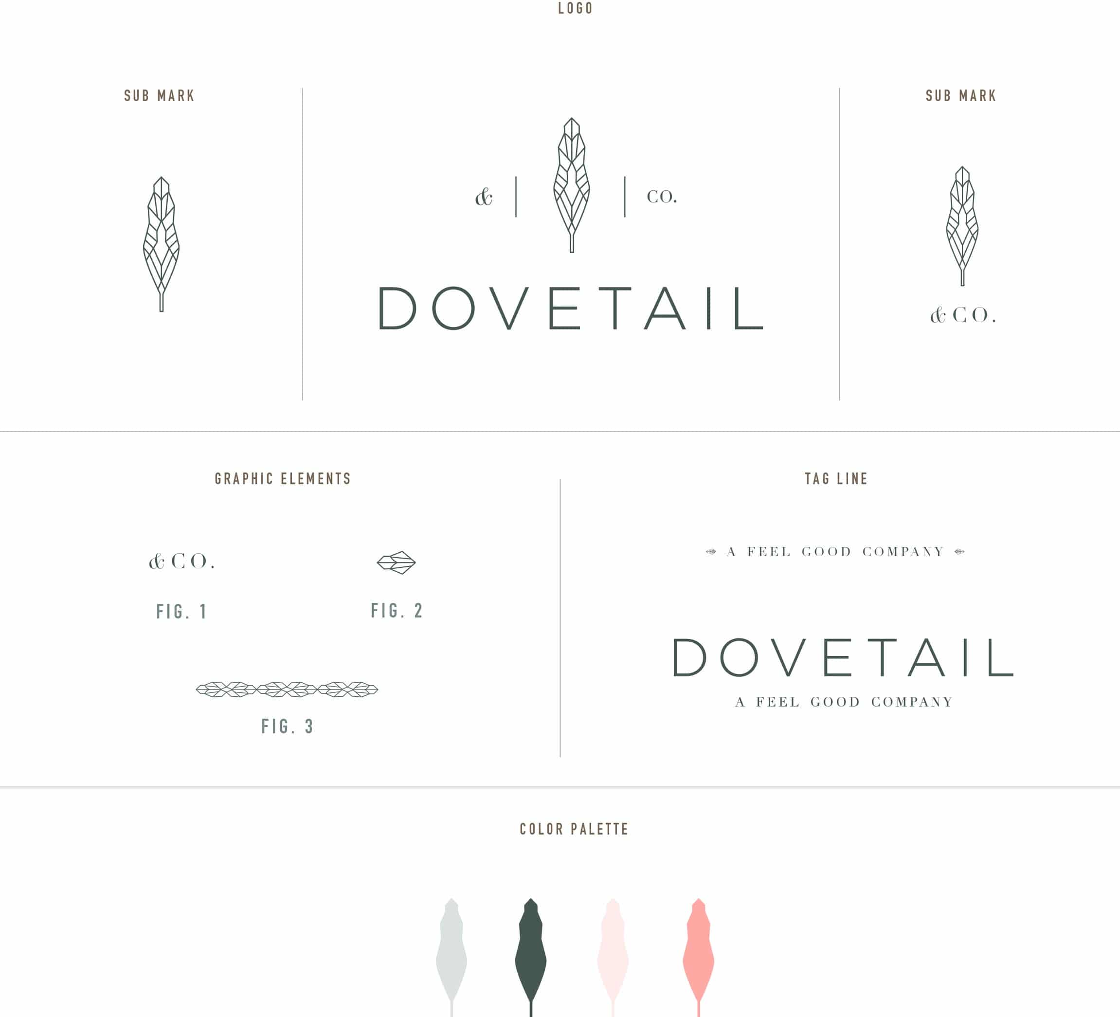
Dovetail & Co. is a unique new company designed to eliminate the guess work of finding an experienced practitioner in the health and wellness industries. By getting to know your needs, goals and experiences, Dovetail accurately matches you with the ideal practitioner for single service visits, or as part of a long-term health, nutrition or fitness program. Read the rest of this entry »
Client: Dovetail & Co.
Cooking in Season
January 16, 2013
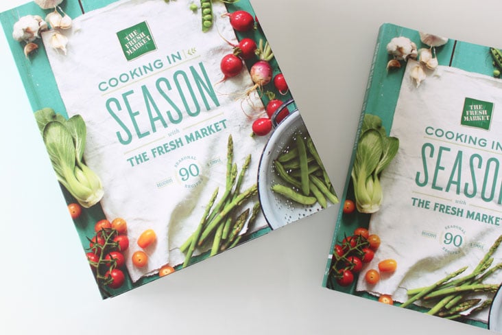
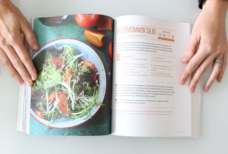
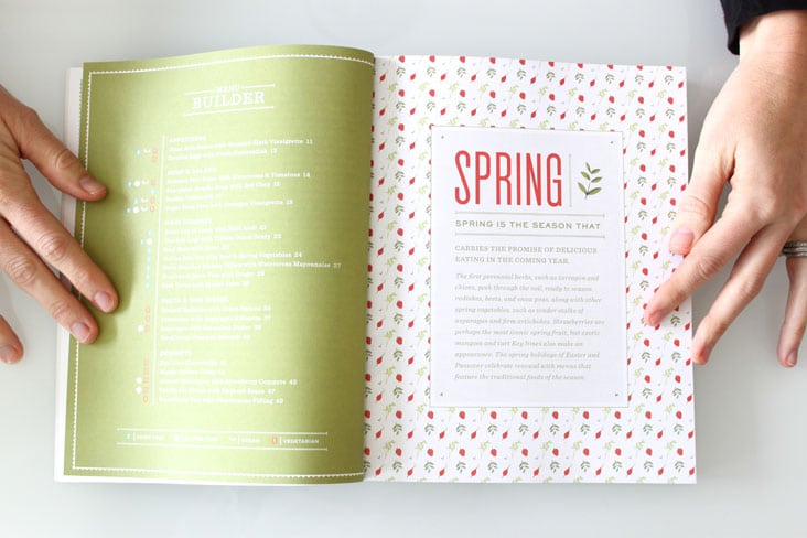
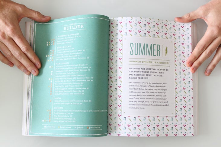
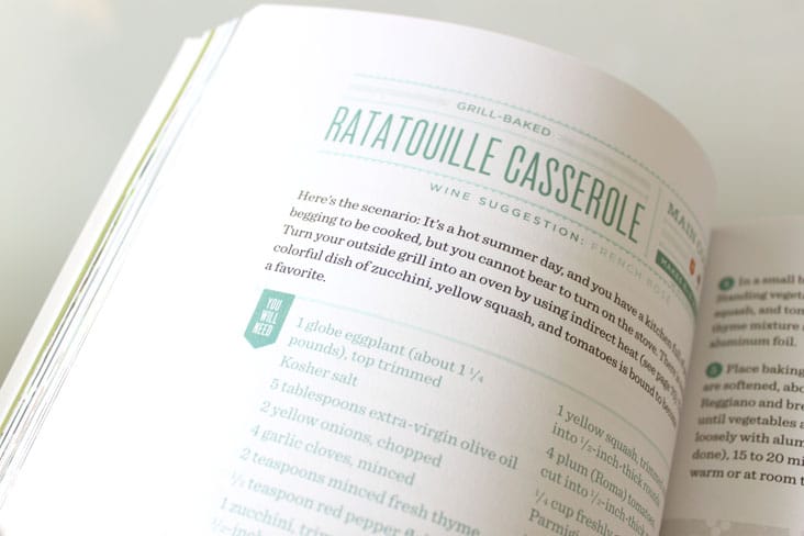
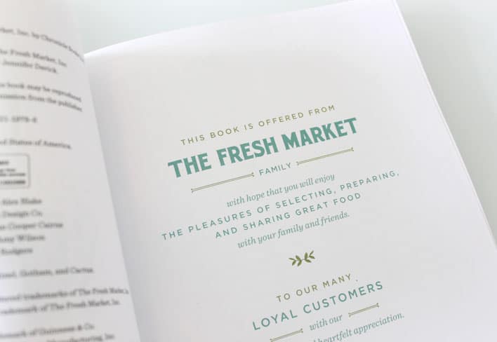
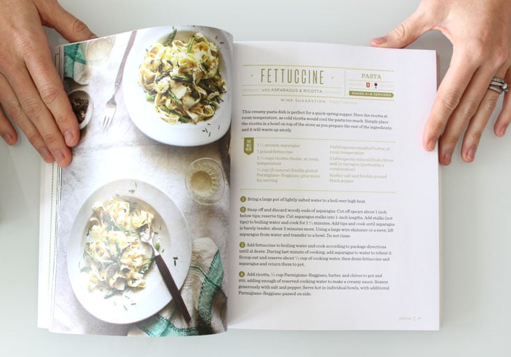
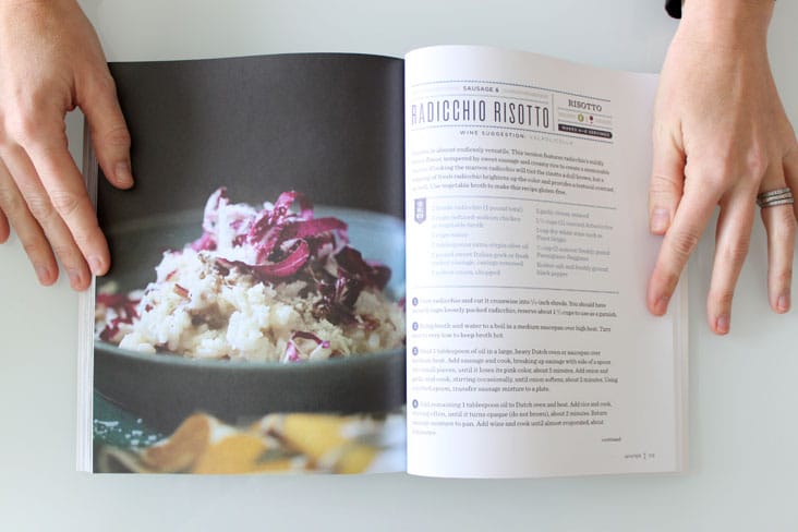
The new cook book we designed for Chronicle Books, Cooking in Season with The Fresh Market has finally arrived! We’re so excited to see the finished product! Cooking in Season is designed around the seasons and the practice of enjoying foods at their peak of freshness and taste. We designed the book using graphic details and patterns representative of the colors and foods from each season. Read the rest of this entry »
Client: Chronicle Books
Communication Arts FRESH
January 2, 2013
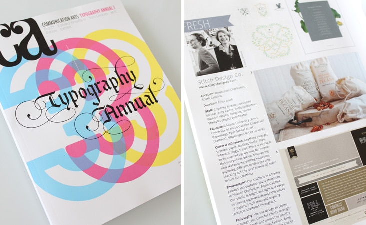
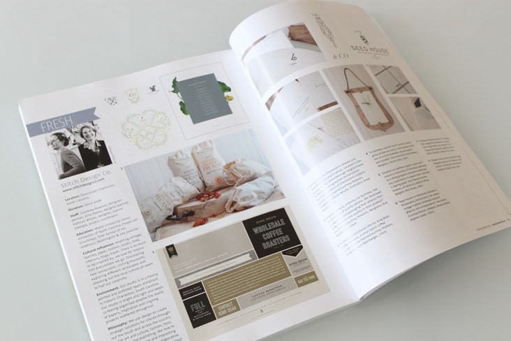
It’s a new year with a FRESH start. We’re thrilled to be included in the Communication Arts Typography Annual 3, Fresh column. Check us out on pages 202-203.
Client: Stitch Design Co.
Found Bath Branding
December 19, 2012
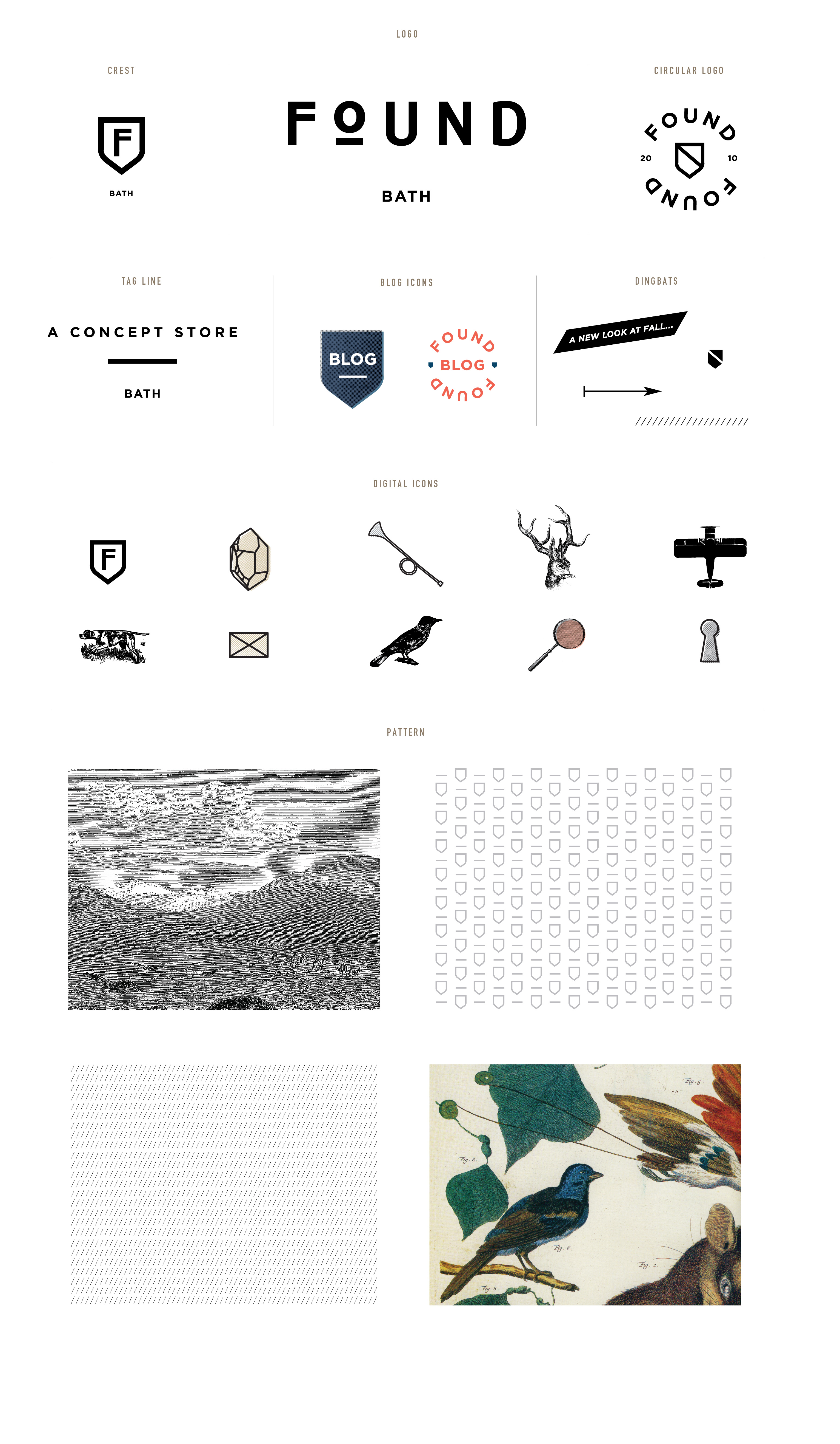
Found is a concept store in Bath that looks for the undiscovered, the classic and the contemporary. Found came to us to build a brand around their unique store. We used their phrase– “We believe there is a bit of luxury for everyone” as a starting point to design icons, patterns and sub marks. They are launching a new site soon which will incorporate all of the new elements, we can’ t wait to see it live!
Client: Found
Spoleto Festival USA 2013
December 17, 2012
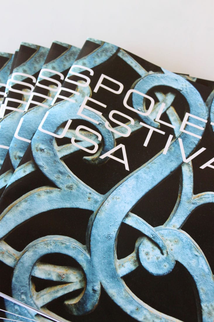
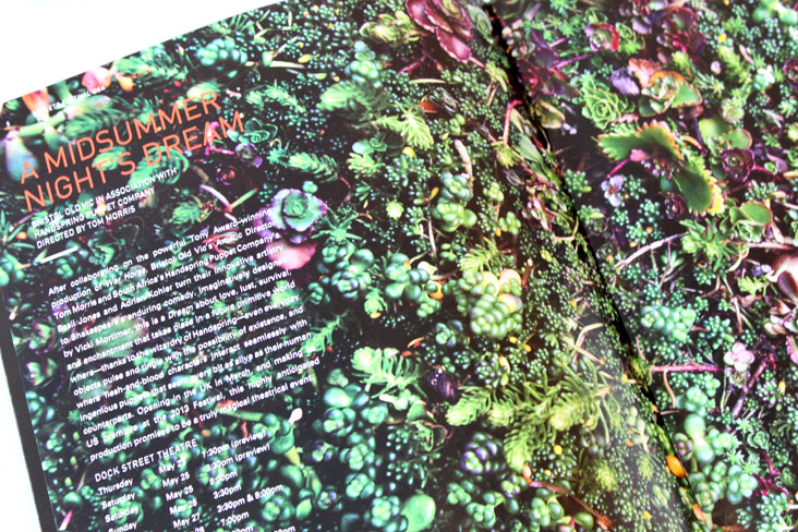
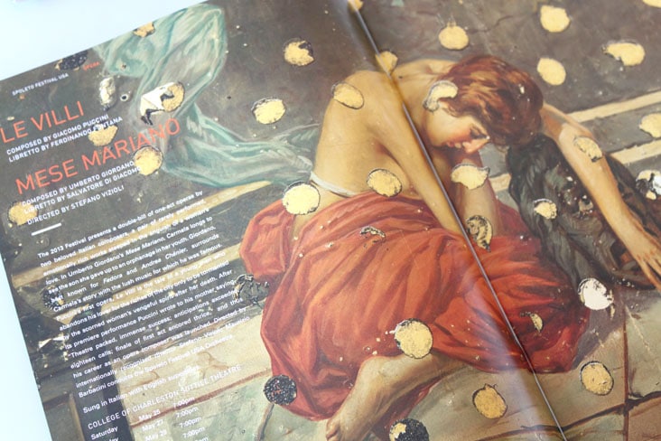
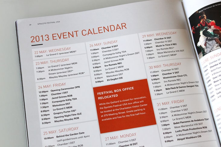
The Spoleto Festival USA 2013 ticket brochures have arrived. Per usual, the festival line up is amazing! It was a pleasure to design this piece and we can’t wait for the festival season to start! Read the rest of this entry »
Client: Spoleto Festival USA
Hob Nob Stationery Package
December 11, 2012
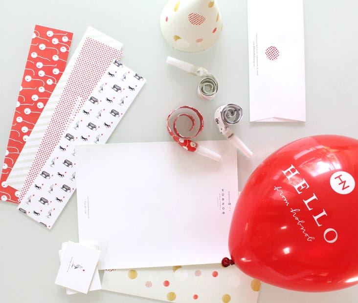
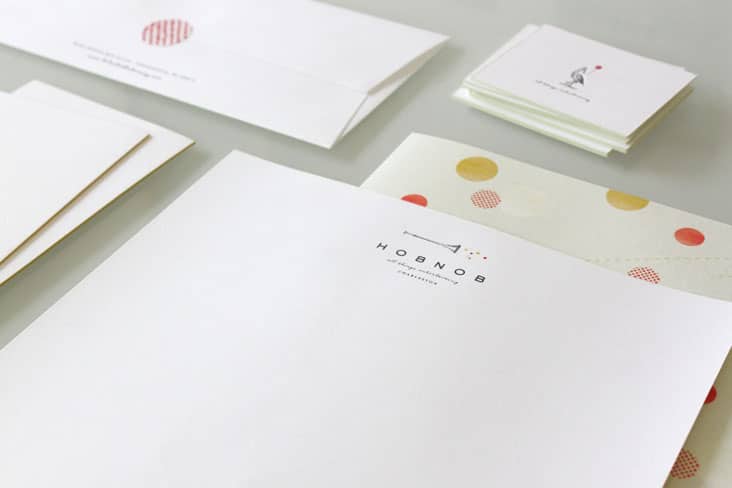
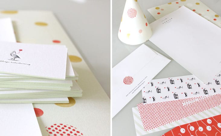
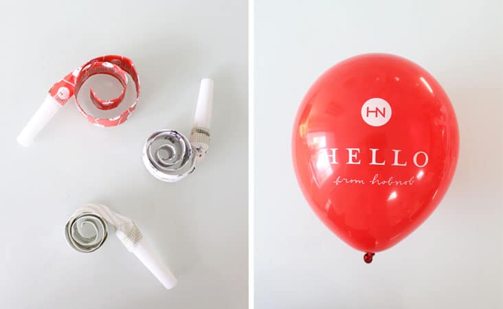
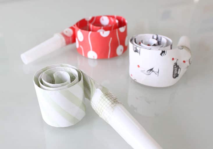
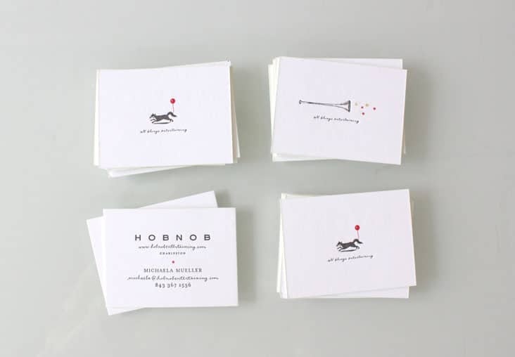
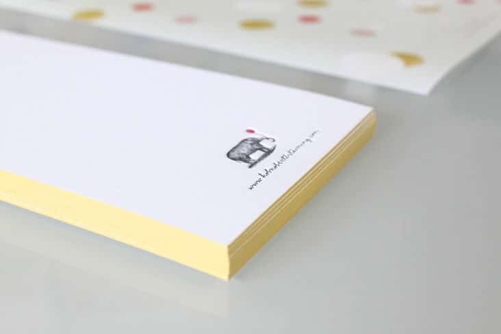
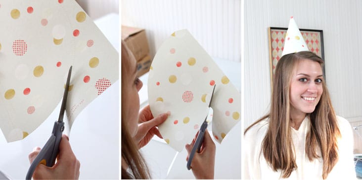
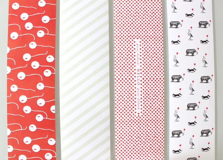
With a name and company like Hob Nob (see their branding here), we knew we couldn’t just design your standard stationery package. We designed this suite to feel unique, fun and interactive. The letterhead transforms into a party hat. The note card comes with a balloon attached and custom printed party blowers were a must have item to be included in this suite. Etched animals with balloons in tow adorn the fronts of the business cards. Read the rest of this entry »
Client: Hob Nob
Urbanic Paper Boutique
December 7, 2012
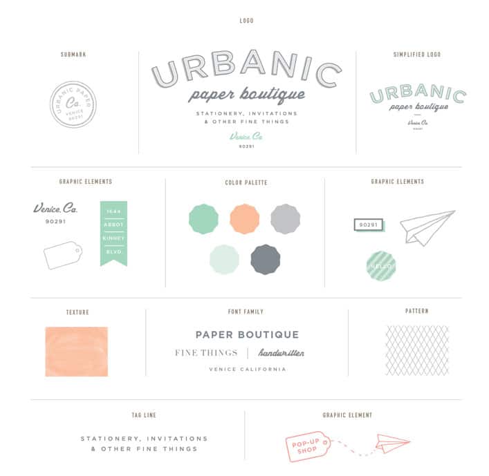
We have been long time followers of the quaint Venice, California paper store, Urbanic Paper Boutique. Being lovers of all things paper ourselves, we immediately new it would be a perfect match. Audrey and Joshua came to us with great inspiration which we then took and designed their new logo and branding around. Block letters, handwritten script and playful graphic elements all come together to represent their love of an old fashioned hand written note and the timelessness of correspondence. Read the rest of this entry »
Client: Urbanic Paper Boutique
Rewined Candles Stationery Package
December 3, 2012
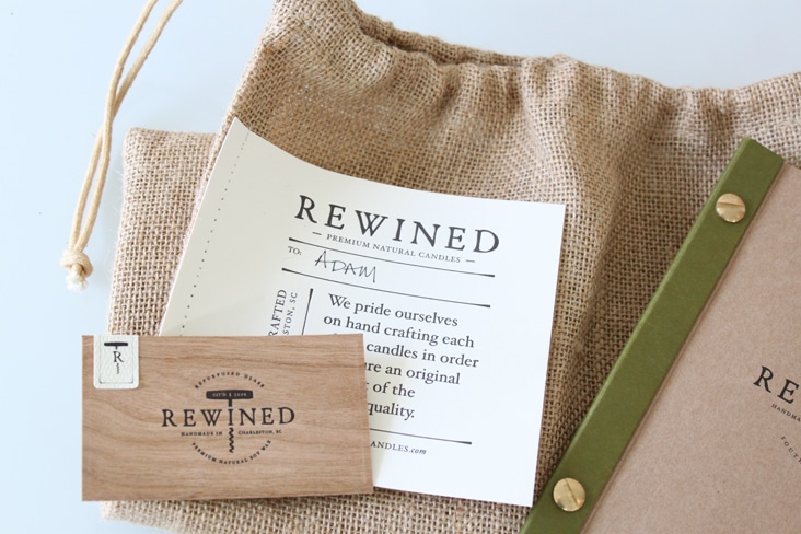
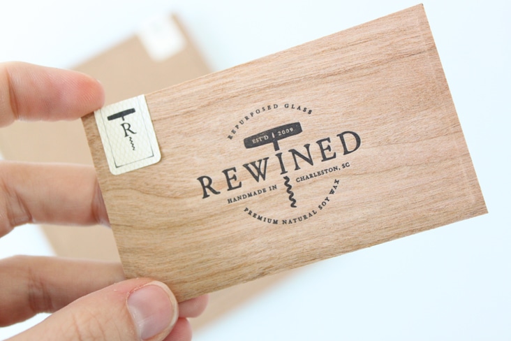
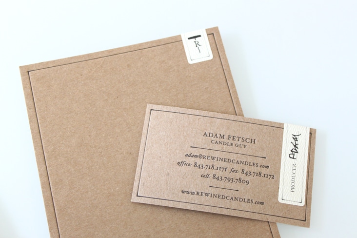
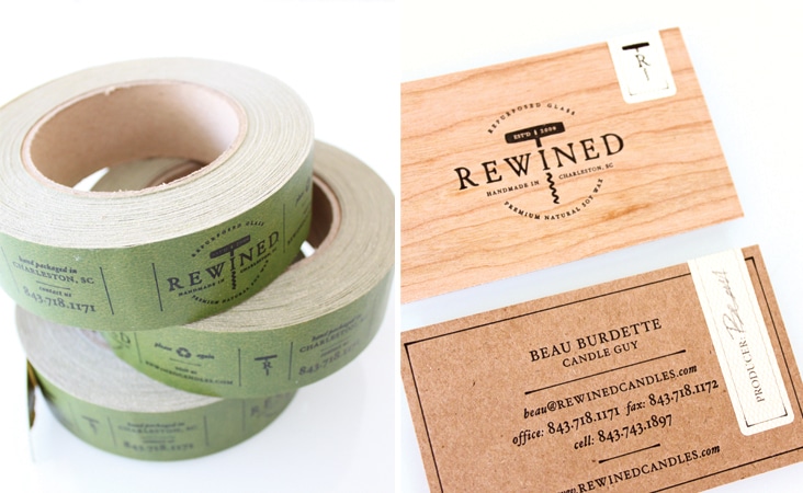
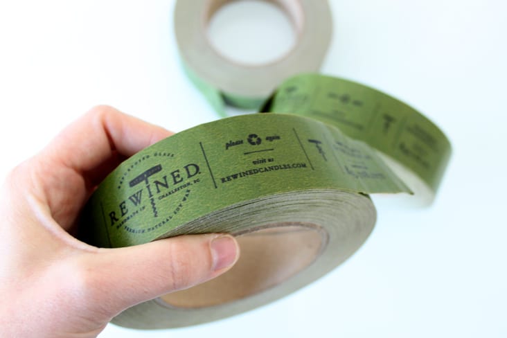
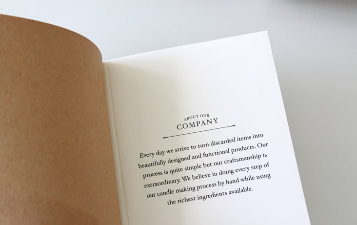
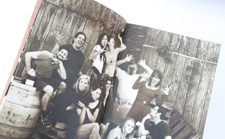
Another fun project to share with you for Rewined Candles. We always enjoy working with Adam and his team on their projects! Wood veneer, letterpress, kraft paper and small hand signed stickers seamlessly echo the design solutions from their packaging system.
Client: Rewined Candles
